
Your landing page’s weakest score is Trust.
How Balance ranks
Trust
38PoorProof that the product is real, competent, and safe to try.
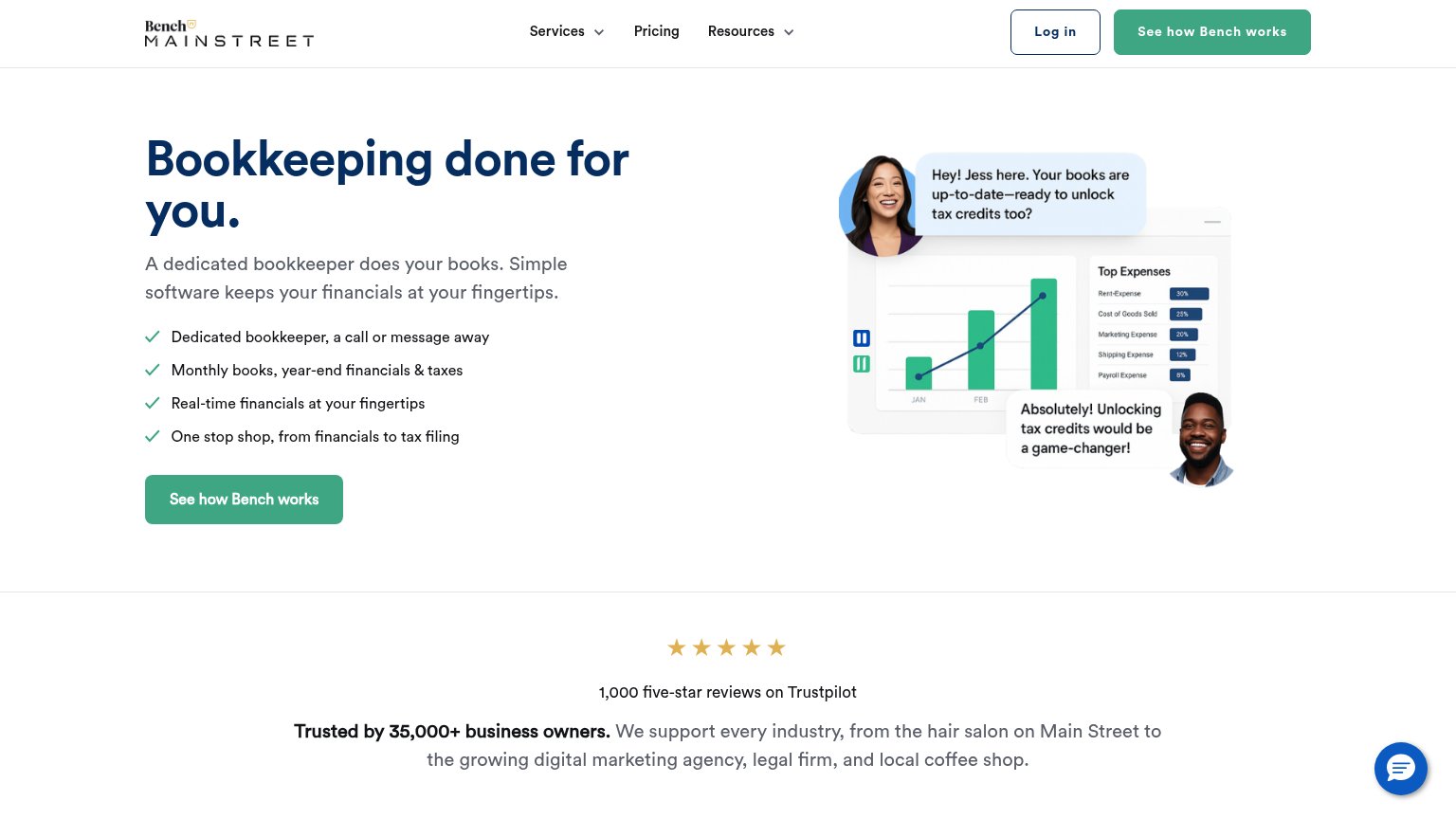
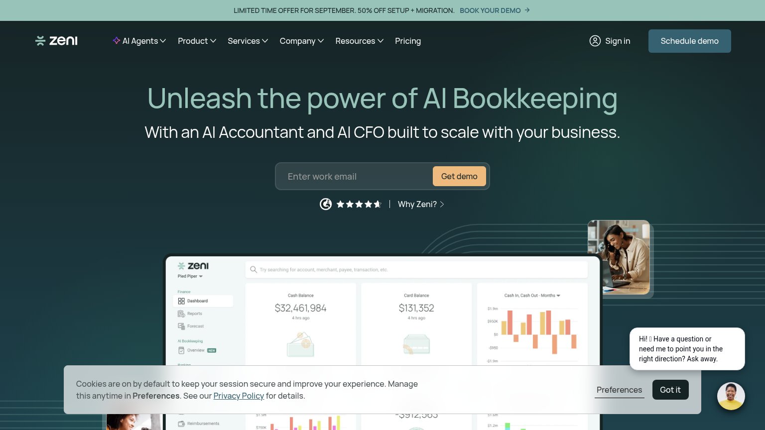


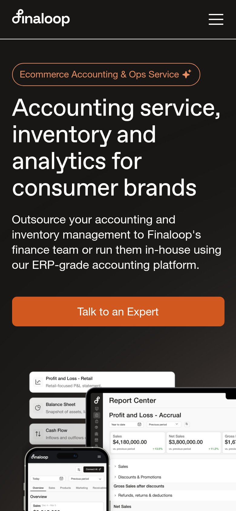
| Trust read | |
|---|---|
| Balance | No visible trust signal identified. |
| TRUSTED BY 3,500+ GROWTH-DRIVEN STARTUPS AND SMALL BUSINESSES | |
| "1,000 five-star reviews on Trustpilot" with five-star rating graphic | |
| G2 badge with ~4.5-star rating next to the "Get demo" CTA | |
| Detailed product UI showing the "Report Center" with a "Profit and Loss - Accrual" report ($4,180,000 sales) alongside a | |
| Detailed "Banks & Cards" product UI showing real transaction data (Mercury Checking, Stripe line items, dollar balances) |
CTA
68FairCopy, size, verb, cost-feel — does the primary CTA earn the click?
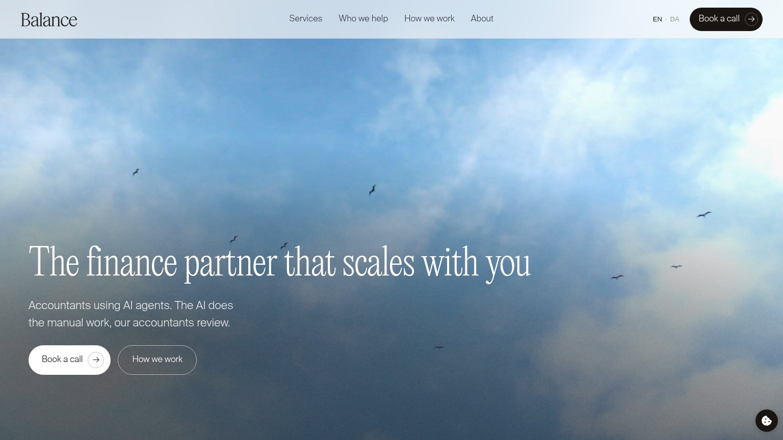
Problems
- click feels costly — a sales call
- no value promised for the click
- no de-risking copy near button
Value props
68FairTitle, subtitle, hero — do they sell the product's true value?
Balance’s headline
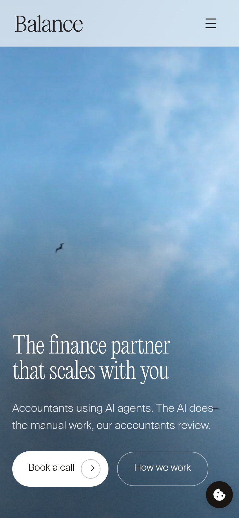
The finance partner that scales with you
Accountants using AI agents. The AI does the manual work, our accountants review.
Working
Could improve
Information hierarchy
78FairDoes the design help or inhibit what the page is trying to say?
What works
What to improve
Mobile web
82StrongThe phone experience as a first-class citizen.
What works
What to improve