
Your landing page’s weakest score is Trust.
How Digits ranks
72Growth scoreupdated
category scores
category scoresShowHide
Trust
54FairProof that the product is real, competent, and safe to try.

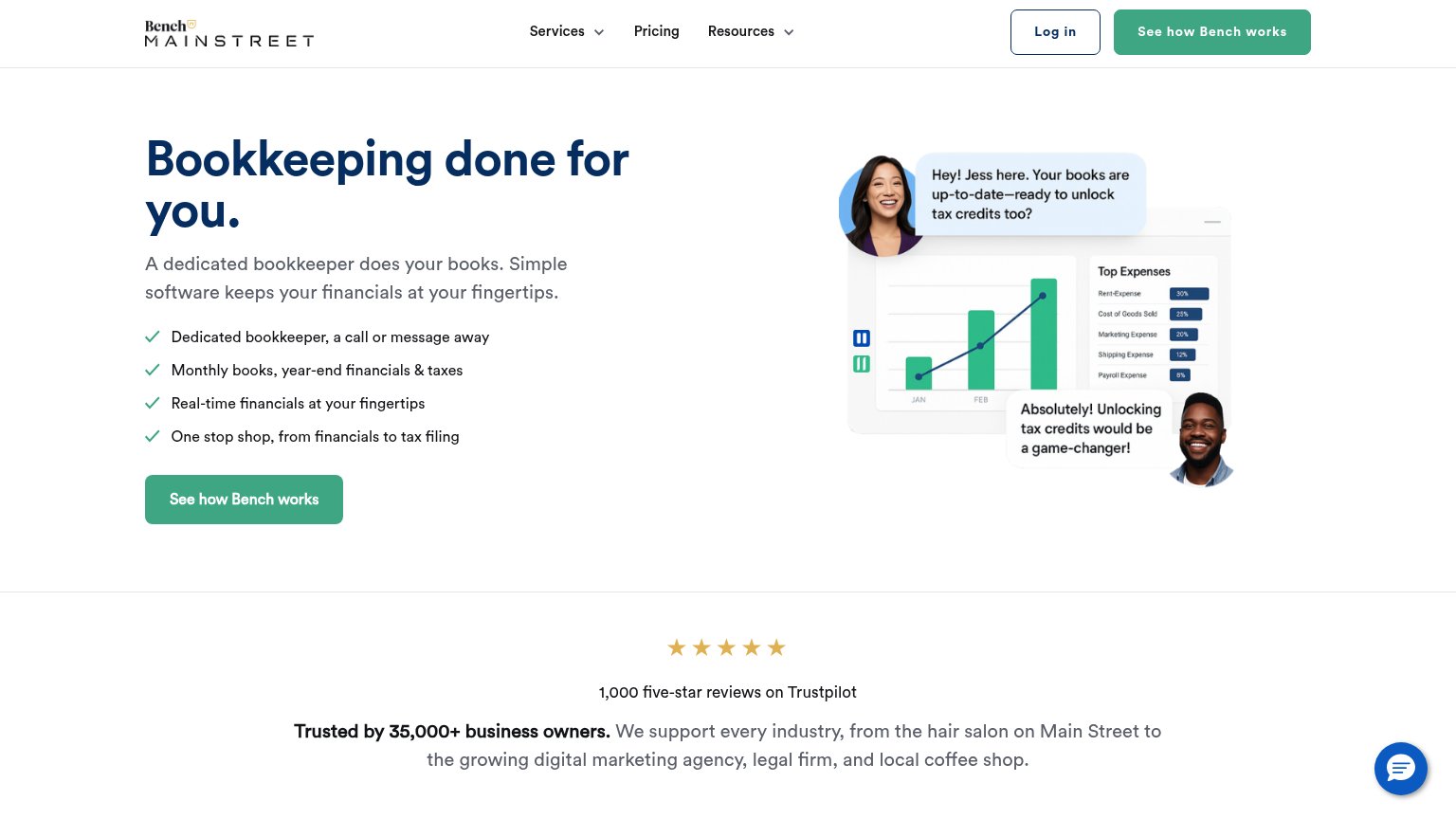
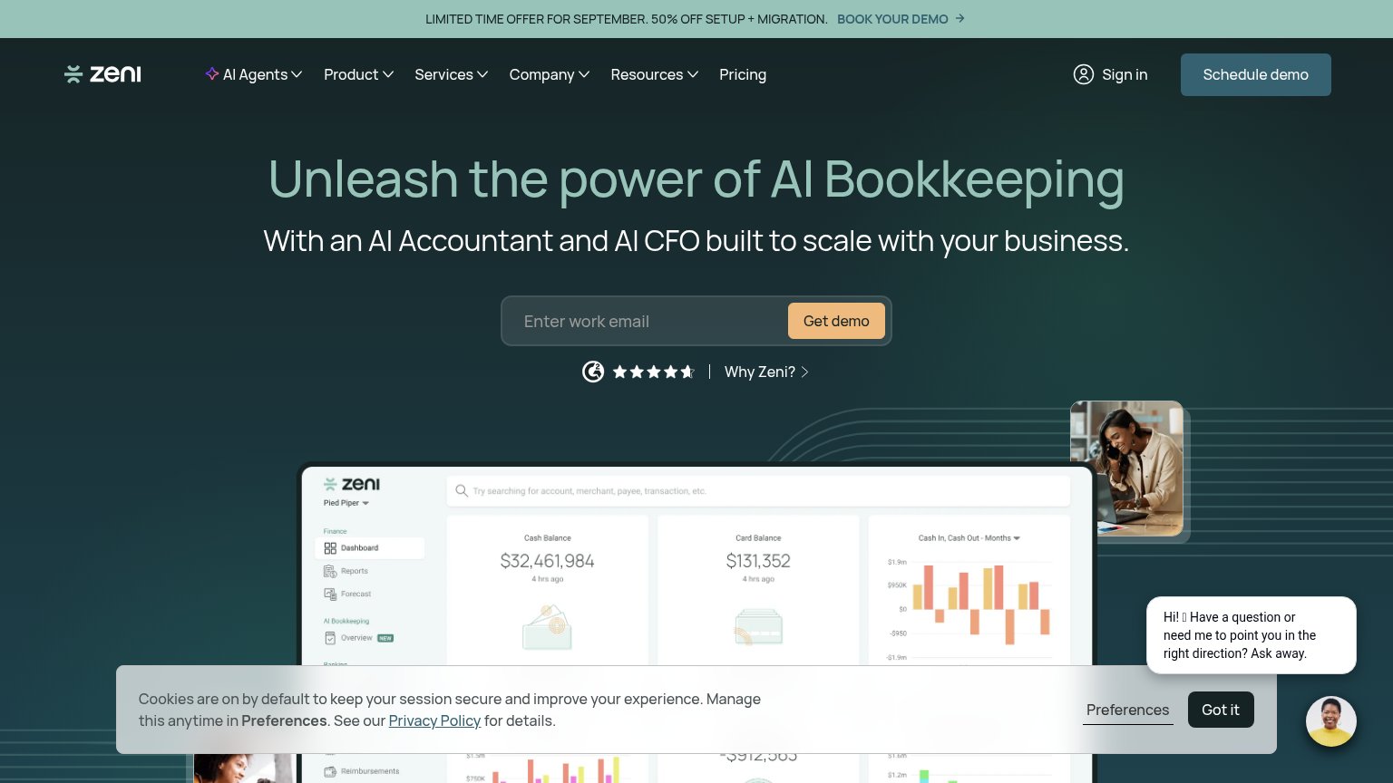

| Trust read | |
|---|---|
| Digits | Detailed "Banks & Cards" product UI showing real transaction data (Mercury Checking, Stripe line items, dollar balances) |
| No visible trust signal identified. | |
| TRUSTED BY 3,500+ GROWTH-DRIVEN STARTUPS AND SMALL BUSINESSES | |
| "1,000 five-star reviews on Trustpilot" with five-star rating graphic | |
| G2 badge with ~4.5-star rating next to the "Get demo" CTA | |
| Detailed product UI showing the "Report Center" with a "Profit and Loss - Accrual" report ($4,180,000 sales) alongside a |
Information hierarchy
76FairDoes the design help or inhibit what the page is trying to say?
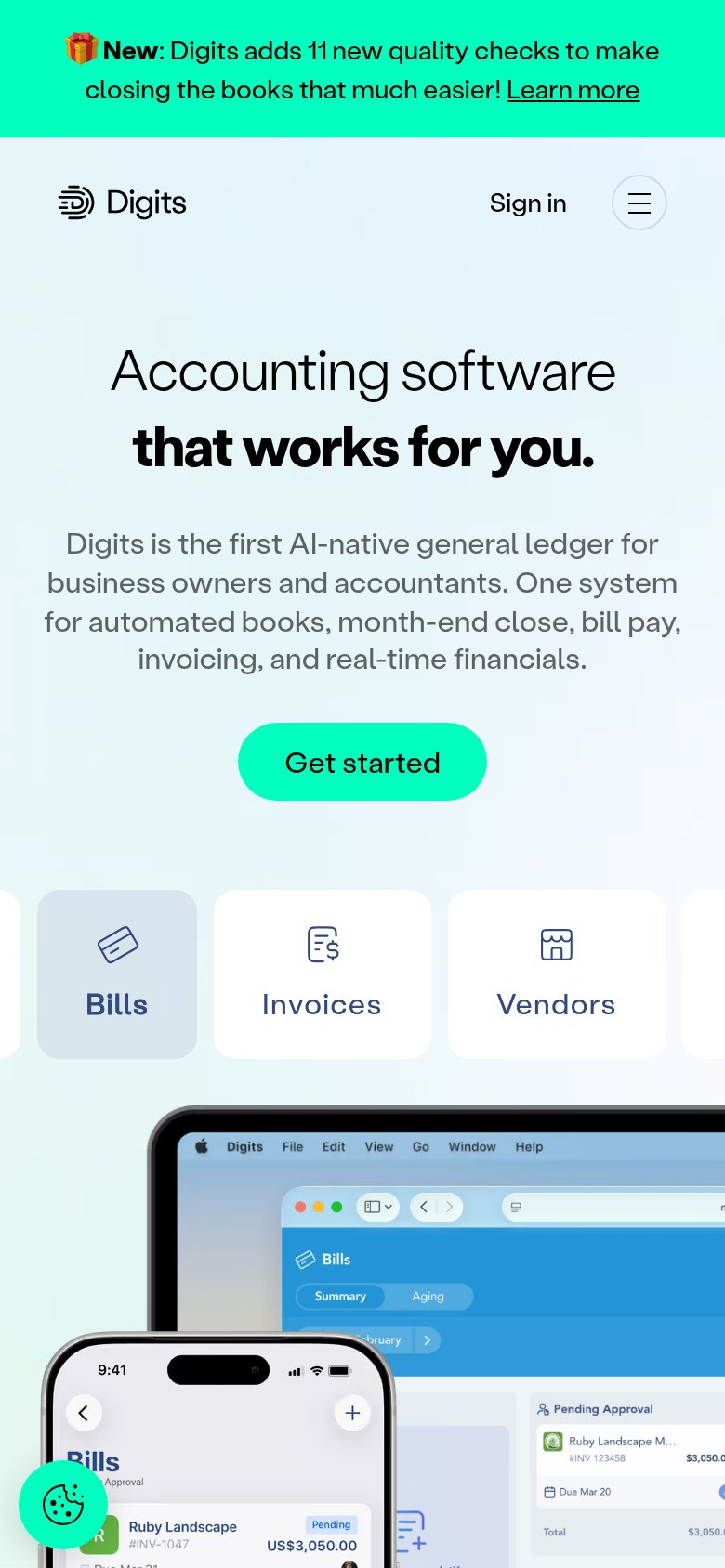
1234- Duplicate Get started buttons — The nav 'Get started' (black) competes with the hero 'Get started' (green) at similar weight, splitting the primary action into two styles.
- Announcement banner — Bright green 'New: Digits adds 11 new quality checks' bar with a 'Learn more' link is the highest-contrast element on the page and pulls attention above the headline.
- Five dropdown nav menus — Why Digits?, Product, Accountants, Resources, and Pricing all open exit paths at equal weight before the visitor reaches the CTA.
- Hero CTA color blends — The green 'Get started' button shares its hue with the banner and the mint background gradient, weakening its one-second findability.
CTA
76FairCopy, size, verb, cost-feel — does the primary CTA earn the click?
How Digits compares
Recommended rewrites
Value props
76FairTitle, subtitle, hero — do they sell the product's true value?
Digits’s headline
Accounting software—that works for you.
Digits is the first AI-native general ledger for business owners and accountants. One system for automated books, month-end close, bill pay, invoicing, and real-time financials.
Working
Could improve
Mobile web
78FairThe phone experience as a first-class citizen.
What works
What to improve