
Your landing page’s weakest score is Mobile web.
How Gamefam ranks
Mobile web
52FairThe phone experience as a first-class citizen.
 1234
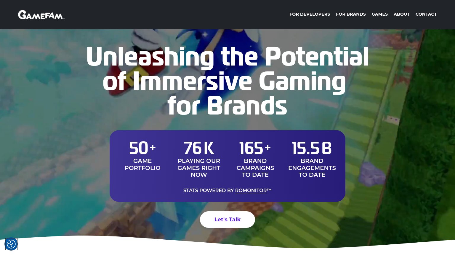
- Cut-off Let's Talk CTA — The primary CTA is clipped at the very bottom edge, barely visible and not tappable in the first fold.
- Oversized hero headline — Headline wraps into six huge lines, eating half the viewport and pushing the CTA off-screen.
- Full-screen stats card — Four stacked stats plus attribution fill nearly half the fold, crowding out the conversion action.
- Accessibility widget overlap — The floating widget icon sits directly against the stats card corner, adding clutter near the CTA path.
CTA
62FairCopy, size, verb, cost-feel — does the primary CTA earn the click?
Problems
- click feels like a sales call
- no value named in the label
- small vs. huge hero headline
- cut off below mobile fold
Value props
62FairTitle, subtitle, hero — do they sell the product's true value?
Gamefam’s headline
Unleashing the Potential of Immersive Gaming for Brands
Working
Could improve
Information hierarchy
68FairDoes the design help or inhibit what the page is trying to say?
What works
What to improve
Trust
68FairProof that the product is real, competent, and safe to try.
How Gamefam compares
Trust read