
Your landing page’s weakest score is Information hierarchy.
How Buoy Studios ranks
71Growth scoreupdated
category scores
category scoresShowHide
Information hierarchy
64FairDoes the design help or inhibit what the page is trying to say?
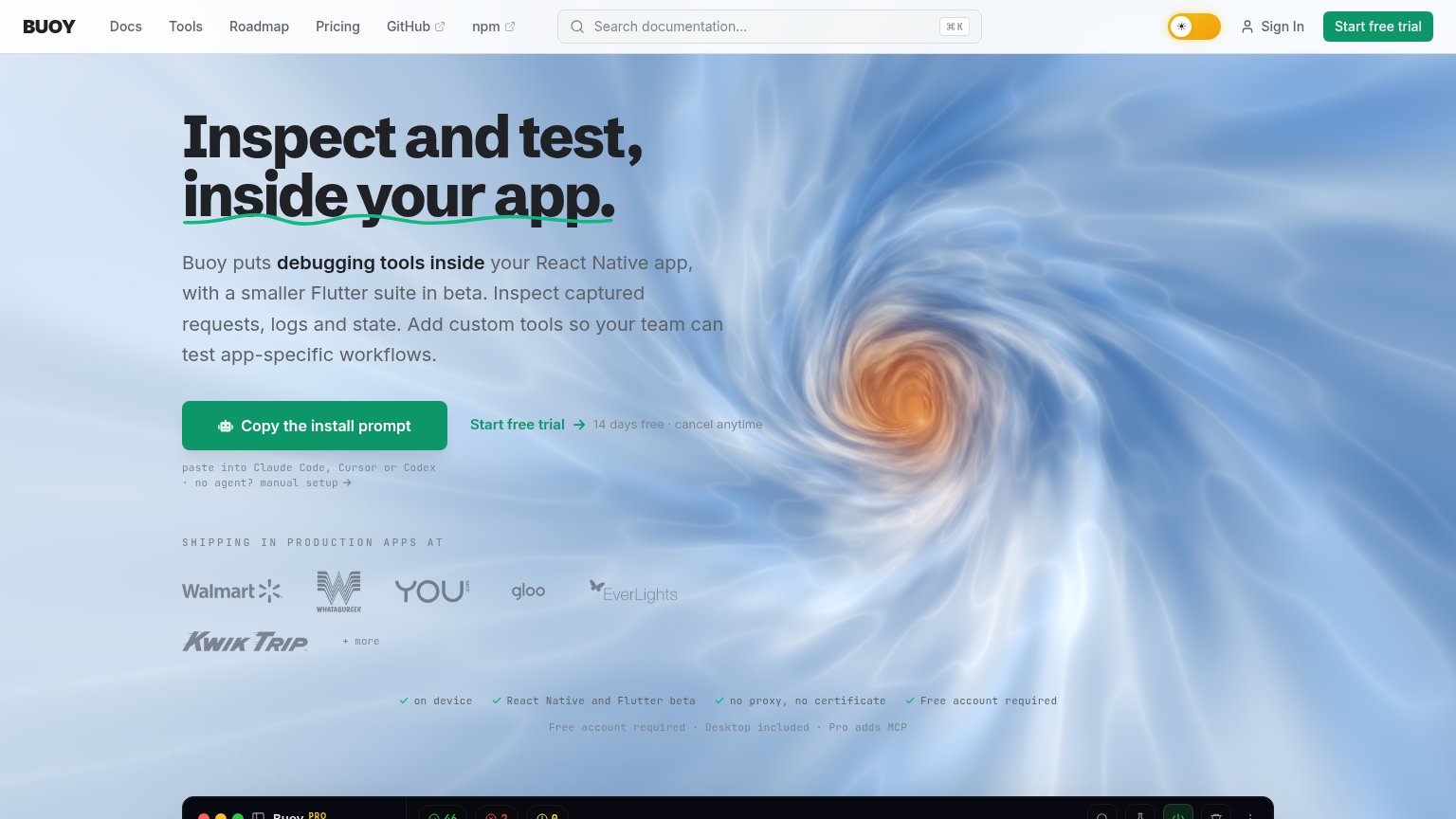 1234
- Gray subheadline text — Light gray copy sits over the bright swirl and loses legibility mid-paragraph — the value prop washes out.
- Helper text under CTA — Monospace gray 'paste into Claude Code' instructions are near-invisible against the background, hiding the CTA's next step.
- Nav Start free trial — High-contrast green button in the nav duplicates the hero action and pulls eyes away from the primary CTA path.
- Checkmark feature row — Faded gray reassurance line ('no proxy, no certificate', 'Free account required') is barely readable where objections should be answered.
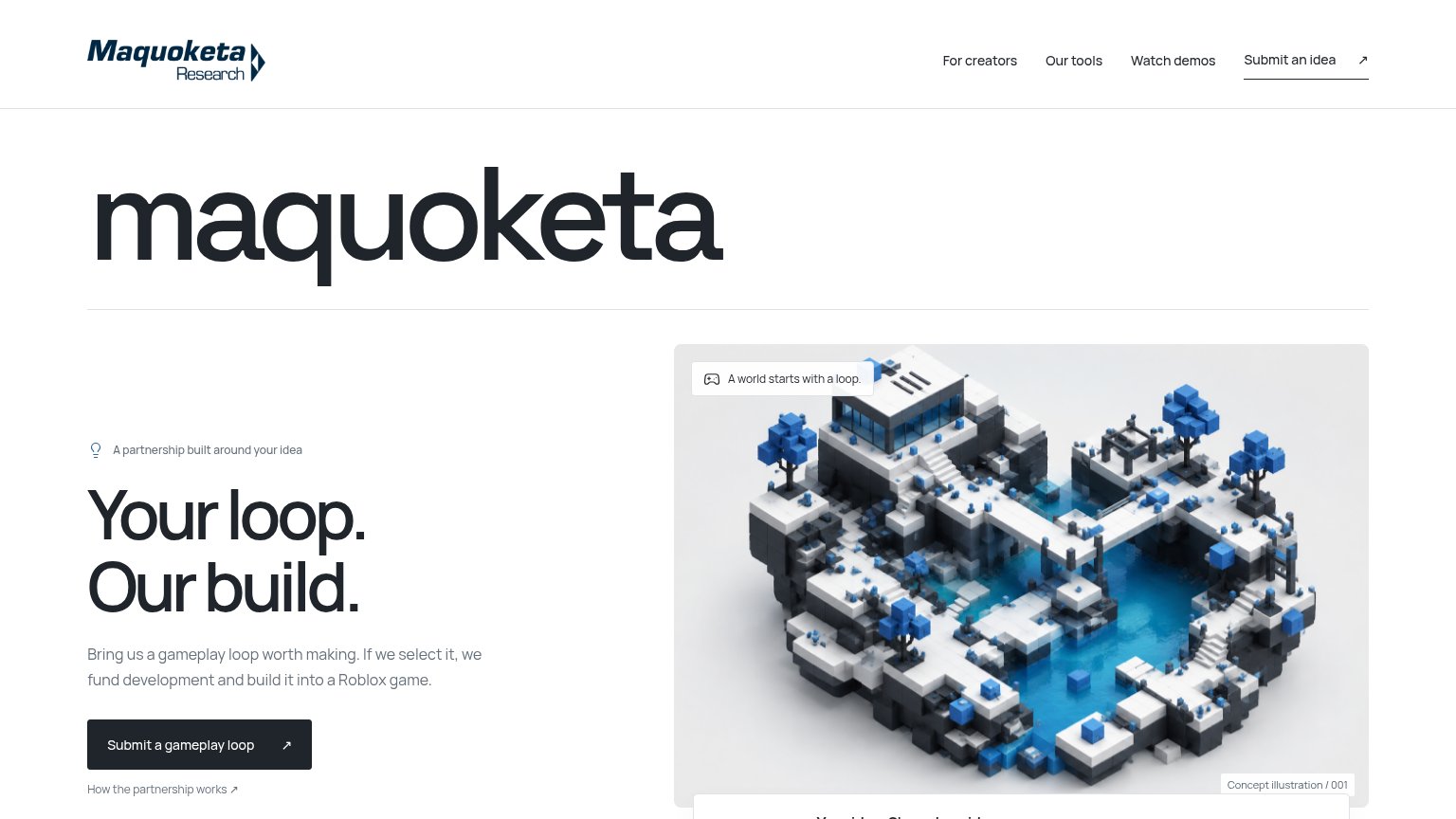
CTA
72FairCopy, size, verb, cost-feel — does the primary CTA earn the click?
Problems
- 4 words — over one fixation
- no 'free' despite free tier
- 3 competing labels above fold
- assumes visitor knows agent flow
Value props
72FairTitle, subtitle, hero — do they sell the product's true value?
Buoy Studios’s headline
Inspect and test, inside your app.
Buoy puts debugging tools inside your React Native app, with a smaller Flutter suite in beta. Inspect captured requests, logs and state. Add custom tools so your team can test app-specific workflows.
Working
Could improve
Mobile web
72FairThe phone experience as a first-class citizen.
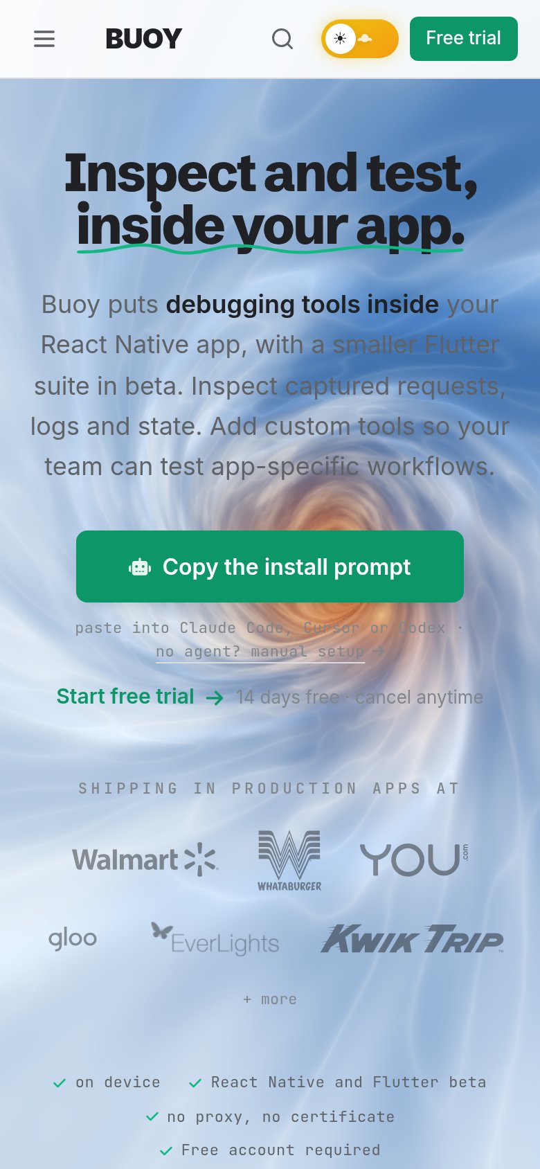
What works
What to improve
Trust
76FairProof that the product is real, competent, and safe to try.
How Buoy Studios compares
Trust read