
Your landing page’s weakest score is Information hierarchy.
How FieldPulse ranks
- 1.
Jobber82
- 2.
Stormy75
- 3.
Housecall Pro71
- 4.
ServiceTitan70
- 5.
FieldPulse62
62Growth scoreupdated
category scores
category scoresShowHide
Information hierarchy
42PoorDoes the design help or inhibit what the page is trying to say?
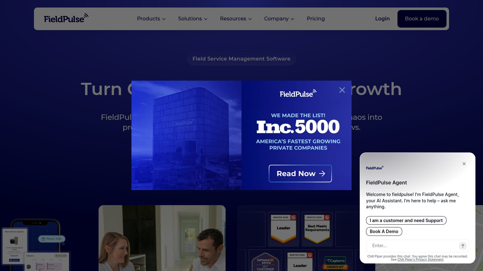 1234
- Inc.5000 popup — Covers the headline and hero CTA; its 'Read Now' button hijacks the primary action on first load.
- FieldPulse Agent panel — Auto-expanded chat with 'Book A Demo' duplicates the nav CTA and adds a second competing dialog to the fold.
- Blocked hero headline — 'Turn C…rowth' is unreadable behind the popup, so the value proposition never lands in the first second.
- Nav link row — Five dropdown items plus Login sit at equal weight beside 'Book a demo', leaking attention before the pitch.
CTA
58FairCopy, size, verb, cost-feel — does the primary CTA earn the click?
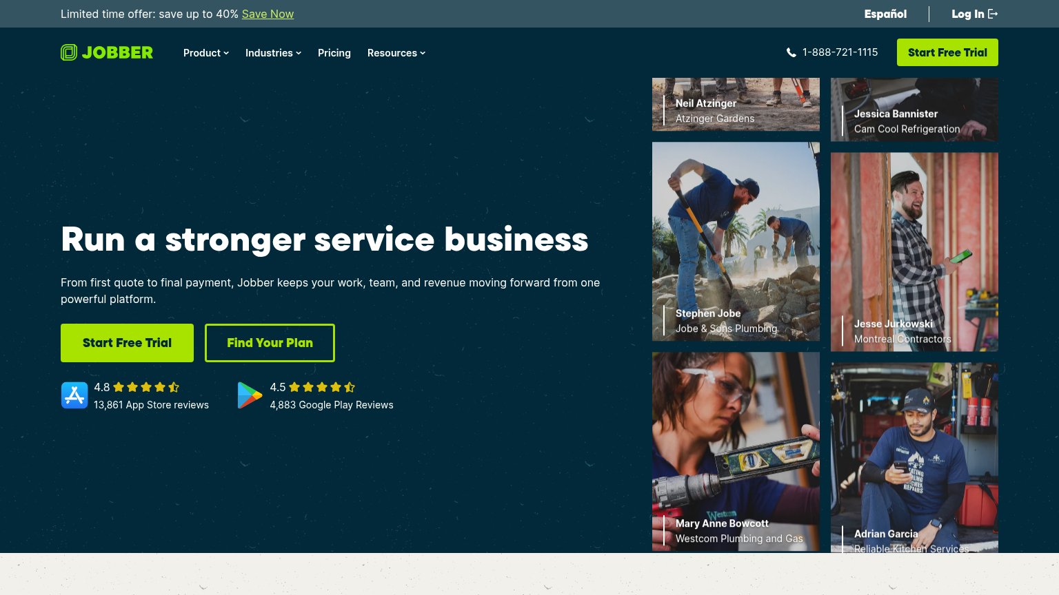
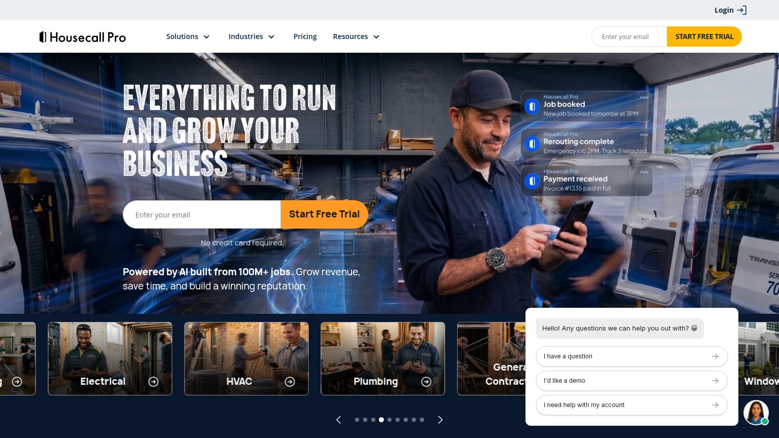
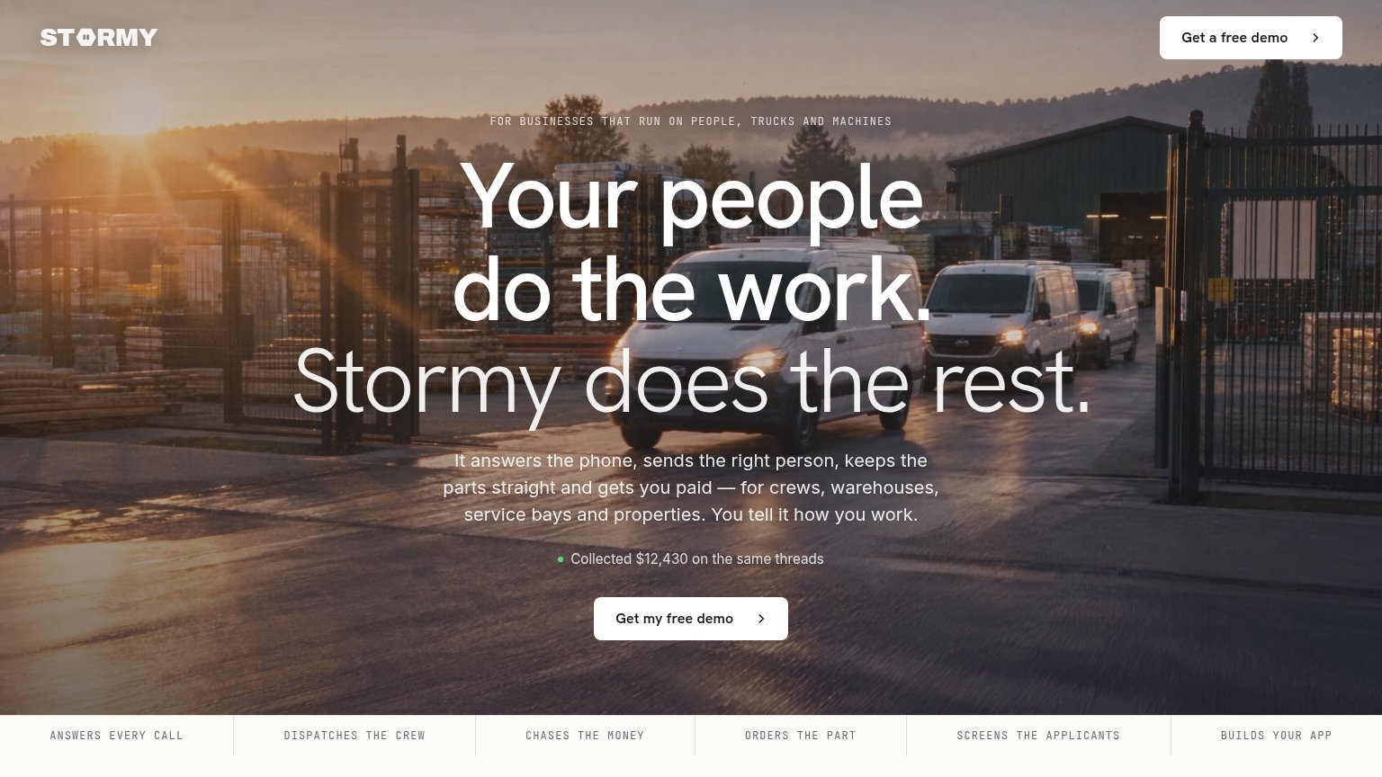
Problems
- desktop CTA hidden by promo modal
- demo ask feels costly
- label differs from nav 'Book a demo'
- 'Explore' secondary is vague
Value props
62FairTitle, subtitle, hero — do they sell the product's true value?
FieldPulse’s headline
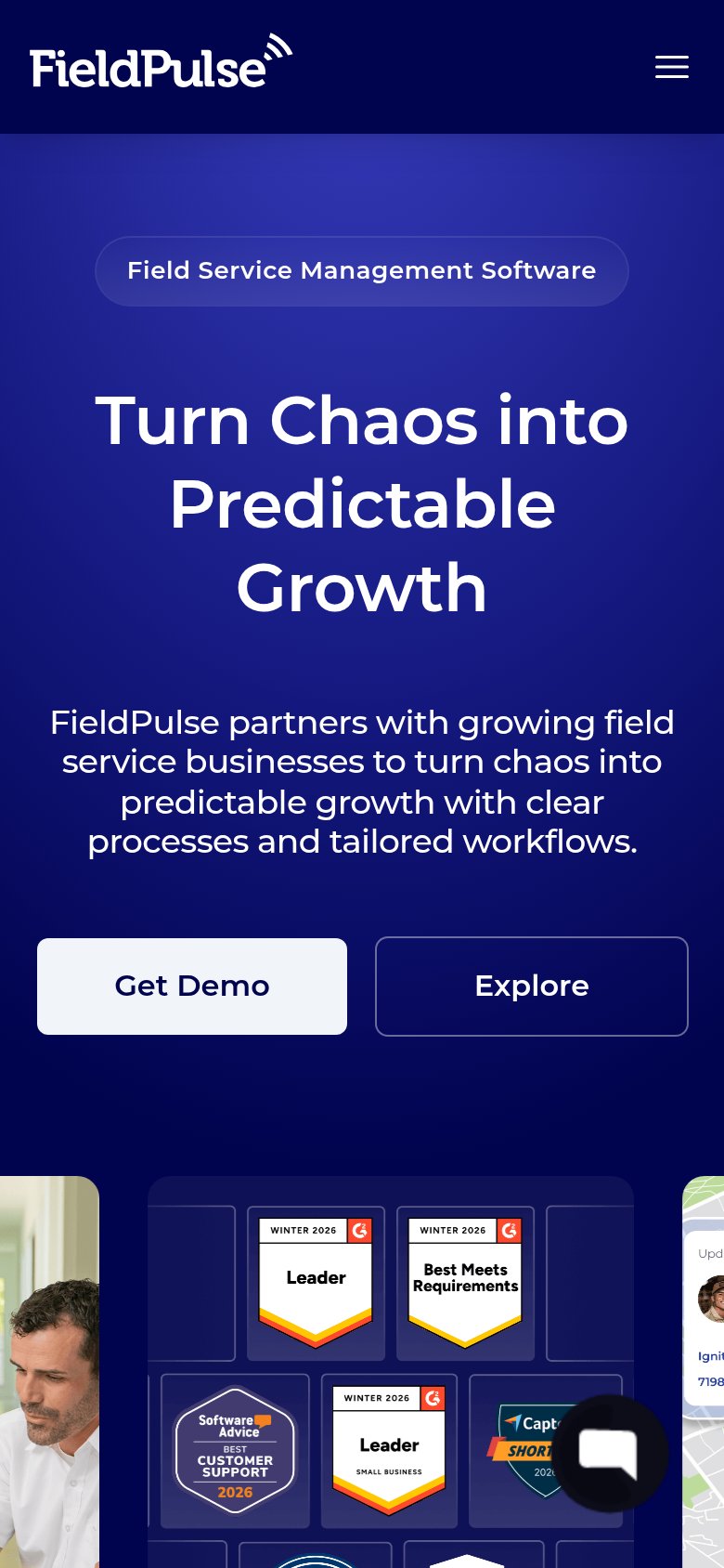
Turn Chaos into Predictable Growth
FieldPulse partners with growing field service businesses to turn chaos into predictable growth with clear processes and tailored workflows.
Working
Could improve
Trust
68FairProof that the product is real, competent, and safe to try.
How FieldPulse compares
Trust read
Mobile web
78FairThe phone experience as a first-class citizen.
What works
What to improve