
Your landing page’s weakest score is Trust.
How Fewsats ranks
Trust
48PoorProof that the product is real, competent, and safe to try.

| Trust read | |
|---|---|
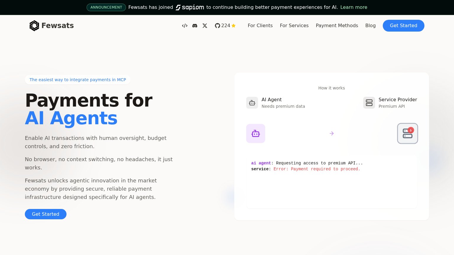
| Fewsats | "How it works" panel with AI Agent → Service Provider flow and terminal snippet ("Error: Payment required to proceed.") |
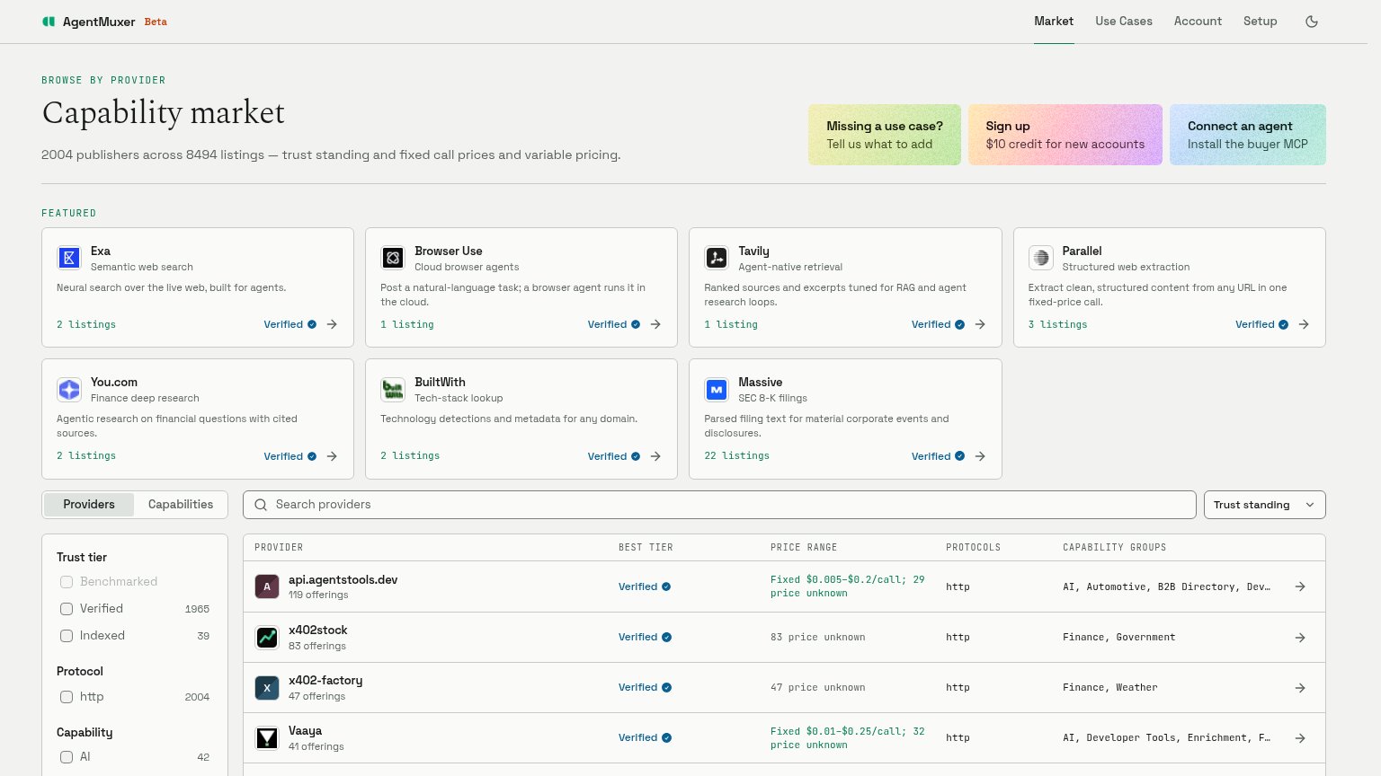
| "2004 publishers across 8494 listings" backed by the live provider table with Verified badges and fixed call prices | |
| Ecosystem builder logo row next to "Explore the x402 ecosystem and its builders" | |
| ISO 27001, SOC 2 Type II and PCI SAQ-D compliance badges in the logo bar | |
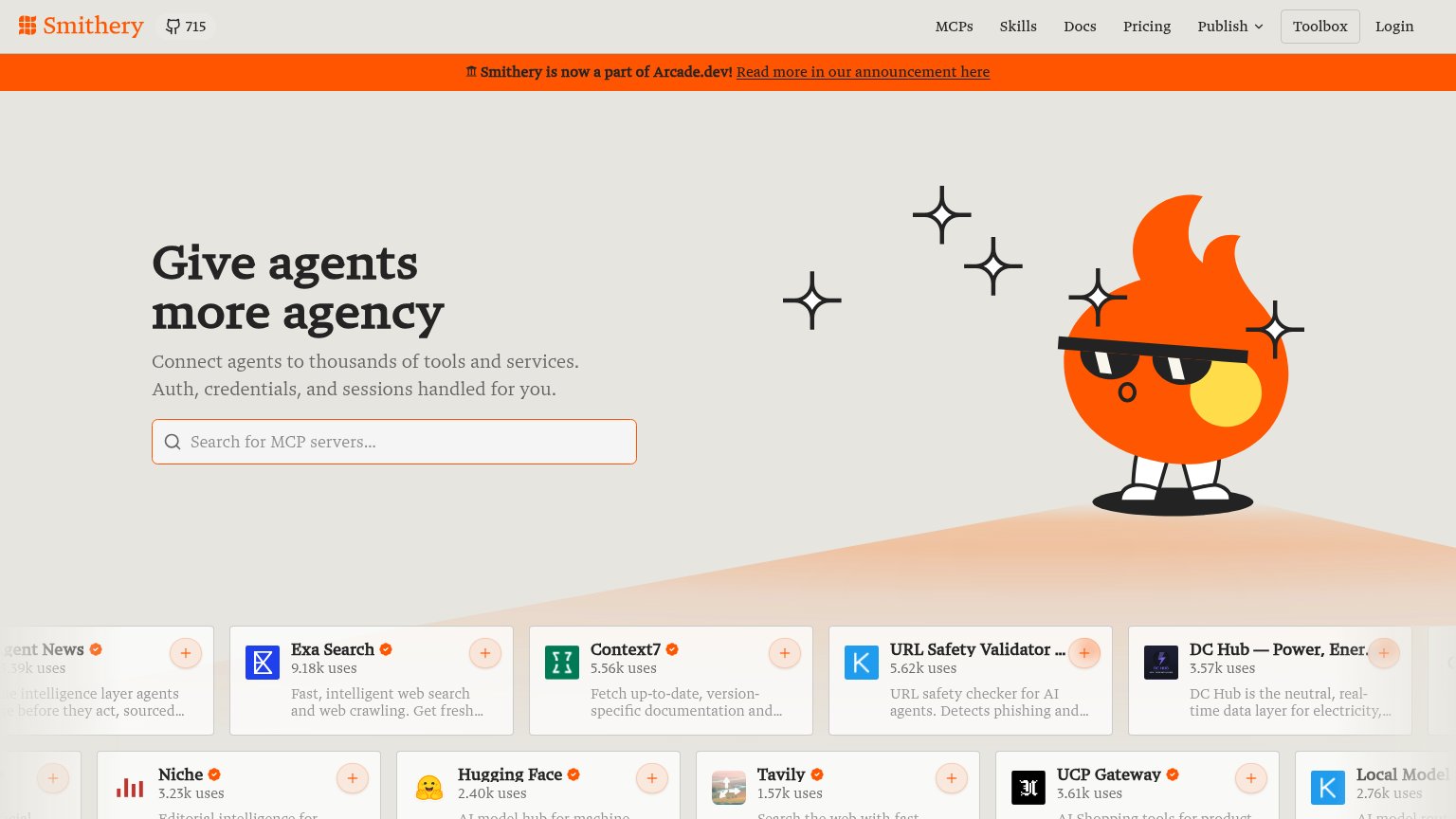
| MCP server cards with usage counts, e.g. "Exa Search — 9.18k uses" and "OneSignal — 22.49k uses" |
Mobile web
62FairThe phone experience as a first-class citizen.
 123
- Get Started button — Desktop-sized pill at the fold's bottom edge; should be full-width and higher up.
- Stacked hero paragraphs — Three competing body paragraphs push the CTA to the viewport edge.
- Announcement banner — Four lines of banner text eat the top of the first mobile viewport.
Information hierarchy
64FairDoes the design help or inhibit what the page is trying to say?
What works
What to improve
CTA
68FairCopy, size, verb, cost-feel — does the primary CTA earn the click?
How Fewsats compares
Recommended rewrites
Value props
68FairTitle, subtitle, hero — do they sell the product's true value?
Fewsats’s headline
Payments for AI Agents
Enable AI transactions with human oversight, budget controls, and zero friction.
Working
Could improve