
Your landing page’s weakest score is Mobile web.
How Amorphic Labs ranks
61Growth scoreupdated
category scores
category scoresShowHide
Mobile web
54FairThe phone experience as a first-class citizen.
 123
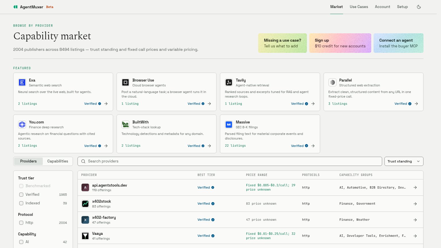
- Uncollapsed nav row — Full desktop link row crammed in; 'Setup' clips at the right edge instead of collapsing to a hamburger.
- Three stacked CTA cards — Three competing pastel cards with no button styling; no single primary action stands out or fills the width.
- Sign up card width — Desktop-proportioned card floats partial-width in the phone column instead of a thumb-friendly full-bleed button.
Information hierarchy
58FairDoes the design help or inhibit what the page is trying to say?
 1234
- Three pastel CTA cards — Three same-weight cards split the primary action; no visitor knows which one the page wants clicked.
- Featured provider grid — Seven cards with identical weight and arrows create a directory feel and fourteen exit paths above the fold.
- Provider table in fold — A dense filterable data table crowds the first viewport, competing with the headline and CTAs for attention.
- Top navigation row — Four nav links plus theme toggle leak attention before any conversion surface is established.
CTA
58FairCopy, size, verb, cost-feel — does the primary CTA earn the click?
How Amorphic Labs compares
Recommended rewrites
Value props
64FairTitle, subtitle, hero — do they sell the product's true value?
Amorphic Labs’s headline
Capability market
2004 publishers across 8494 listings — trust standing and fixed call prices and variable pricing.
Working
Could improve
Trust
72FairProof that the product is real, competent, and safe to try.
How Amorphic Labs compares
Trust read