
Your landing page’s weakest score is Mobile web.
How Eldermark ranks
59Growth scoreupdated
category scores
category scoresShowHide
Mobile web
44PoorThe phone experience as a first-class citizen.
 1234
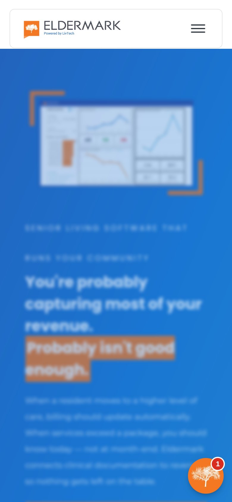
- Headline block — No CTA accompanies it — the six-line wrapped headline fills the fold with no tappable action anywhere in view.
- Chat bubble badge — Chat launcher with a red "1" notification badge adds distraction with no conversion-valuable CTA.
- Stacked eyebrow lines — Two separate all-caps eyebrow lines stack above the headline, adding a competing message layer in a cramped column.
- Hero dashboard screenshot — Desktop-scale dashboard shrunk to phone width is illegible and consumes a third of the first viewport.
Information hierarchy
54FairDoes the design help or inhibit what the page is trying to say?
 1234
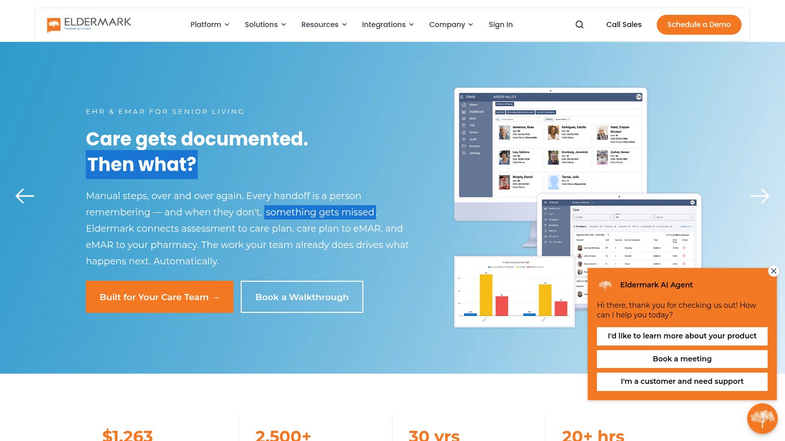
- AI Agent chat popup — Auto-opened orange panel with three same-weight buttons hijacks attention from the hero CTA and covers the product screenshot.
- Dual hero CTAs — "Built for Eldermark's Care Team →" and "Book a Walkthrough" sit side by side at similar weight, splitting the click; neither matches the header's "Schedule a Demo".
- Carousel arrows — Left/right slider arrows signal rotating hero content, inviting visitors to page past the value prop instead of acting on it.
- Six dropdown nav — Platform, Solutions, Resources, Integrations, Company plus Sign In and search offer many exits before the pitch is read.
Trust
54FairProof that the product is real, competent, and safe to try.
How Eldermark compares
Trust read
CTA
58FairCopy, size, verb, cost-feel — does the primary CTA earn the click?
How Eldermark compares
Recommended rewrites
Value props
84StrongTitle, subtitle, hero — do they sell the product's true value?
Eldermark’s headline
Care gets documented. Then what?
Manual steps, over and over again. Every handoff is a person remembering — and when they don't, something gets missed. Eldermark connects assessment to care plan, care plan to eMAR, and eMAR to your pharmacy. The work your team already does
Working
Could improve