
Your landing page’s weakest score is Value props.
How Element Six ranks
58Growth scoreupdated
category scores
category scoresShowHide
Value props
42PoorTitle, subtitle, hero — do they sell the product's true value?
Element Six’s headline vague
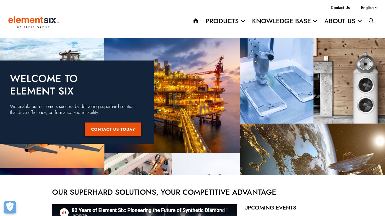
WELCOME TO ELEMENT SIX
We enable our customers success by delivering superhard solutions that drive efficiency, performance and reliability.
Working
- 'Superhard' hints at real material science
- Image mosaic shows real application markets
- Names outcomes: efficiency, reliability
Could improve
- 'Welcome to' headline sells nothing
- No mention of synthetic diamond
- Zero numbers or proof points in hero
Information hierarchy
58FairDoes the design help or inhibit what the page is trying to say?
 123
- Welcome to Element Six — Headline says nothing about what Element Six makes; the generic greeting wastes the fold's highest-attention slot.
- Top nav dropdowns — Three dropdown menus plus search, home icon, Contact Us, and language switcher give seven exit paths before the CTA.
- Contact Us Today CTA — Small button tucked bottom-left of the panel, outside the natural scan path and duplicating the nav's Contact Us link.
Trust
58FairProof that the product is real, competent, and safe to try.
How Element Six compares
Trust read
CTA
62FairCopy, size, verb, cost-feel — does the primary CTA earn the click?
How Element Six compares
Recommended rewrites
Mobile web
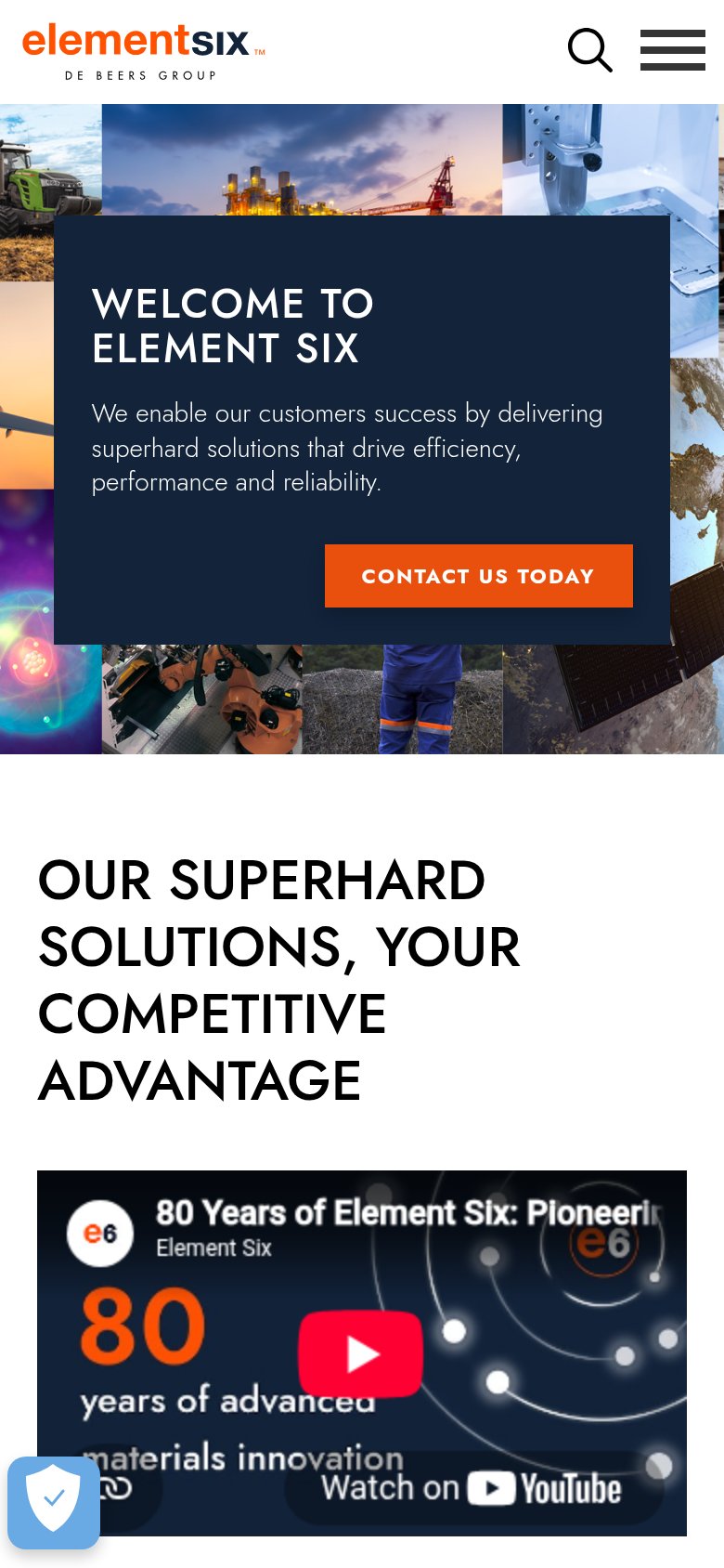
72FairThe phone experience as a first-class citizen.
What works
What to improve