
Your landing page’s weakest score is Trust.
How Durable ranks
82Growth scoreupdated
category scores
category scoresShowHide
Trust
72FairProof that the product is real, competent, and safe to try.
| Trust read | |
|---|---|
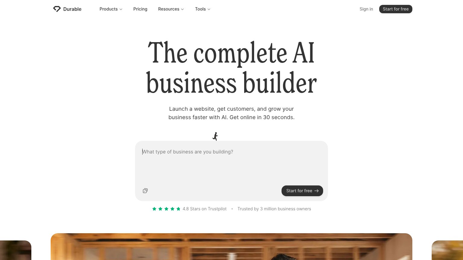
| Durable | "4.8 Stars on Trustpilot" with five-star row and "Trusted by 3 million business owners" below the CTA |
| Interactive prompt box with example "Create a course for my sales skills" | |
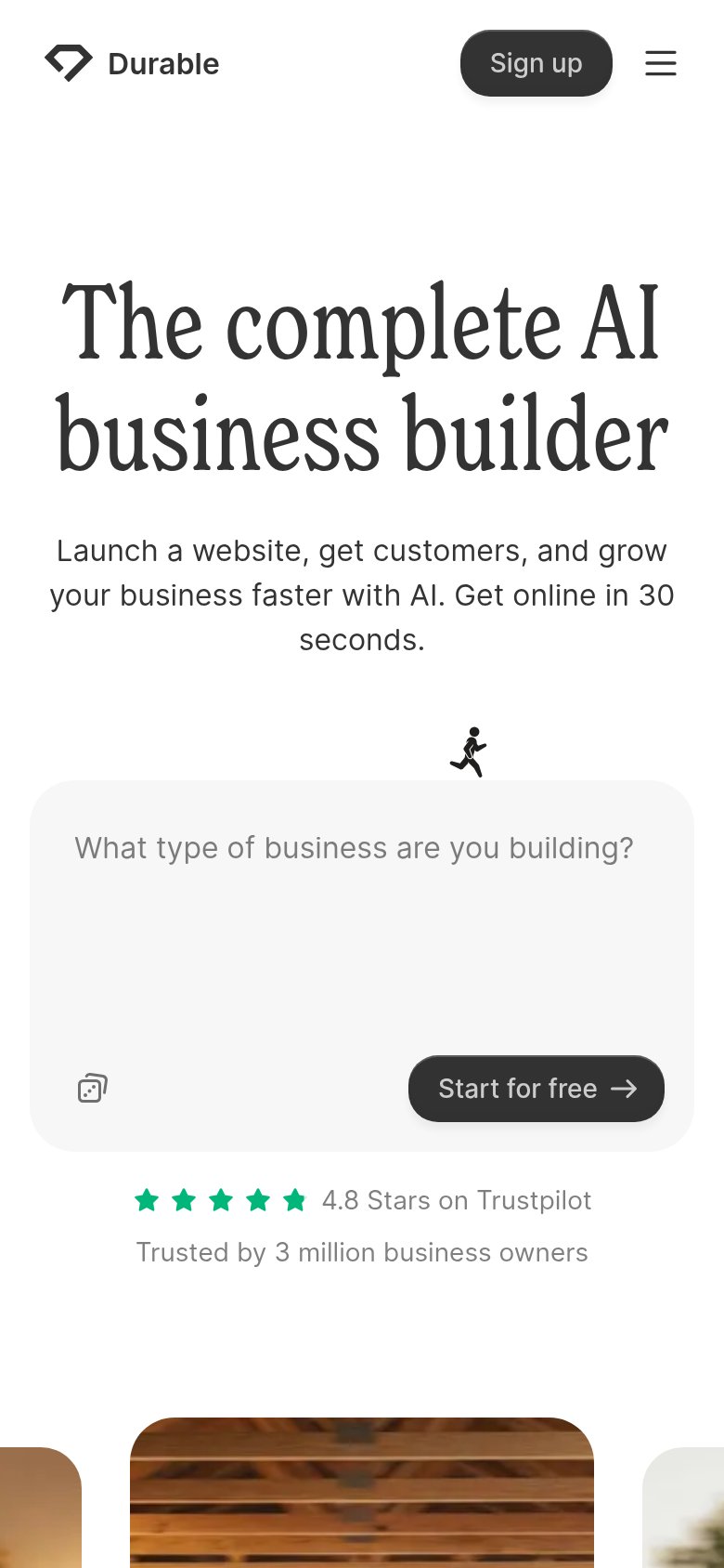
| "Trusted by 750k+ businesses — 4.8/5 on Trustpilot" badge under the mobile CTA | |
| G2 badge with 4.9 star rating below the "Try for free" CTA | |
| No visible trust signal identified. | |
| AI editor demo showing the prompt "Create a website for Apex, a cycling club, with an energetic, outdoorsy and community |
Information hierarchy
78FairDoes the design help or inhibit what the page is trying to say?
 123
- Header CTA duplicate — "Start for free" in the nav competes at equal visual weight with the hero form's identical CTA, splitting the action path.
- Nav dropdown menus — Products, Resources, and Tools dropdowns open three exit trees before the visitor reaches the prompt box.
- Prompt field affordance — The large gray textarea reads as passive whitespace until scanned; only faint placeholder text signals it is the conversion entry point.
Value props
82StrongTitle, subtitle, hero — do they sell the product's true value?
Durable’s headline
The complete AI business builder
Launch a website, get customers, and grow your business faster with AI. Get online in 30 seconds.
Working
Could improve
CTA
88StrongCopy, size, verb, cost-feel — does the primary CTA earn the click?
How Durable compares
Recommended rewrites
Mobile web
88StrongThe phone experience as a first-class citizen.
What works
What to improve