
Your landing page’s weakest score is Trust.
How DTEX Systems ranks
Trust
38PoorProof that the product is real, competent, and safe to try.
| Trust read | |
|---|---|
| DTEX Systems | No visible trust signal identified. |
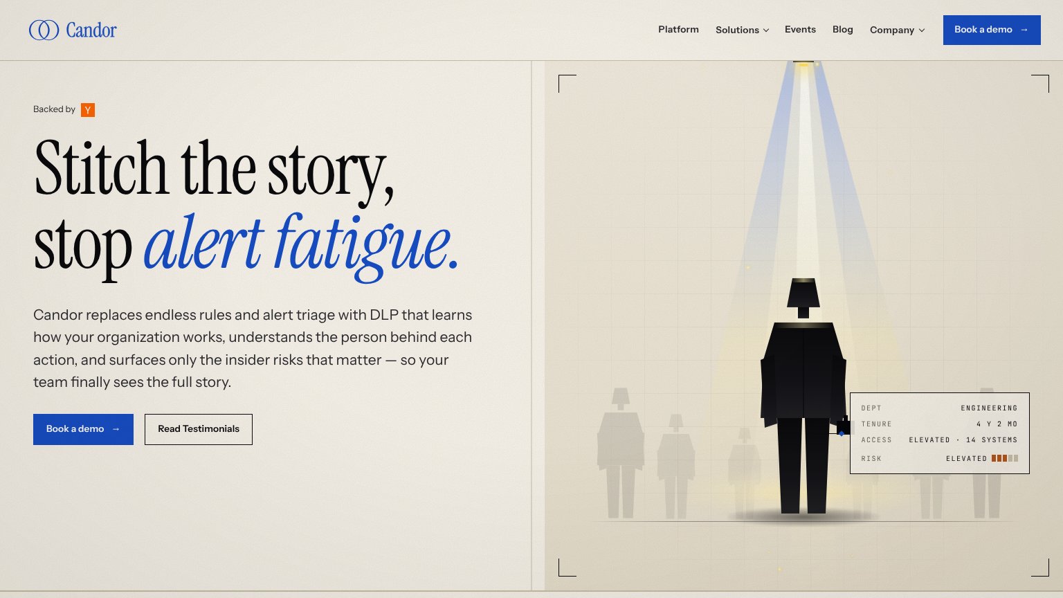
| "Backed by" Y Combinator badge above the headline | |
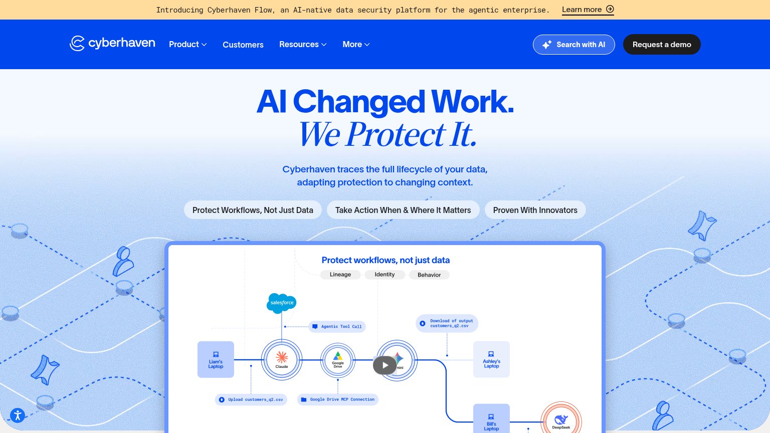
| Data-lineage demo diagram tracing customers_q2.csv across Claude, Salesforce, Google Drive and Gemini | |
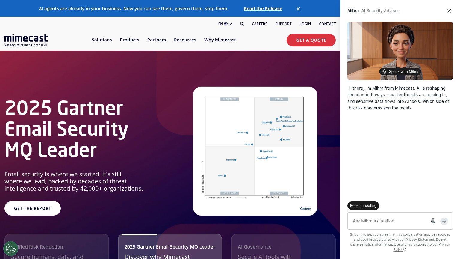
| 2025 Gartner Email Security MQ Leader headline with the Magic Quadrant chart showing Mimecast in the Leaders quadrant | |
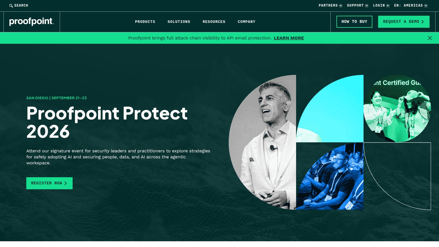
| Authentic conference photos of a keynote speaker and badged attendees at Proofpoint Protect | |
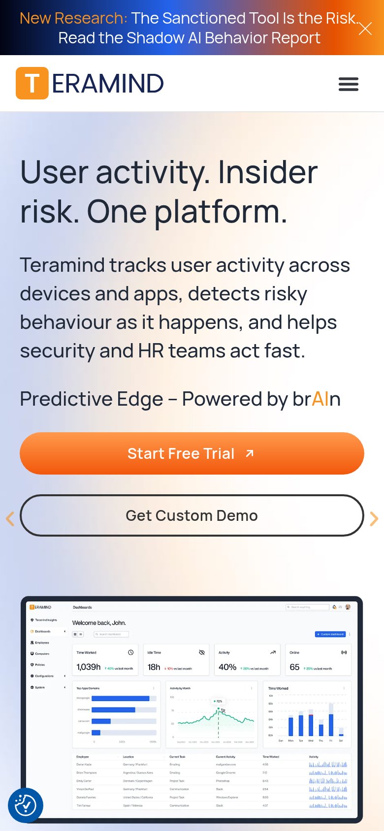
| Detailed product dashboard screenshot showing "Risky Users" panel with risk scores and "Time Worked 1,039h" metrics |
Mobile web
48PoorThe phone experience as a first-class citizen.
 12
- Edge-to-edge headline — "for Human + Data + AI Risk" touches both viewport edges with zero side padding.
- Floating bubble overlap — Bottom-left widget bubble sits on top of the next section's body text.
Value props
54FairTitle, subtitle, hero — do they sell the product's true value?
DTEX Systems’s headline
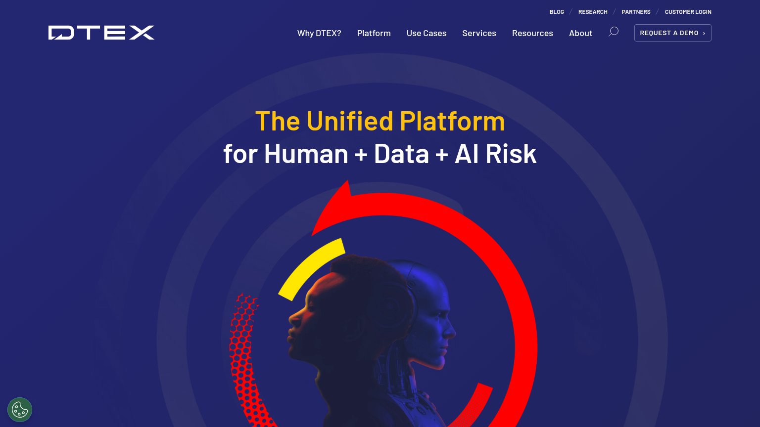
The Unified Platform for Human + Data + AI Risk
Working
Could improve
CTA
56FairCopy, size, verb, cost-feel — does the primary CTA earn the click?
How DTEX Systems compares
Recommended rewrites
Information hierarchy
62FairDoes the design help or inhibit what the page is trying to say?
What works
What to improve