
Your landing page’s weakest score is Mobile web.
How Blacksmith ranks
78Growth scoreupdated
category scores
category scoresShowHide
Mobile web
58FairThe phone experience as a first-class citizen.
 1234
- Clipped contact button — First CTA is half-cut at the fold edge and it is the secondary 'CONTACT OUR TEAM', not 'TRY FOR FREE'.
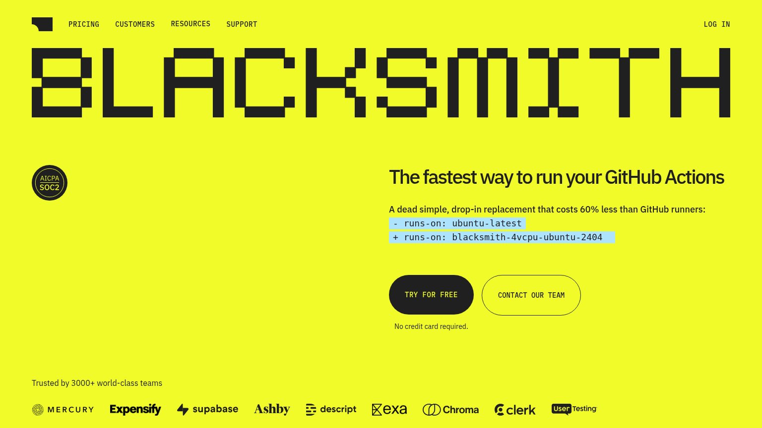
- Oversized pixel wordmark — The BLACKSMITH logotype eats nearly a third of the viewport, pushing every CTA below the fold.
- Wrapped code snippet — 'blacksmith-4vcpu-ubuntu-2404' breaks mid-token across lines, hurting the drop-in-replacement message.
- Large SOC2 badge — Trust badge sits between logo and headline at hero scale, adding vertical cost before the value statement.
Information hierarchy
76FairDoes the design help or inhibit what the page is trying to say?
 12
- Giant pixel wordmark — The BLACKSMITH wordmark consumes the top ~28% of the fold, pushing the headline and CTAs down and outranking the value proposition.
- Contact Our Team button — Styled at nearly equal weight and size to "Try for free", splitting attention at the decision moment.
Trust
82StrongProof that the product is real, competent, and safe to try.
How Blacksmith compares
Trust read
CTA
86StrongCopy, size, verb, cost-feel — does the primary CTA earn the click?
How Blacksmith compares
Recommended rewrites
Value props
90StrongTitle, subtitle, hero — do they sell the product's true value?
Blacksmith’s headline
The fastest way to run your GitHub Actions
A dead simple, drop-in replacement that costs 60% less than GitHub runners:
Working
Could improve