
Your landing page’s weakest score is Information hierarchy.
How Confident AI (DeepEval) ranks
- 1.
Braintrust77
- 2.
Langfuse77
- 3.
Confident AI (DeepEval)72
- 4.
Kashikoi71
- 5.
LangSmith67
- 6.
Maxim AI67
72Growth scoreupdated
category scores
category scoresShowHide
Information hierarchy
68FairDoes the design help or inhibit what the page is trying to say?
 1234
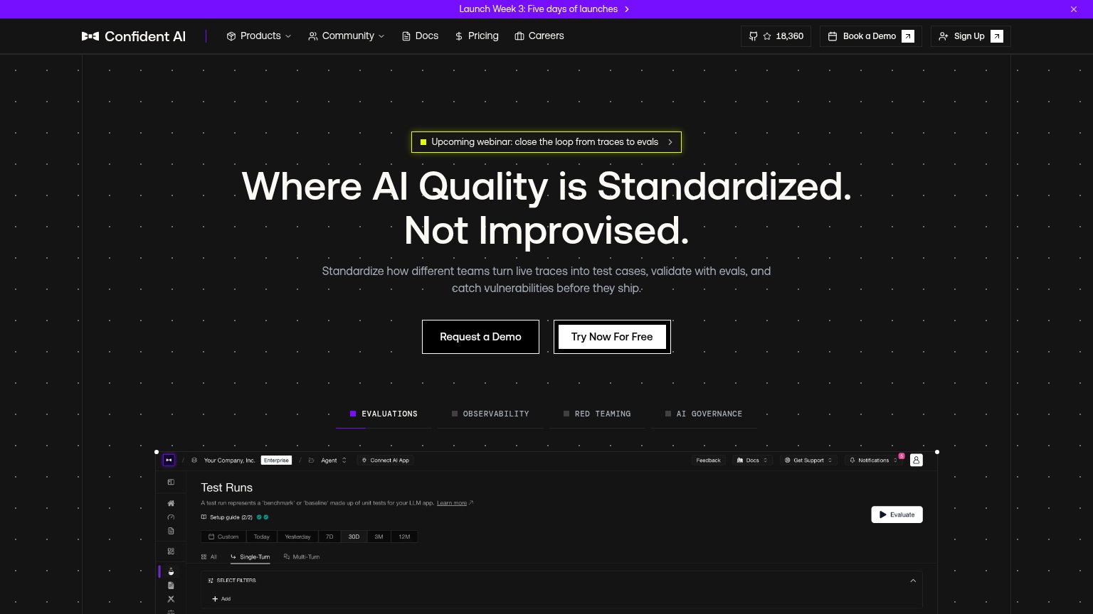
- Dual hero CTAs — "Request a Demo" and "Try Now For Free" sit side by side at equal weight, splitting the primary action.
- Webinar banner above headline — Yellow-bordered webinar pill outranks the headline in the scan path and adds a third exit before the value prop.
- Header demo/signup pair — "Book a Demo" and "Sign Up" duplicate the hero CTAs, giving four action buttons of similar weight in one fold.
- Launch Week banner — Purple announcement bar stacks a fourth message and another exit above the fold.
Trust
68FairProof that the product is real, competent, and safe to try.
| Trust read | |
|---|---|
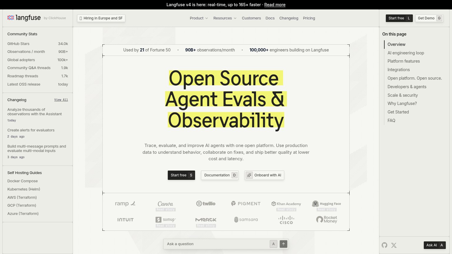
| Confident AI (DeepEval) | GitHub star count "18,360" in the nav alongside the real "Test Runs" product dashboard screenshot |
| "Backed by Y Combinator" badge above the hero headline | |
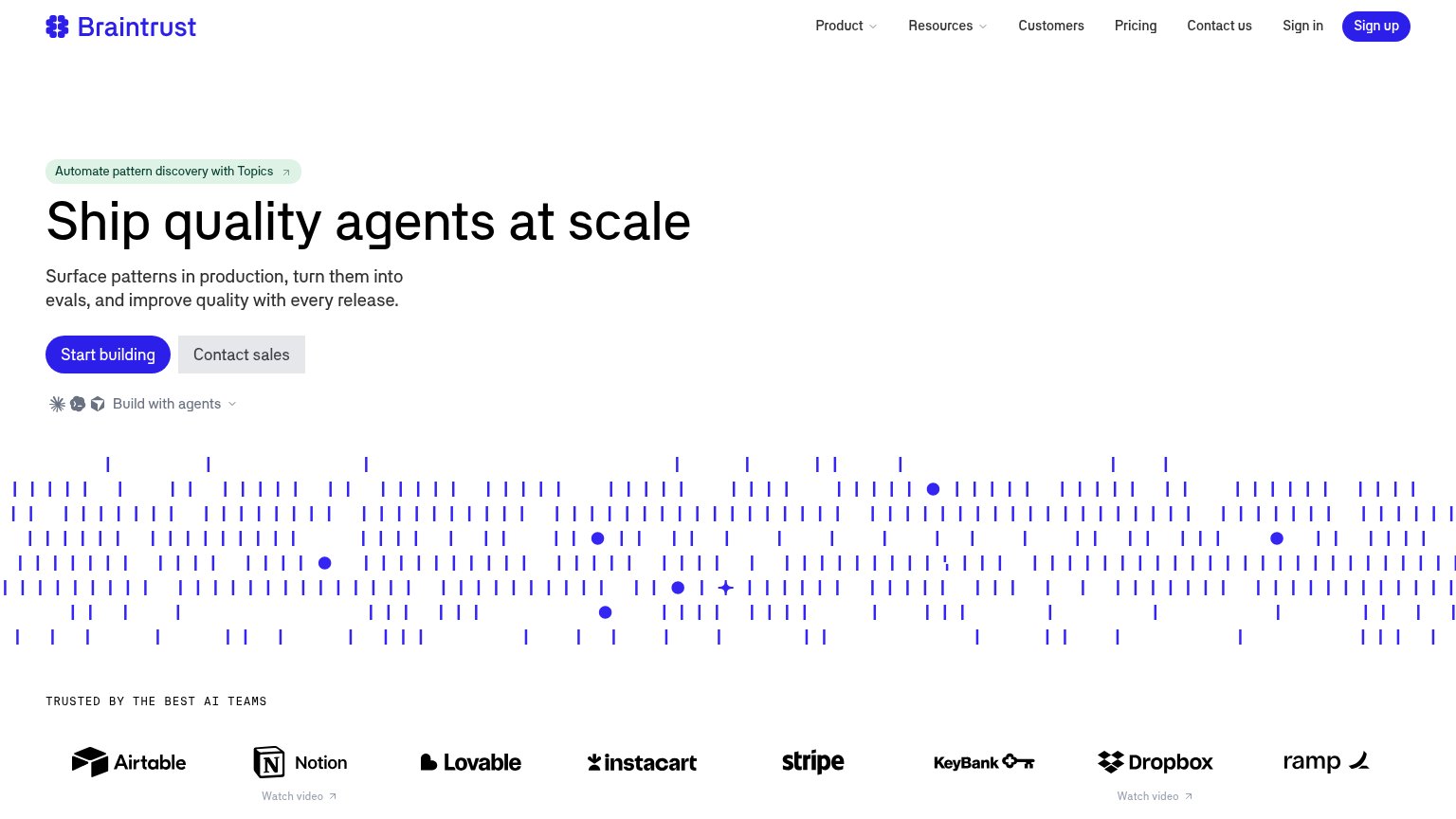
| "TRUSTED BY THE BEST AI TEAMS" logo wall (Airtable, Notion, Stripe, Instacart, Dropbox, Ramp) | |
| 'Interrupt is coming to London & NYC in the fall!' conference banner | |
| Used by 21 of Fortune 50 · 90B+ observations/month · 100,000+ engineers building on Langfuse | |
| "[ WE'RE OPEN SOURCE ]" badge with GitHub link and "npx @maximhq/bifrost" install command |
Mobile web
68FairThe phone experience as a first-class citizen.
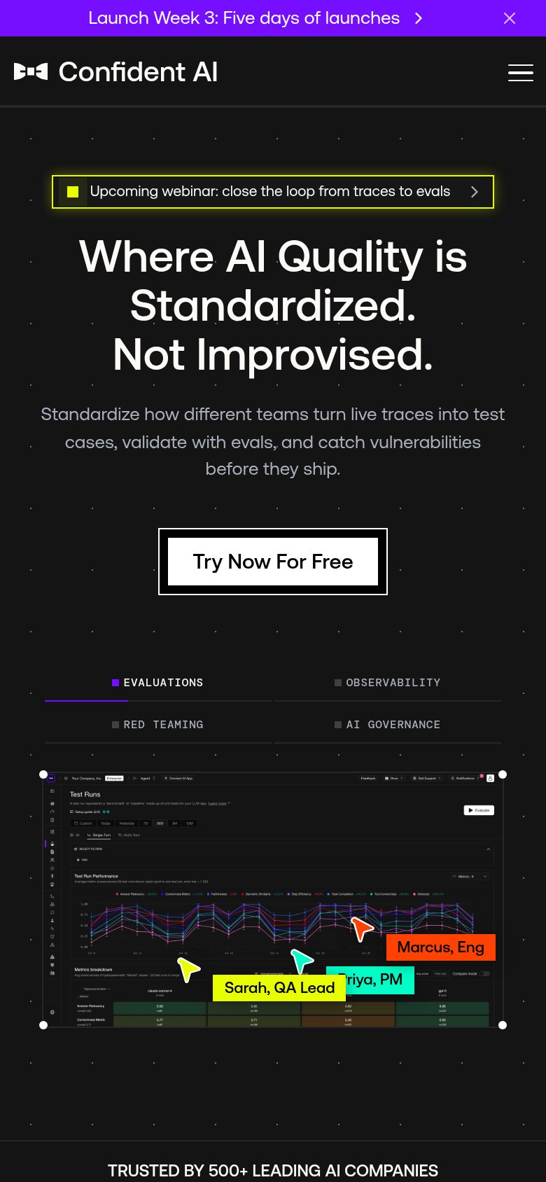
What works
What to improve
Value props
72FairTitle, subtitle, hero — do they sell the product's true value?
Confident AI (DeepEval)’s headline
Where AI Quality is Standardized. Not Improvised.
Standardize how different teams turn live traces into test cases, validate with evals, and catch vulnerabilities before they ship.
Working
Could improve
CTA
82StrongCopy, size, verb, cost-feel — does the primary CTA earn the click?
How Confident AI (DeepEval) compares
Recommended rewrites