
Your landing page’s weakest score is Mobile web.
How Complir ranks
Mobile web
52FairThe phone experience as a first-class citizen.
 12
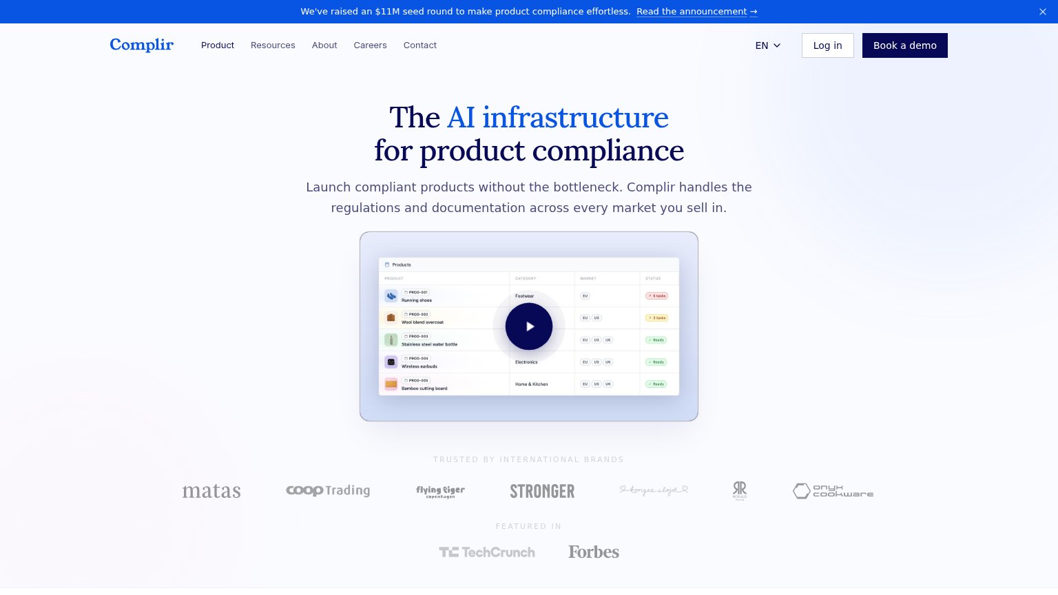
- Announcement banner — Three-line seed-round banner consumes the top ~140px of the first viewport before the logo appears, pushing the headline and any CTA further down.
- Subheadline paragraph — Four lines of body copy stack under the two-line headline, adding vertical bulk that helps push the video and CTA path below the fold.
CTA
54FairCopy, size, verb, cost-feel — does the primary CTA earn the click?

Problems
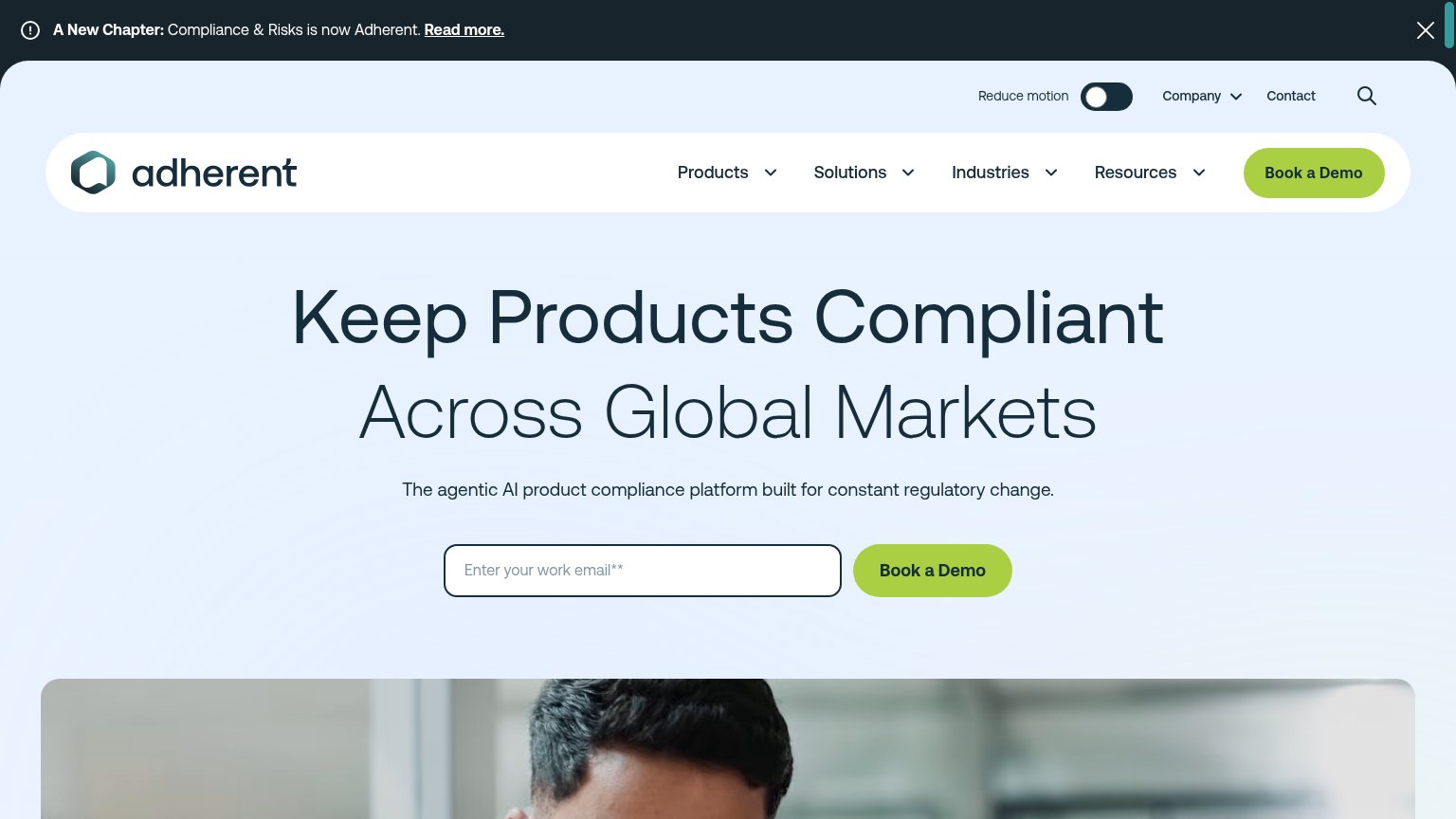
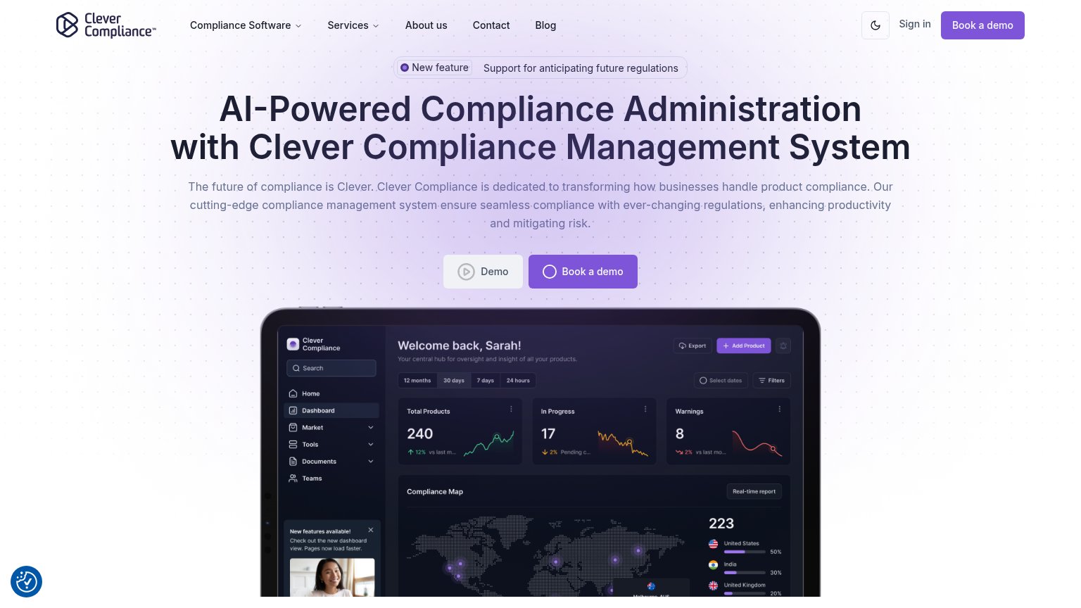
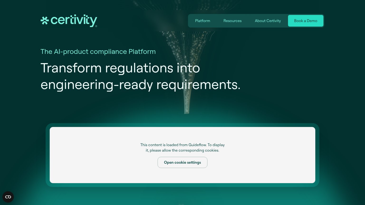
- no CTA in the hero on either viewport
- hidden behind hamburger on mobile
- demo ask feels costly, sales-gated
- nav-sized footprint, easy to miss
Information hierarchy
68FairDoes the design help or inhibit what the page is trying to say?
What works
What to improve
Value props
72FairTitle, subtitle, hero — do they sell the product's true value?
Complir’s headline
The AI infrastructure for product compliance
Launch compliant products without the bottleneck. Complir handles the regulations and documentation across every market you sell in.
Working
Could improve
Trust
78FairProof that the product is real, competent, and safe to try.
How Complir compares
Trust read