
Your landing page’s weakest score is Information hierarchy.
How ComplianceGate ranks
72Growth scoreupdated
category scores
category scoresShowHide
Information hierarchy
62FairDoes the design help or inhibit what the page is trying to say?
 1234
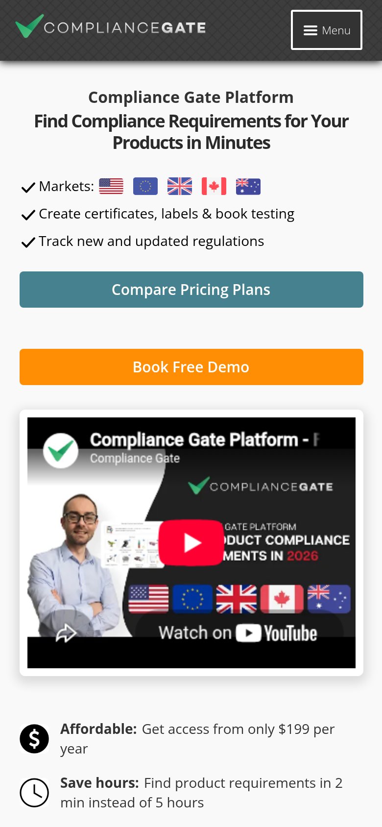
- Double navigation stack — Two stacked nav bars expose 12+ exit links before the headline, leaking attention from the conversion path.
- Two competing hero CTAs — Teal 'Compare Pricing Plans' sits at equal size beside 'Book Free Demo', splitting the click and diluting the primary action.
- Book Free Consultation button — A third orange CTA with different wording than 'Book Free Demo' — two labels for the booking action confuse the ask.
- Watch on YouTube chip — An off-site exit embedded inside the hero visual pulls visitors to YouTube instead of the demo booking.
Trust
64FairProof that the product is real, competent, and safe to try.
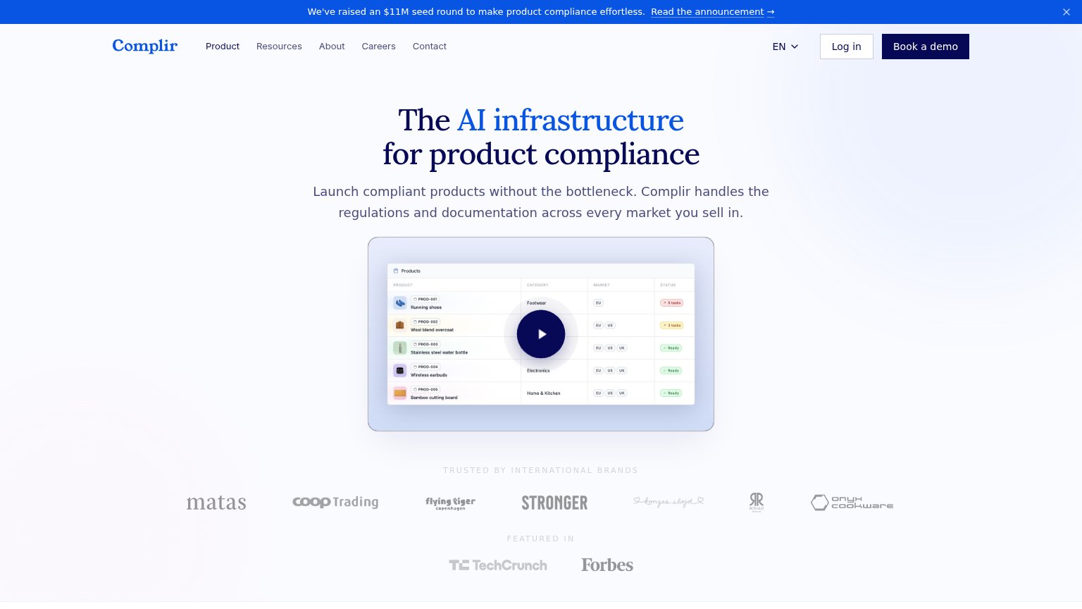
| Trust read | |
|---|---|
| ComplianceGate | Trustpilot widget: "TrustScore 4.5 | 81 reviews" |
| "TRUSTED BY INTERNATIONAL BRANDS" logo row featuring Matas, Coop Trading, Flying Tiger Copenhagen, Stronger, and Onyx Co | |
| No visible trust signal identified. | |
| "Trusted by the world's best companies" logo strip with Daimler Truck and AUMOVIO logos (mobile capture) | |
| Product dashboard screenshot with Compliance Map and live-looking metrics (Total Products 240, Warnings 8) |
CTA
74FairCopy, size, verb, cost-feel — does the primary CTA earn the click?
How ComplianceGate compares
Recommended rewrites
Value props
78FairTitle, subtitle, hero — do they sell the product's true value?
ComplianceGate’s headline
Find Compliance Requirements for Your Products in Minutes
Compliance Gate Platform
Working
Could improve
Mobile web
80StrongThe phone experience as a first-class citizen.
What works
What to improve