
Your landing page’s weakest score is Mobile web.
How Colppy ranks
Mobile web
48PoorThe phone experience as a first-class citizen.
 1234
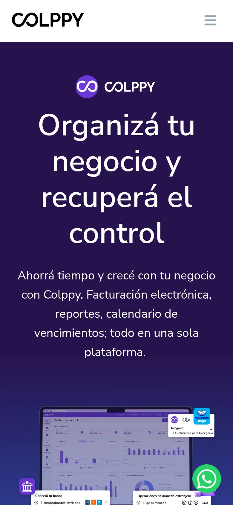
- Oversized hero headline — Headline barely scaled down from desktop; four huge lines consume half the viewport and push the CTA off-screen.
- Six-line subheadline — Long subhead stacked under the headline fills the rest of the fold, leaving no room for any tappable action.
- WhatsApp chat bubble — Floating chat bubble overlaps the product screenshot and competes for the tap where a conversion CTA should sit.
- Header without CTA — Mobile header keeps only logo and hamburger, dropping the desktop's Probalo gratis button and leaving no visible action.
Trust
52FairProof that the product is real, competent, and safe to try.
| Trust read | |
|---|---|
| Colppy | Real dashboard screenshot ("Tablero de control") with Mercado Pago integration callout "+14 soluciones para tu negocio" |
| Mobile 'Snapshot · En vivo' product widget showing Caja consolidada $1,37M, Ingresos (ARR) $4,2M, Burn mensual $312K, Ru | |
| "US$ 24.90 / month for ALL apps" price annotation next to the CTA, paired with the dated event card "Accounting Academy | |
| No visible trust signal identified. | |
| No visible trust signal identified. |
Value props
68FairTitle, subtitle, hero — do they sell the product's true value?
Colppy’s headline
Organizá tu negocio y recuperá el control
Ahorrá tiempo y crecé con tu negocio con Colppy. Facturación electrónica, reportes, calendario de vencimientos; todo en una sola plataforma.
Working
Could improve
Information hierarchy
70FairDoes the design help or inhibit what the page is trying to say?
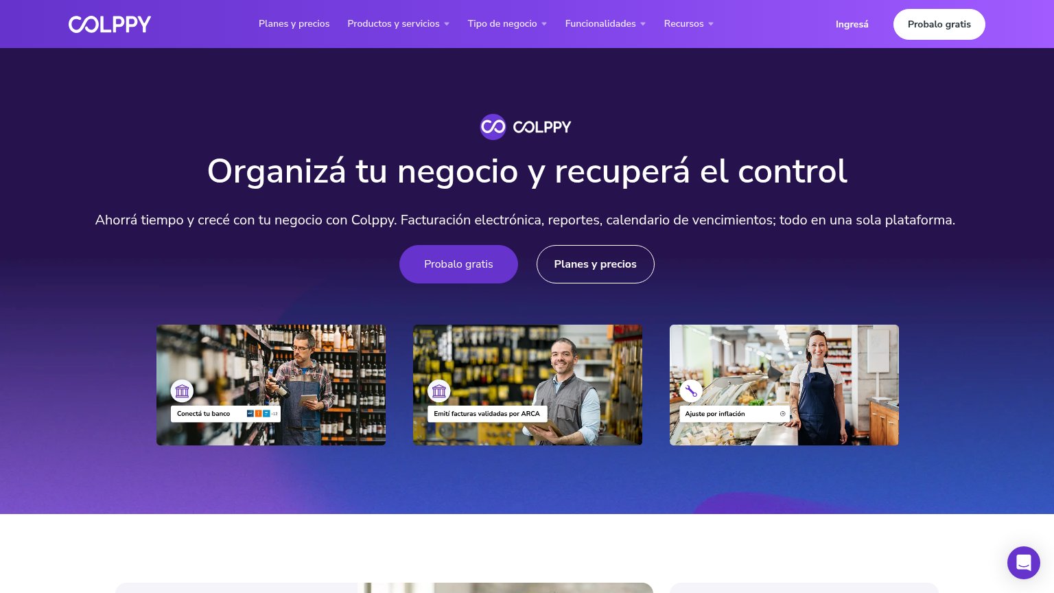
What works
What to improve
CTA
82StrongCopy, size, verb, cost-feel — does the primary CTA earn the click?
How Colppy compares
Recommended rewrites