
Your landing page’s weakest score is Mobile web.
How Colossyan ranks
76Growth scoreupdated
category scores
category scoresShowHide
Mobile web
70FairThe phone experience as a first-class citizen.
 1234
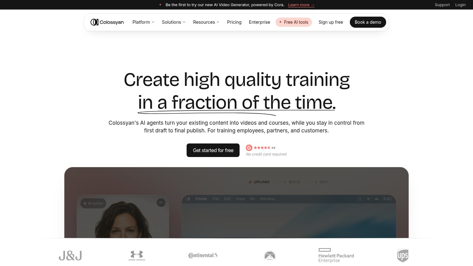
- Get started button — Primary CTA is pushed below the first viewport and sized for desktop, not full-bleed for thumbs.
- Six-line subheadline — Body copy runs six lines and displaces the CTA off-screen; needs a mobile-length cut.
- G2 badge beside CTA — Rating badge crowds the CTA row, stealing width the button needs to be thumb-friendly.
- Announcement promo bar — Two-line Cora banner plus header eats a slice of the fold before the hero starts.
Information hierarchy
72FairDoes the design help or inhibit what the page is trying to say?
 1234
- Book a demo button — Black pill matches the hero CTA's weight, splitting the fold's one action into two.
- Sign up free link — Duplicates the hero's 'Get started for free' with different wording, adding a competing conversion path.
- Cora promo banner — Top-of-page 'Learn more →' link pulls first attention away from the training value prop.
- Free AI tools pill — Salmon highlight makes a nav exit the most colorful element above the headline.
Value props
76FairTitle, subtitle, hero — do they sell the product's true value?
Colossyan’s headline
Create high quality training in a fraction of the time.
Colossyan's AI agents turn your existing content into videos and courses, while you stay in control from first draft to final publish. For training employees, partners, and customers.
Working
Could improve
Trust
78FairProof that the product is real, competent, and safe to try.
How Colossyan compares
Trust read
CTA
82StrongCopy, size, verb, cost-feel — does the primary CTA earn the click?
How Colossyan compares
Recommended rewrites