
Your landing page’s weakest score is Trust.
How ChipFlow ranks
53Growth scoreupdated
category scores
category scoresShowHide
Trust
38PoorProof that the product is real, competent, and safe to try.

| Trust read | |
|---|---|
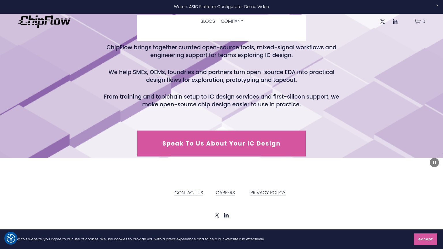
| ChipFlow | "Watch: ASIC Platform Configurator Demo Video" announcement bar |
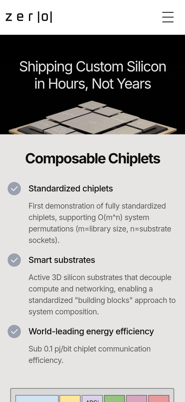
| Terminal demo starting with "rtl-demo $ git diff" visible at the bottom of the mobile fold | |
| "Sub 0.1 pj/bit chiplet communication efficiency." spec alongside the chiplet-array hardware photo | |
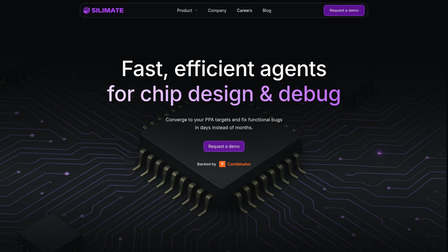
| "Backed by Y Combinator" badge under the hero CTA | |
| No visible trust signal identified. |
Information hierarchy
54FairDoes the design help or inhibit what the page is trying to say?
123- Three equal paragraphs — Three centered body-text blocks share identical size and weight, forcing visitors to read a text wall instead of scanning a headline-subhead beat.
- Cookie banner overlap — The cookie bar and accessibility widget cover the banner text and collide with the Accept button, cluttering the bottom of the fold.
- Cart icon in nav — A shopping-cart control on a services consultancy page adds a confusing exit that competes with the pink CTA.
Mobile web
54FairThe phone experience as a first-class citizen.

What works
What to improve
Value props
55FairTitle, subtitle, hero — do they sell the product's true value?
ChipFlow’s headline
ChipFlow brings together curated open-source tools, mixed-signal workflows and engineering support for teams exploring IC design.
We help SMEs, OEMs, foundries and partners turn open-source EDA into practical design flows for exploration, prototyping and tapeout.
Working
Could improve
CTA
62FairCopy, size, verb, cost-feel — does the primary CTA earn the click?
How ChipFlow compares
Recommended rewrites