
Your landing page’s weakest score is Trust.
How Cavallo ranks
- 1.
Proton.ai74
- 2.
Lark71
- 3.
Cavallo47
47Growth scoreupdated
category scores
category scoresShowHide
Trust
38PoorProof that the product is real, competent, and safe to try.
| Trust read | |
|---|---|
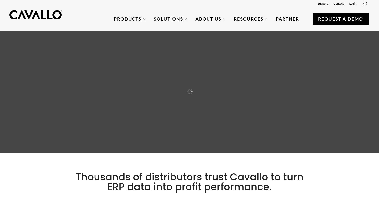
| Cavallo | "Thousands of distributors trust Cavallo to turn ERP data into profit performance." |
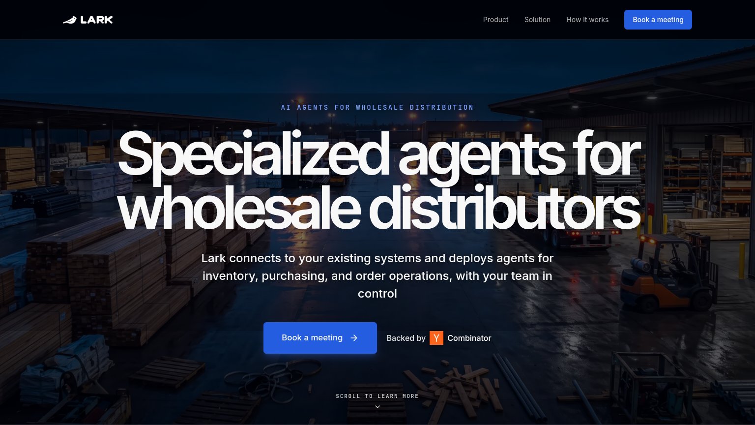
| "Backed by Y Combinator" badge next to the Book a meeting CTA | |
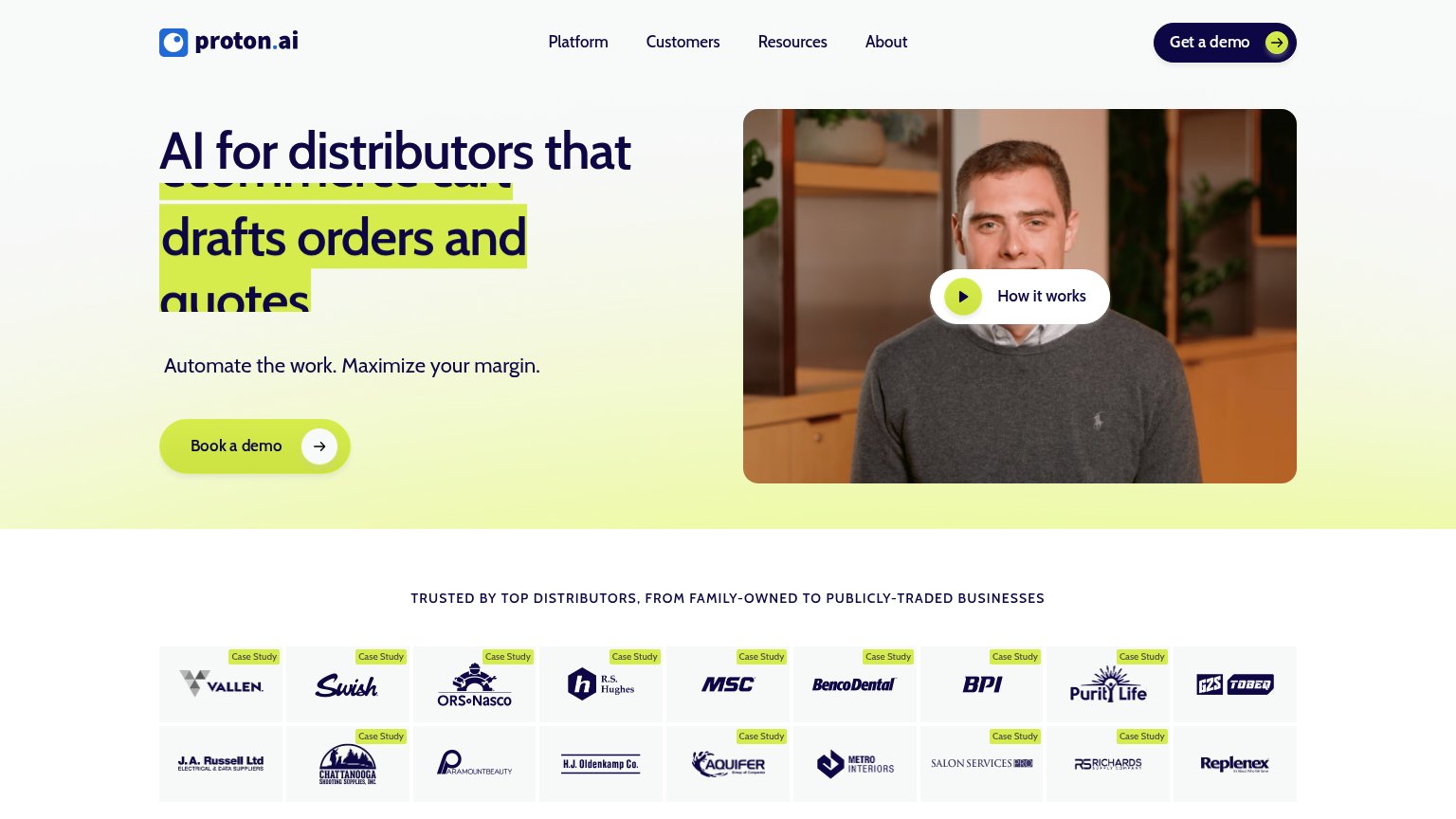
| Logo wall under "TRUSTED BY TOP DISTRIBUTORS, FROM FAMILY-OWNED TO PUBLICLY-TRADED BUSINESSES" with named customers (Val |
Information hierarchy
42PoorDoes the design help or inhibit what the page is trying to say?
123- Utility link row — Support, Contact, Login, and search add four exits above the nav before the visitor sees any pitch.
- Five dropdown nav items — Five same-weight menus with carets invite exploration away from REQUEST A DEMO before the value prop loads.
- Headline below fold — The only value statement is cut at the viewport edge, so the pitch is invisible at first glance.
Mobile web
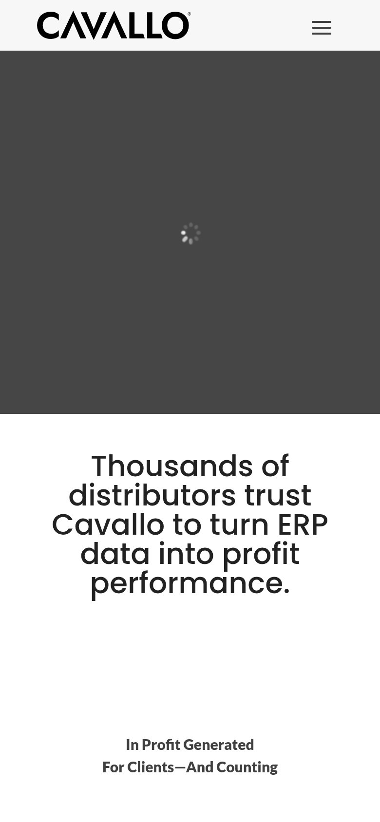
44PoorThe phone experience as a first-class citizen.
What works
What to improve
CTA
52FairCopy, size, verb, cost-feel — does the primary CTA earn the click?
How Cavallo compares
Recommended rewrites
Value props
58FairTitle, subtitle, hero — do they sell the product's true value?
Cavallo’s headline
Thousands of distributors trust Cavallo to turn ERP data into profit performance.
Working
Could improve