
Your landing page’s weakest score is Trust.
How Cartesia ranks
69Growth scoreupdated
category scores
category scoresShowHide
Trust
52FairProof that the product is real, competent, and safe to try.
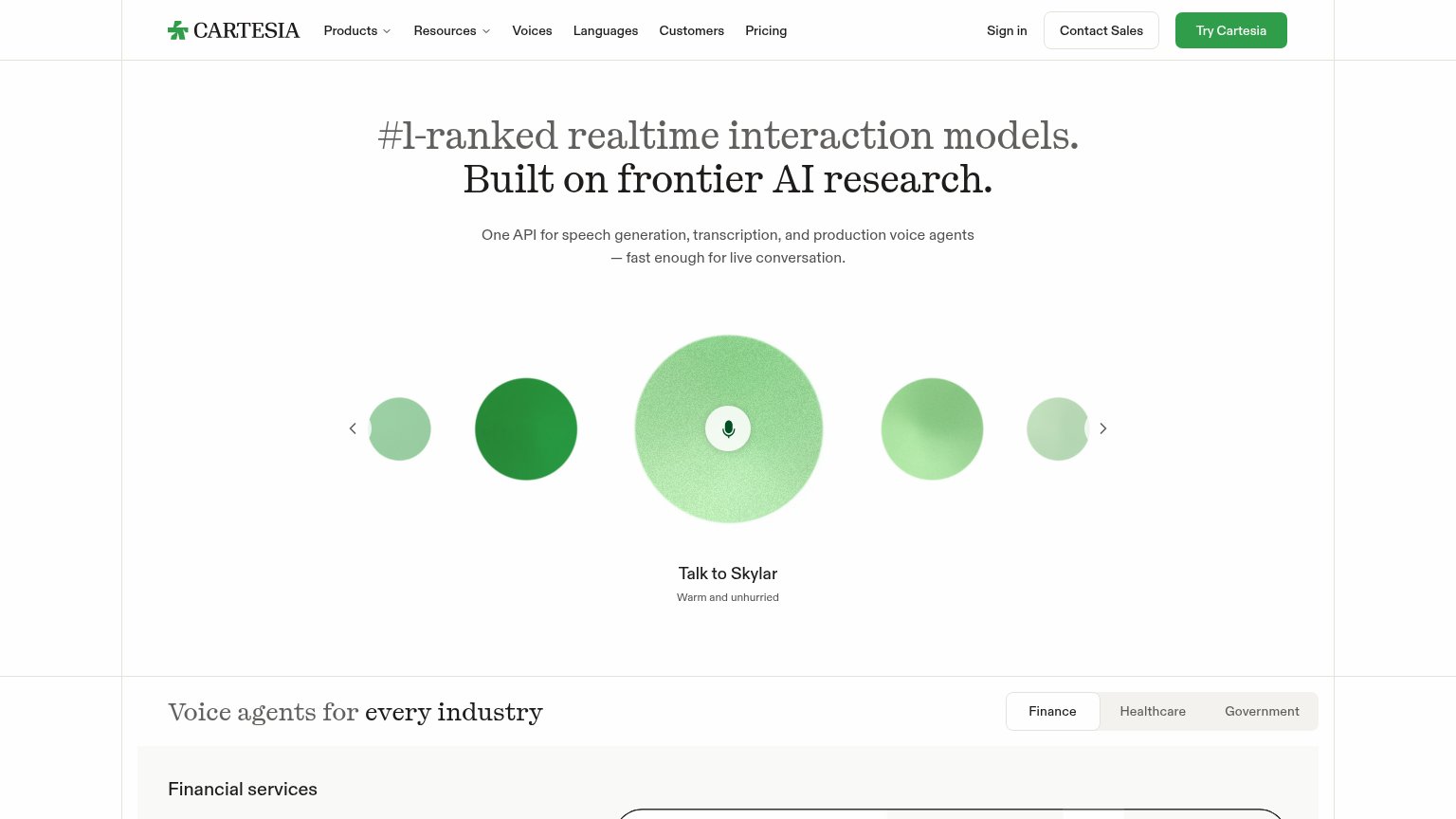

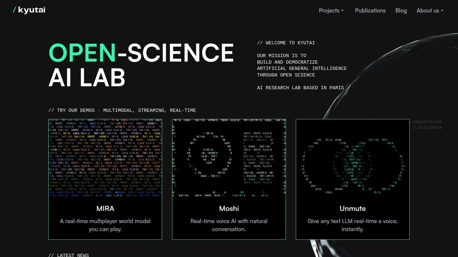
| Trust read | |
|---|---|
| Cartesia | Interactive "Talk to Skylar" voice demo carousel |
| No visible trust signal identified. | |
| Three named live demos — "MIRA," "Moshi," and "Unmute" — with concrete descriptions like "Real-time voice AI with natura | |
| Customer logo strip including Mayo Clinic, LiveKit, Daily, and Dialpad below the hero CTAs | |
| "Our decades of research in multimodal emotional intelligence span" with stat counters 50+ / 48+ / 600+ | |
| "Join thousands of teams building natural, conversational voice AI experiences" |
Information hierarchy
72FairDoes the design help or inhibit what the page is trying to say?
1234- Contact Sales button — Boxed at near-equal weight to Try Cartesia, splitting the primary CTA scan between two actions.
- Seven-link nav row — Products, Resources, Voices, Languages, Customers, Pricing plus Sign in leak attention before the CTA.
- Voice orb carousel — Tiny mic icon is the only demo affordance; arrows read as image paging, not an invitation to talk.
- Industry tabs at fold — Finance/Healthcare/Government toggle creeps into the fold as a third same-weight control cluster.
Value props
72FairTitle, subtitle, hero — do they sell the product's true value?
Cartesia’s headline
#1-ranked realtime interaction models. Built on frontier AI research.
One API for speech generation, transcription, and production voice agents — fast enough for live conversation.
Working
Could improve
CTA
74FairCopy, size, verb, cost-feel — does the primary CTA earn the click?
How Cartesia compares
Recommended rewrites
Mobile web
76FairThe phone experience as a first-class citizen.
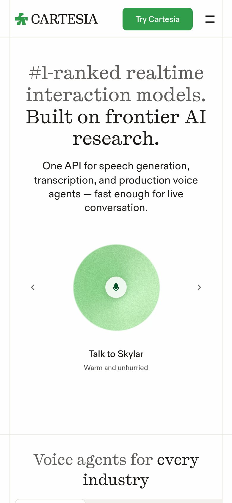
What works
What to improve