
Your landing page’s weakest score is CTA.
How Caris Life Sciences ranks
- 1.
Ocean Genomics65
- 2.
BostonGene65
- 3.
Blank Bio62
- 4.
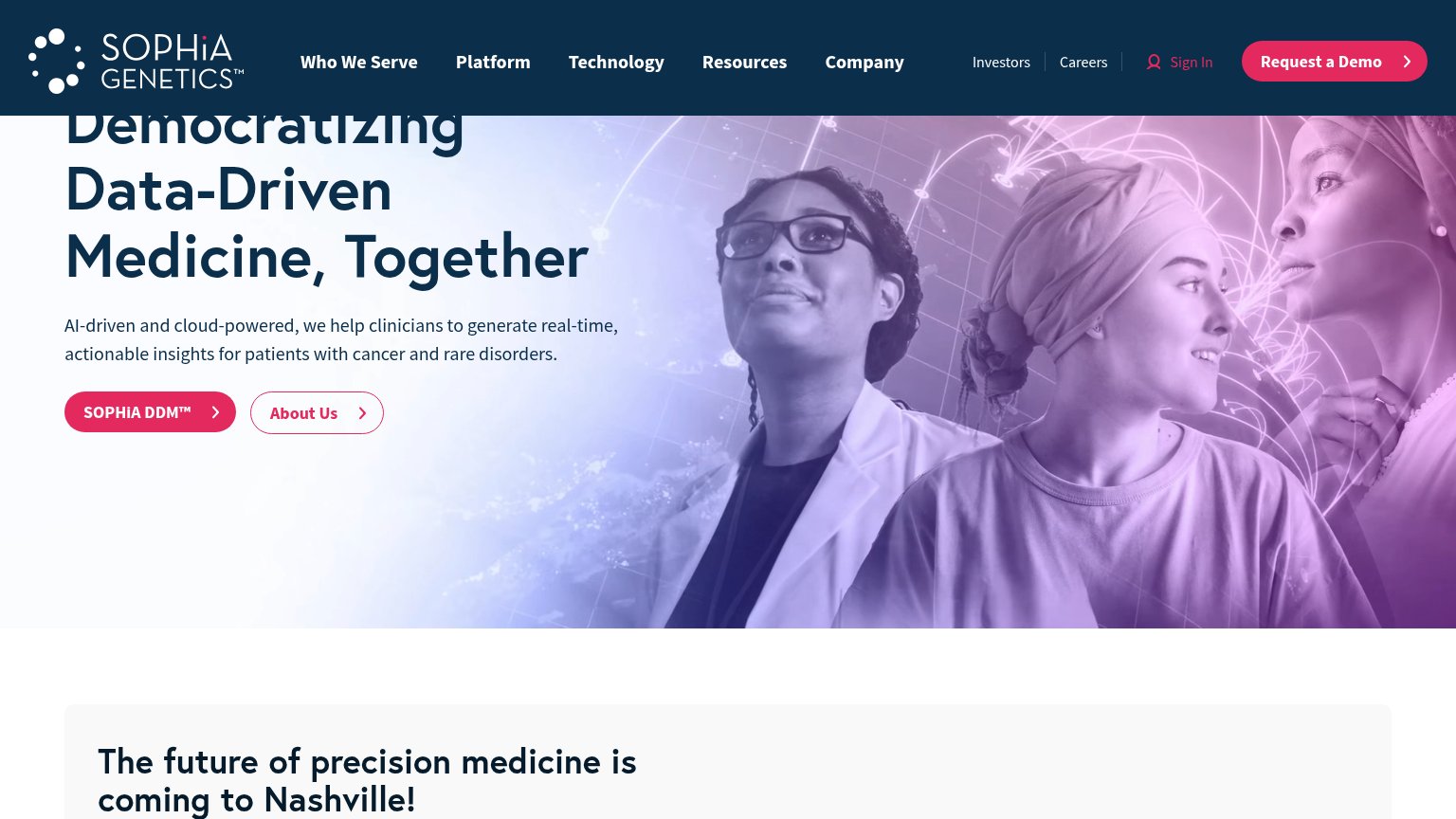
SOPHiA GENETICS58
- 5.
Caris Life Sciences56
CTA
44PoorCopy, size, verb, cost-feel — does the primary CTA earn the click?
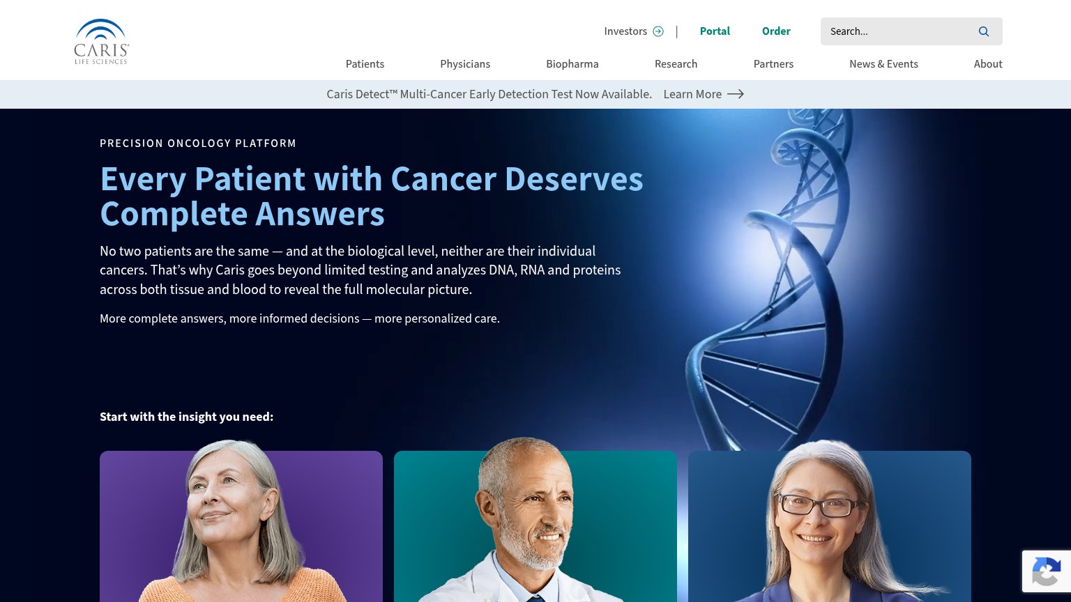
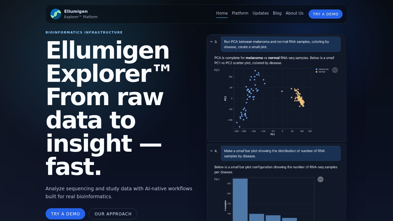
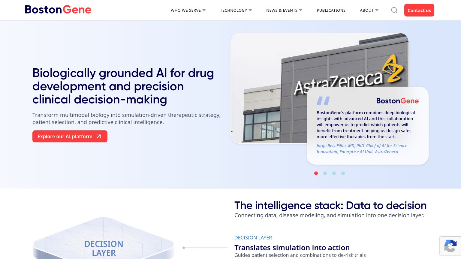
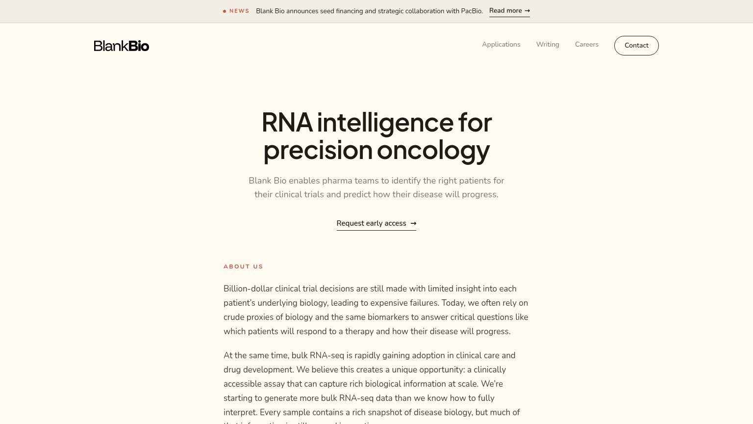
Problems
- no CTA in the hero itself
- generic label, no payoff named
- tiny footprint vs. headline
- no action verb ('Learn' is passive)
Mobile web
48PoorThe phone experience as a first-class citizen.
 123
- Tall header block — Logo, Investors/Portal/Order row, hamburger, and full-width search bar stack into ~25% of the viewport before content starts.
- Two-line promo banner — The Caris Detect banner wraps awkwardly with "Learn More" split across lines, adding clutter above the hero.
- Long body paragraph — Seven lines of desktop copy plus a second paragraph shove the "Start with the insight" cards nearly off-screen.
Trust
54FairProof that the product is real, competent, and safe to try.
How Caris Life Sciences compares
Trust read
Information hierarchy
58FairDoes the design help or inhibit what the page is trying to say?
What works
What to improve
Value props
76FairTitle, subtitle, hero — do they sell the product's true value?
Caris Life Sciences’s headline
Every Patient with Cancer Deserves Complete Answers
No two patients are the same — and at the biological level, neither are their individual cancers. That’s why Caris goes beyond limited testing and analyzes DNA, RNA and proteins across both tissue and blood to reveal the full molecular pict
Working
Could improve