
Your landing page’s weakest score is CTA.
How Eleos (Calm Capital-style operator) ranks
- 1.
Tiny73
- 2.
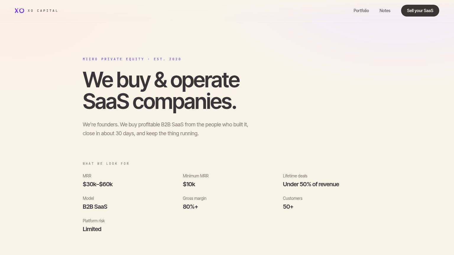
Big Sur Ventures (XO Capital)70
- 3.
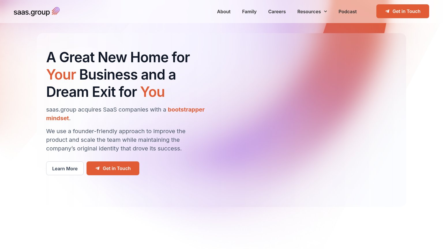
saas.group68
- 4.
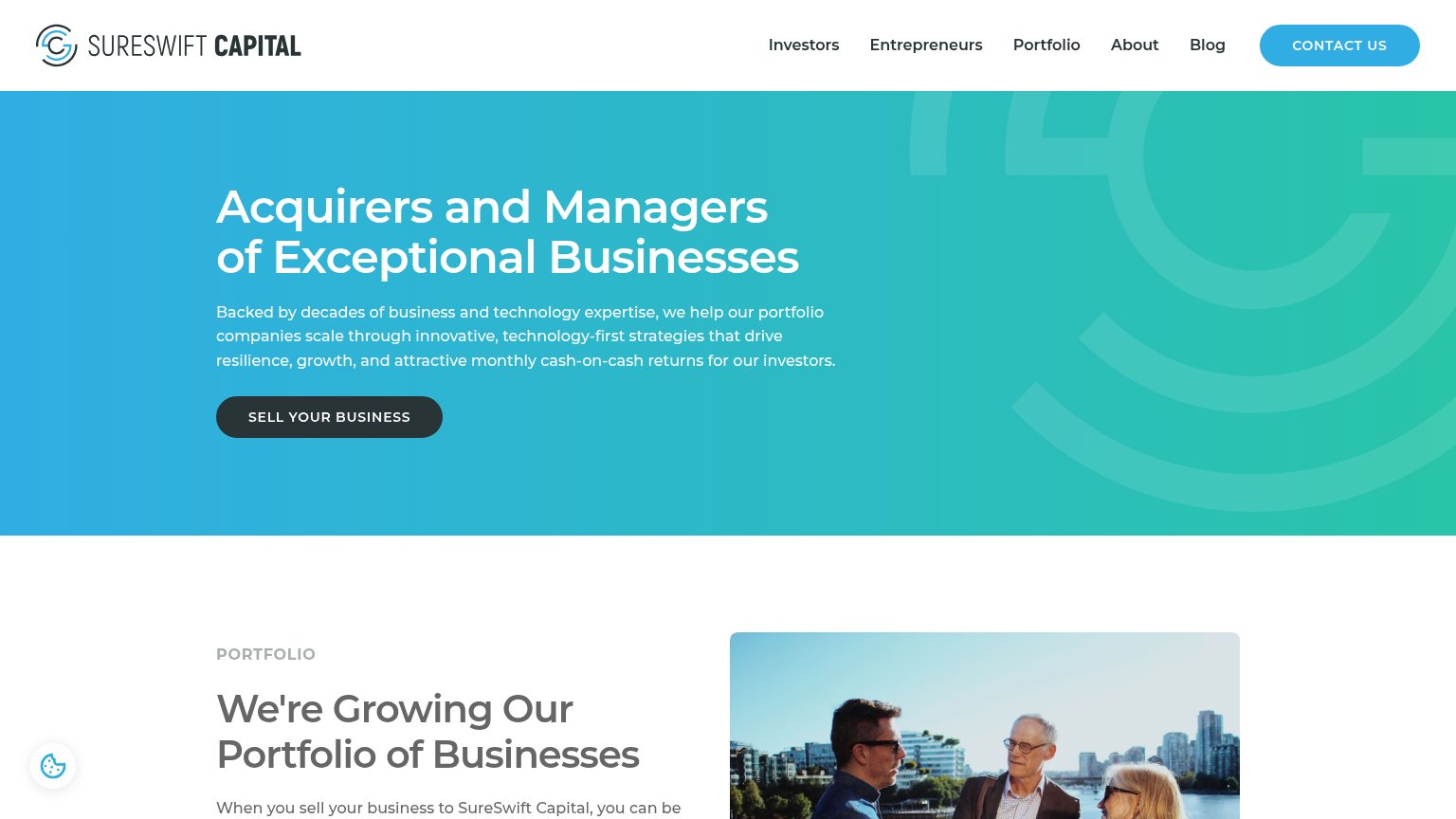
SureSwift Capital63
- 5.
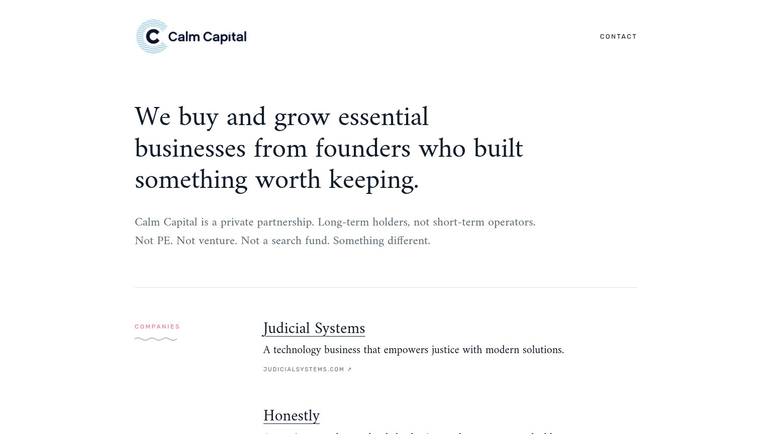
Eleos (Calm Capital-style operator)62
- 6.
Rocketable53
CTA
42PoorCopy, size, verb, cost-feel — does the primary CTA earn the click?

Problems
- no hero CTA button at all
- nav link is only action on page
- no action verb — reads as label
- tiny footprint vs headline
Trust
58FairProof that the product is real, competent, and safe to try.

| Trust read | |
|---|---|
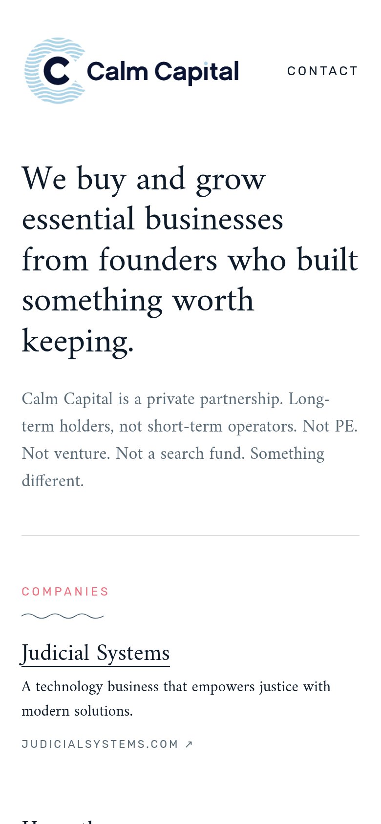
| Eleos (Calm Capital-style operator) | "COMPANIES" portfolio listing "Judicial Systems" with the outbound link "JUDICIALSYSTEMS.COM ↗" |
| "Backed by Y Combinator, True Ventures, Bloomberg Beta, and INDIE.vc" | |
| Portfolio logo orbit including Dribbble, Letterboxd, AeroPress, Metalab, and Serato | |
| No visible trust signal identified. | |
| Mobile photo grid of real saas.group team members at events and in-office (branded shirts, conference talks) | |
| "WHAT WE LOOK FOR" acquisition criteria grid ($30k–$60k MRR, 80%+ gross margin, B2B SaaS, limited platform risk) |
Mobile web
62FairThe phone experience as a first-class citizen.
What works
What to improve
Information hierarchy
72FairDoes the design help or inhibit what the page is trying to say?
What works
What to improve
Value props
78FairTitle, subtitle, hero — do they sell the product's true value?
Eleos (Calm Capital-style operator)’s headline
We buy and grow essential businesses from founders who built something worth keeping.
Calm Capital is a private partnership. Long-term holders, not short-term operators. Not PE. Not venture. Not a search fund. Something different.
Working
Could improve