
Your landing page’s weakest score is CTA.
How AvantStay ranks
- 1.
AvantStay75
- 2.
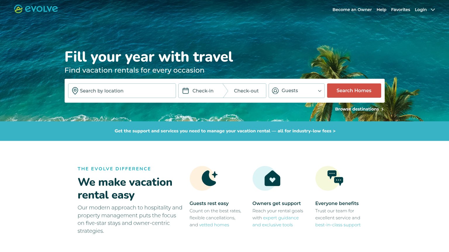
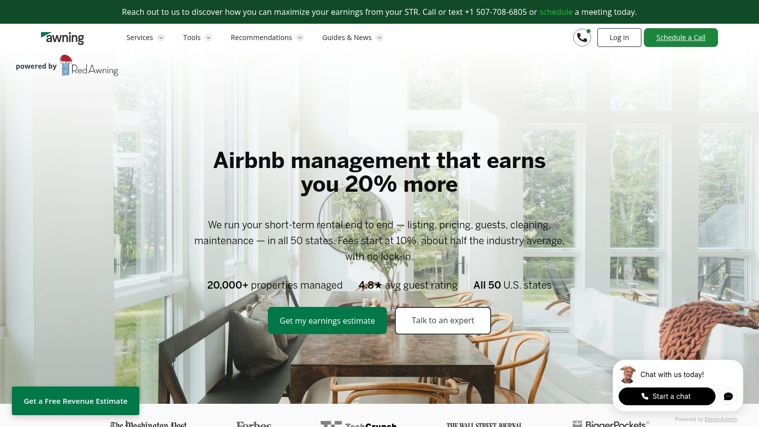
Awning72
- 3.
Evolve71
- 4.
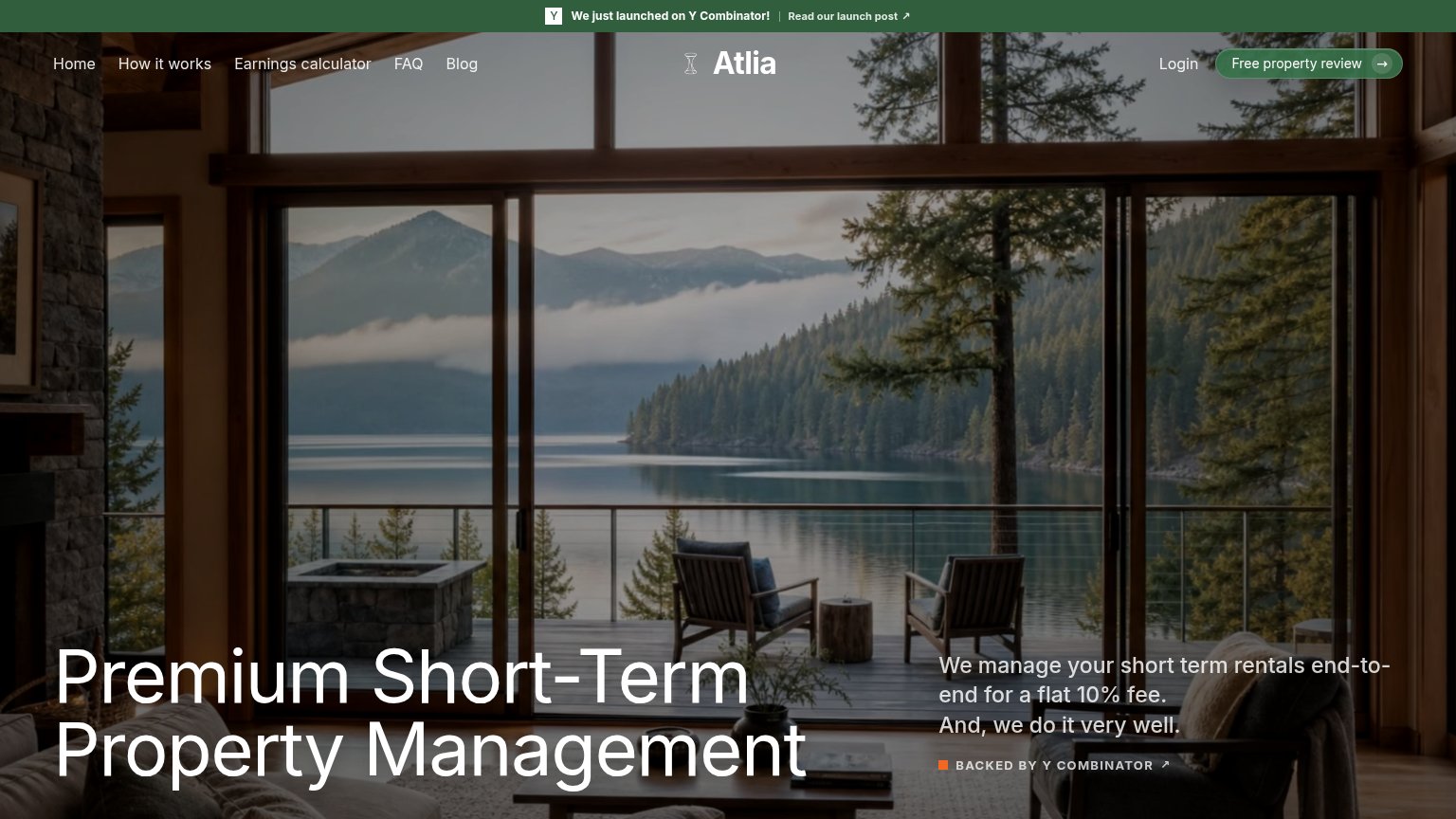
Atlia69
- 5.
Casago69
- 6.
Vacasa67
75Growth scoreupdated
category scores
category scoresShowHide
CTA
68FairCopy, size, verb, cost-feel — does the primary CTA earn the click?
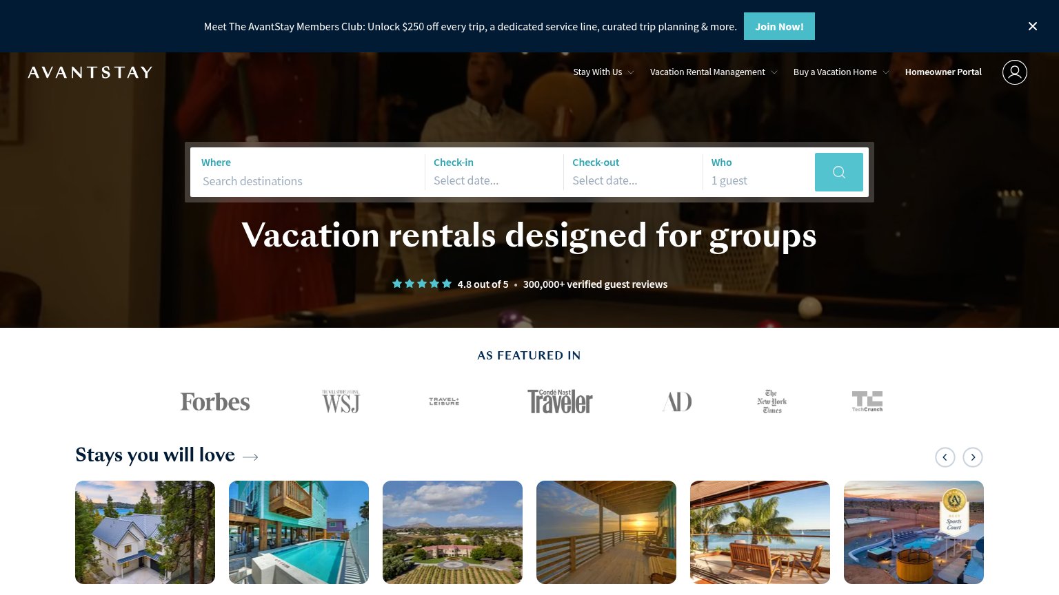
Problems
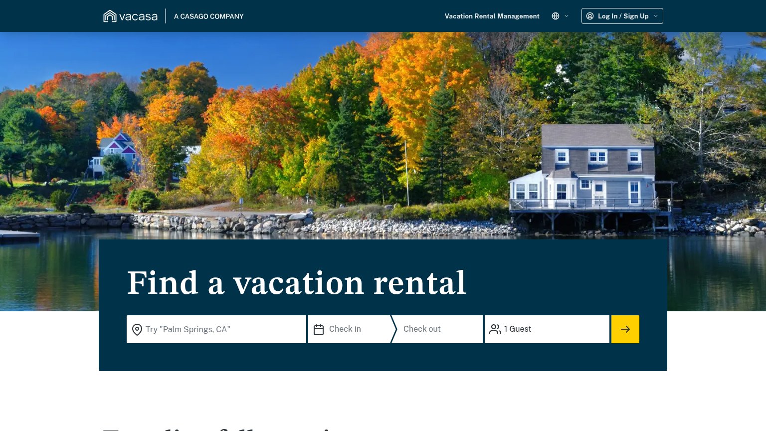
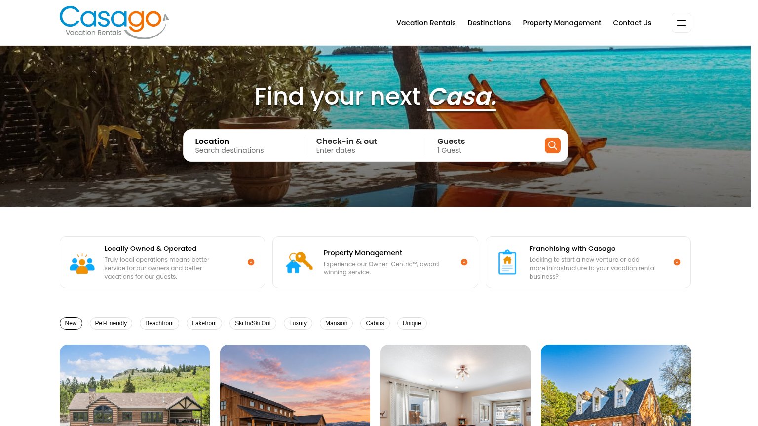
- icon-only submit, no label
- placeholder is a noun, not a verb
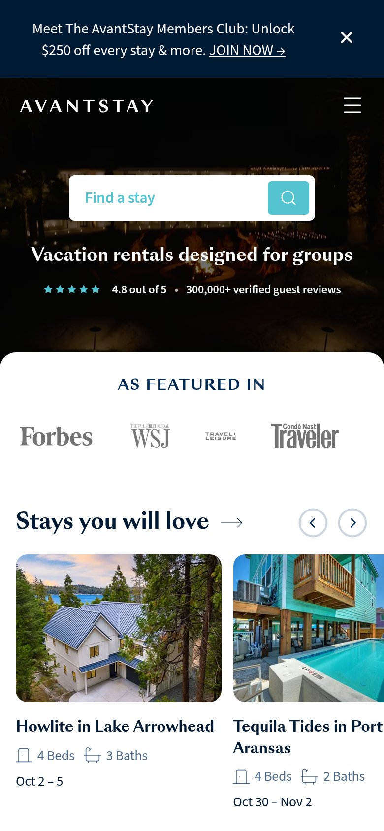
- mobile hides dates/guests fields
- desktop/mobile placeholders differ
Information hierarchy
72FairDoes the design help or inhibit what the page is trying to say?
1234- Members Club banner — The 'Join Now!' banner introduces a competing teal CTA above the search bar, splitting the first click between two same-color actions.
- Search bar placement — The primary search widget sits above the headline, so visitors hit the action before the promise; the scan order is inverted.
- Top navigation row — Four nav items including 'Buy a Vacation Home' and 'Homeowner Portal' target non-guest audiences, leaking guest attention before the search.
- Search icon button — The magnifier-only submit button is small and unlabeled, weakening the one action the fold wants compared to the louder 'Join Now!' banner button.
Value props
76FairTitle, subtitle, hero — do they sell the product's true value?
AvantStay’s headline
Vacation rentals designed for groups
Working
Could improve
Mobile web
76FairThe phone experience as a first-class citizen.
What works
What to improve
Trust
84StrongProof that the product is real, competent, and safe to try.
How AvantStay compares
Trust read