
Your landing page’s weakest score is Trust.
How Atlia ranks
69Growth scoreupdated
category scores
category scoresShowHide
Trust
52FairProof that the product is real, competent, and safe to try.
| Trust read | |
|---|---|
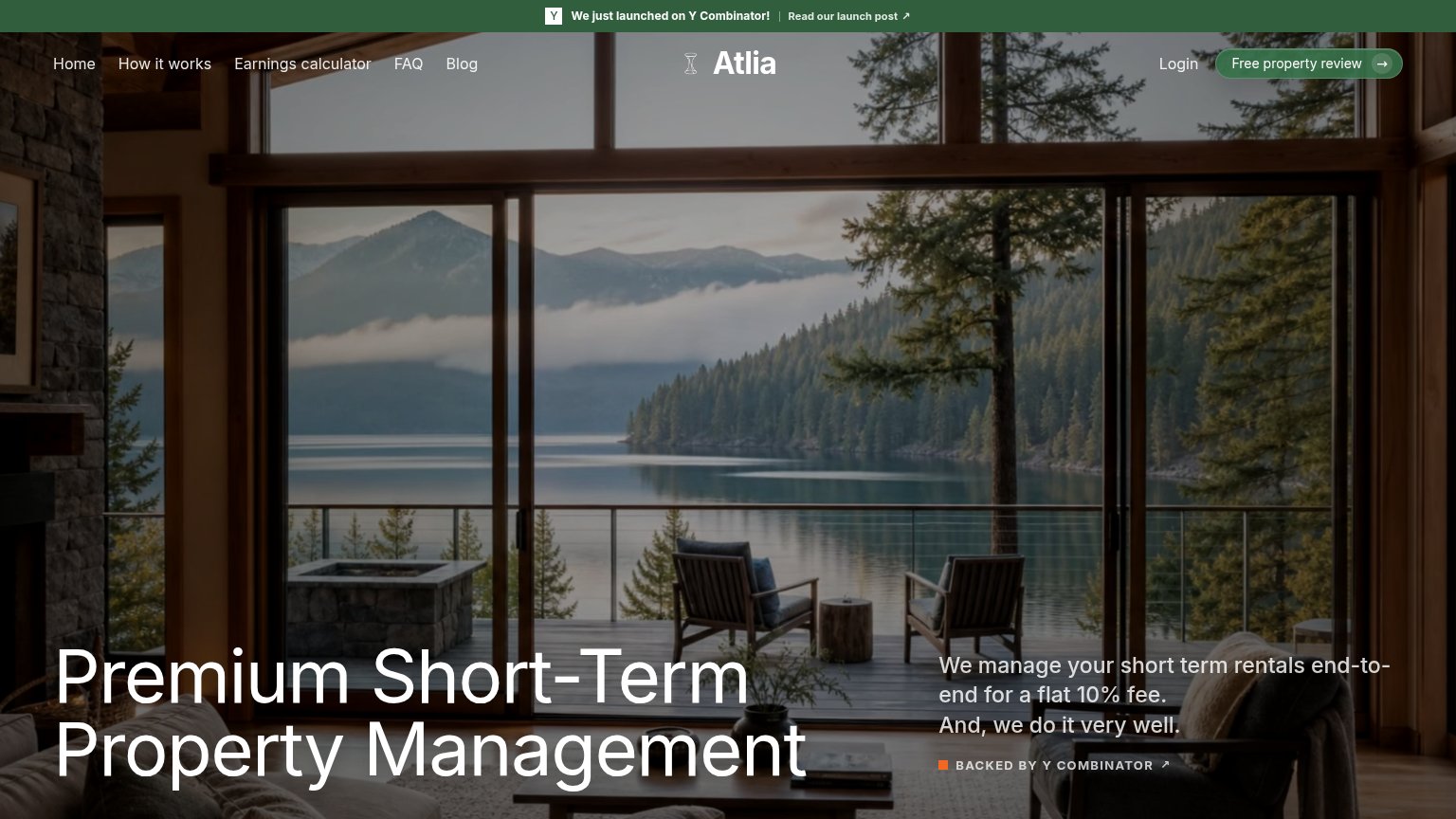
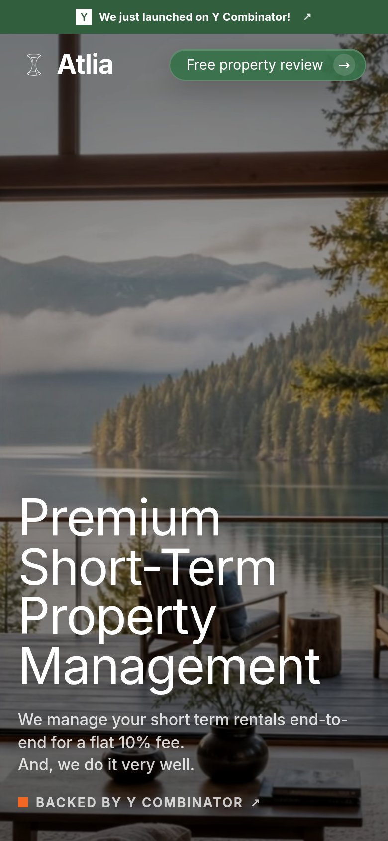
| Atlia | "BACKED BY Y COMBINATOR" badge next to the flat 10% fee claim |
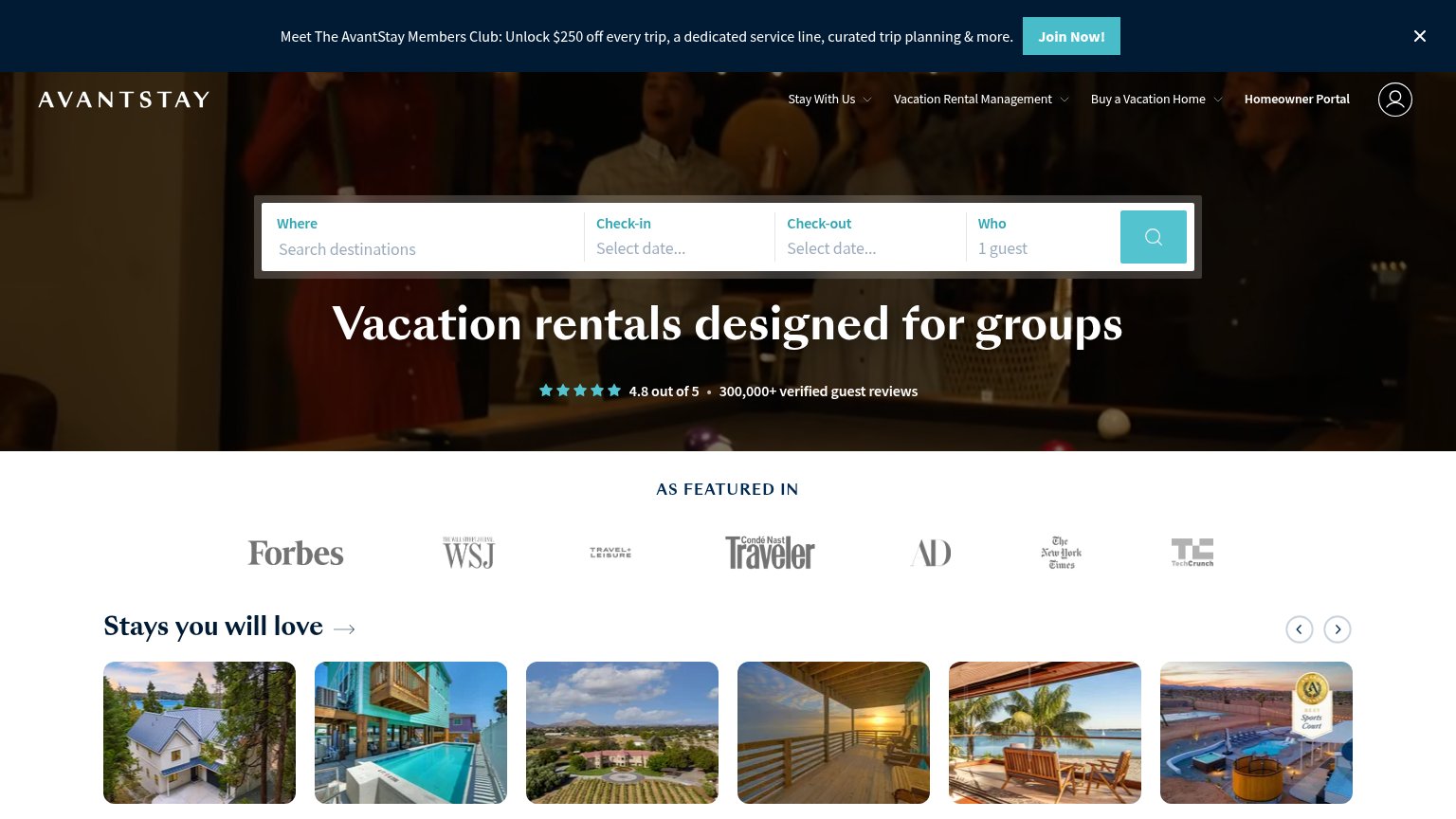
| Functional search widget with location, check-in/check-out, and guest fields showing a real, working booking product | |
| "flexible cancellations, and vetted homes" claim in the Guests rest easy column | |
| 4.8 out of 5 • 300,000+ verified guest reviews | |
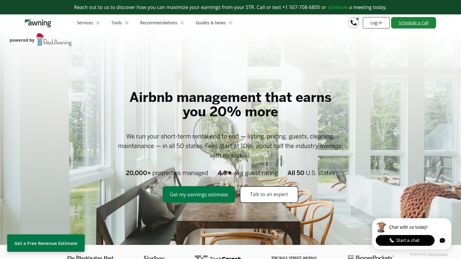
| 20,000+ properties managed — 4.8★ avg guest rating — All 50 U.S. states | |
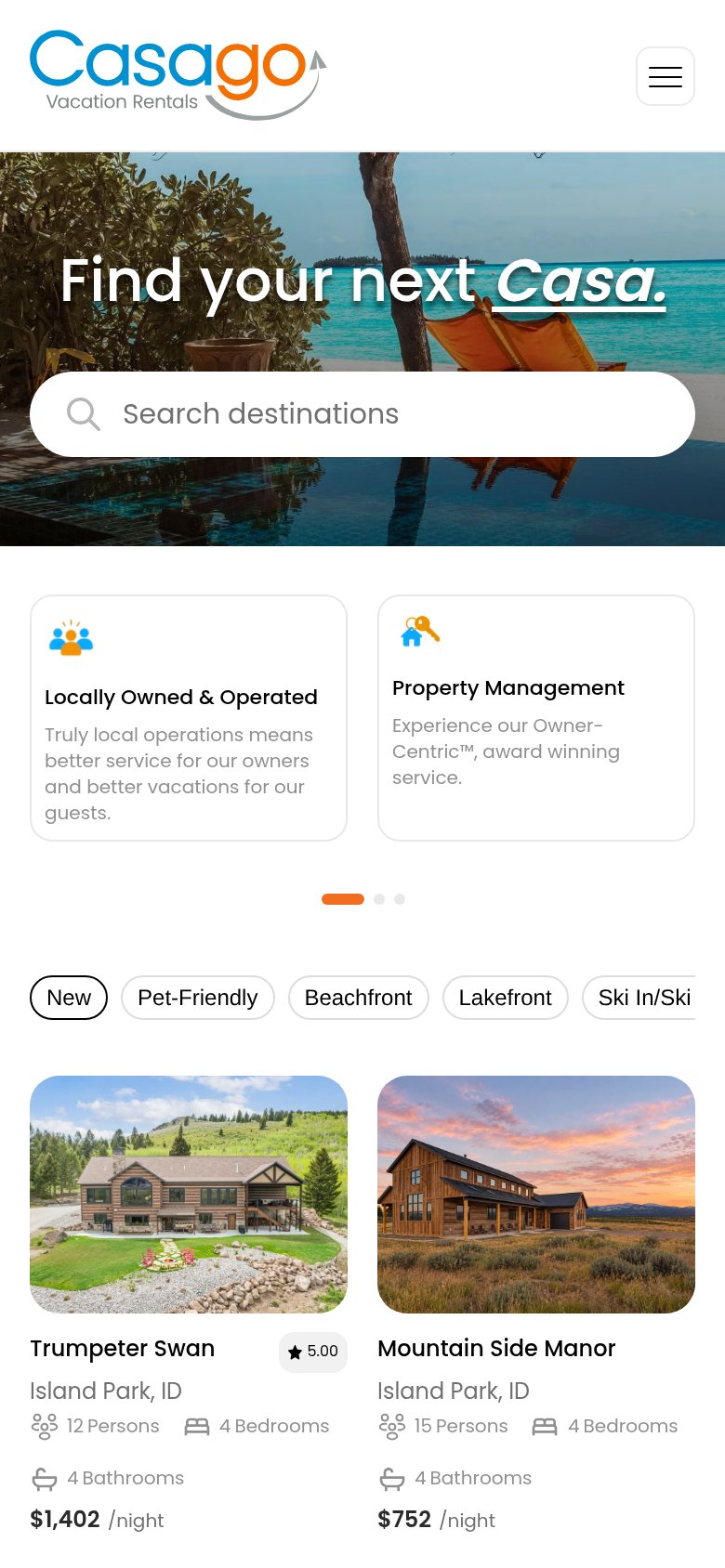
| Property listing card with "5.00" star rating on "Trumpeter Swan" in Island Park, ID (mobile capture) |
Information hierarchy
72FairDoes the design help or inhibit what the page is trying to say?
1234- YC announcement banner — Top banner with outbound 'Read our launch post' link pulls attention off-page before the visitor reads the headline.
- Headline clipped at fold — 'Premium Short-Term Property Management' sits at the very bottom edge, so the value prop only lands after a scroll on shorter viewports.
- Nav link row — Five same-weight nav links plus Login give six exits before the 'Free property review' CTA in the scan path.
- Subhead over busy image — The 10% fee message renders as thin light text over mid-tone foliage, weakening the strongest proof point on the fold.
Value props
72FairTitle, subtitle, hero — do they sell the product's true value?
Atlia’s headline
Premium Short-Term Property Management
We manage your short term rentals end-to-end for a flat 10% fee. And, we do it very well.
Working
Could improve
Mobile web
72FairThe phone experience as a first-class citizen.
What works
What to improve
CTA
76FairCopy, size, verb, cost-feel — does the primary CTA earn the click?
How Atlia compares
Recommended rewrites