
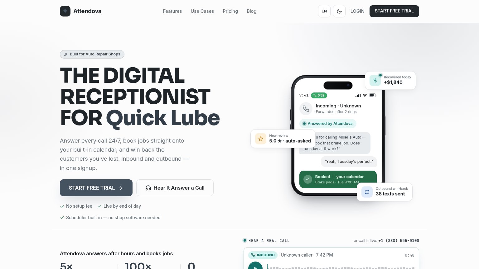
Your landing page’s weakest score is Trust.
How attendova.com ranks
Trust
58FairProof that the product is real, competent, and safe to try.

| Trust read | |
|---|---|
| attendova.com | No visible trust signal identified. |
| Product UI showing a real service conversation with vehicle card ('2021 SUV Trailblazer', RO #7408324) | |
| Detailed product UI screenshot showing a real appointment-reminder text thread ("Hi Tommy… appointment scheduled at Bill | |
| "Born at Google." heading with supporting copy on the mobile capture | |
| Row of six G2 Summer 2026 badges (Leader, Best Est. ROI, Best Usability, Best Support, Easiest Setup, Best Results) | |
| No visible trust signal identified. |
Mobile web
78FairThe phone experience as a first-class citizen.
 123
- Empty header pill — Unlabeled blank button beside the theme toggle looks broken and wastes a header slot.
- Four-line subhead — Long paragraph pushes the primary CTA to the bottom edge of the first viewport.
- Four-line headline block — Display type barely scaled down, wrapping into four heavy lines that dominate the fold.
Information hierarchy
82StrongDoes the design help or inhibit what the page is trying to say?
What works
What to improve
Value props
84StrongTitle, subtitle, hero — do they sell the product's true value?
Working
Could improve
CTA
88StrongCopy, size, verb, cost-feel — does the primary CTA earn the click?
How attendova.com compares
Recommended rewrites