
Your landing page’s weakest score is Mobile web.
How Atropos Health ranks
- 1.
Frekil73
- 2.
nference66
- 3.
TriNetX62
- 4.
Atropos Health58
- 5.
OM138
Mobile web
44PoorThe phone experience as a first-class citizen.
 12
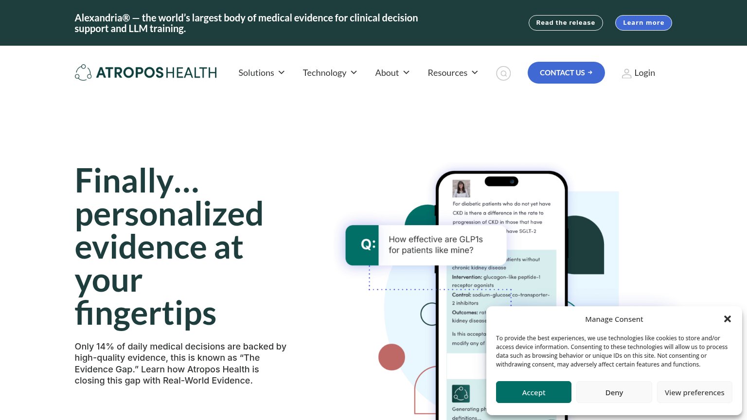
- Announcement bar — Three-line banner plus two buttons eats the top quarter of the screen before the logo appears.
- Hero headline — 'Finally… personalized evidence at Atropos Health's fingertips' wraps into four oversized lines, pushing the value copy under the consent overlay.
CTA
52FairCopy, size, verb, cost-feel — does the primary CTA earn the click?
Problems
- click feels like a sales call
- no CTA in the hero itself
- banner buttons compete for attention
- hidden behind hamburger on mobile
Trust
52FairProof that the product is real, competent, and safe to try.
How Atropos Health compares
Trust read
Information hierarchy
62FairDoes the design help or inhibit what the page is trying to say?
What works
What to improve
Value props
78FairTitle, subtitle, hero — do they sell the product's true value?
Atropos Health’s headline
Finally… personalized evidence at your fingertips
Only 14% of daily medical decisions are backed by high-quality evidence, this is known as "The Evidence Gap." Learn how Atropos Health is closing this gap with Real-World Evidence.
Working
Could improve