
Your landing page’s weakest score is CTA.
How Anon ranks
CTA
30PoorCopy, size, verb, cost-feel — does the primary CTA earn the click?
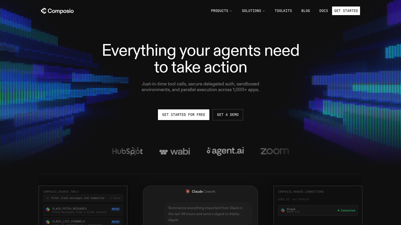
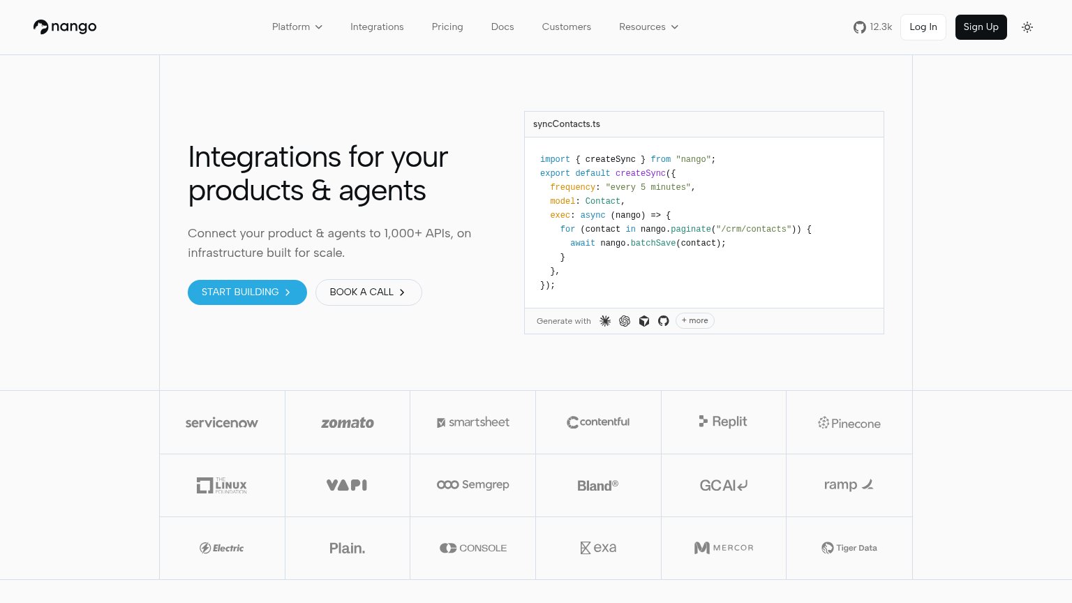
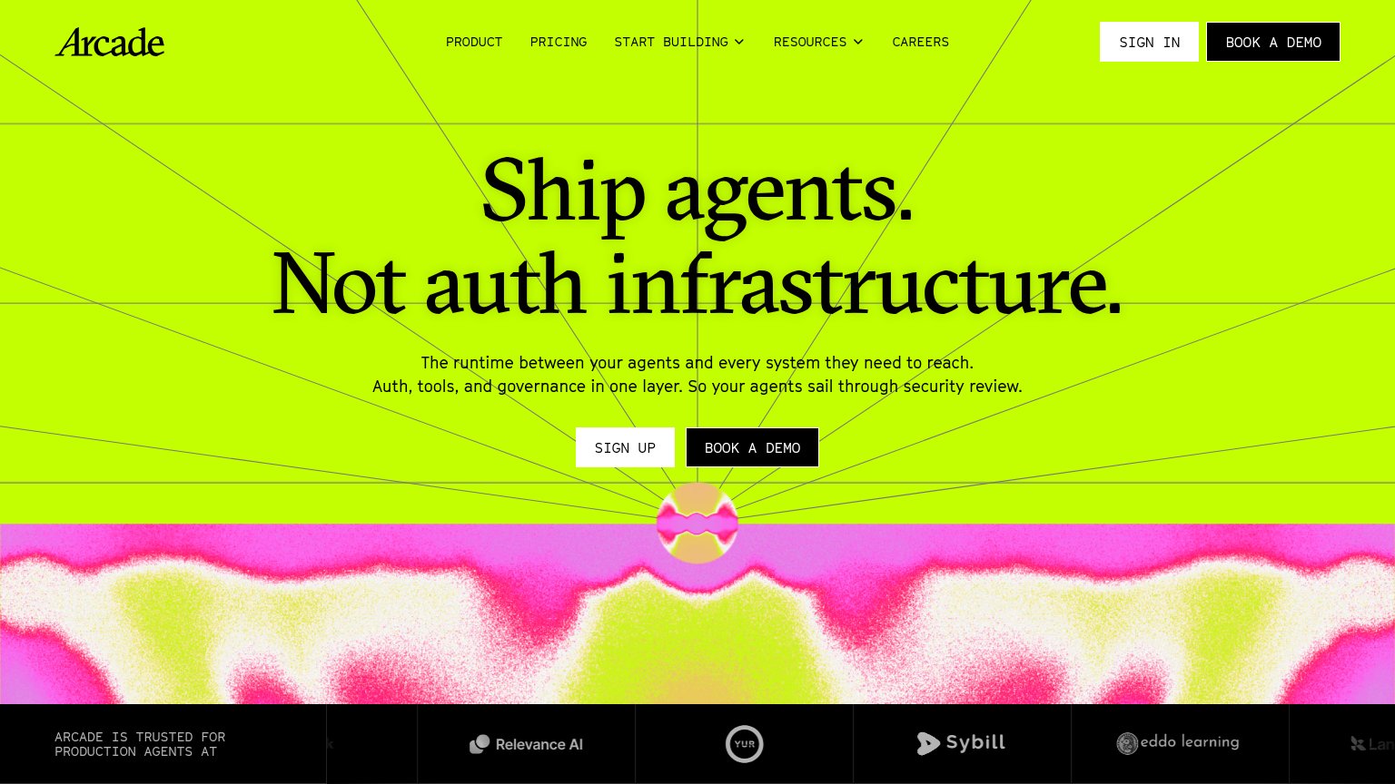
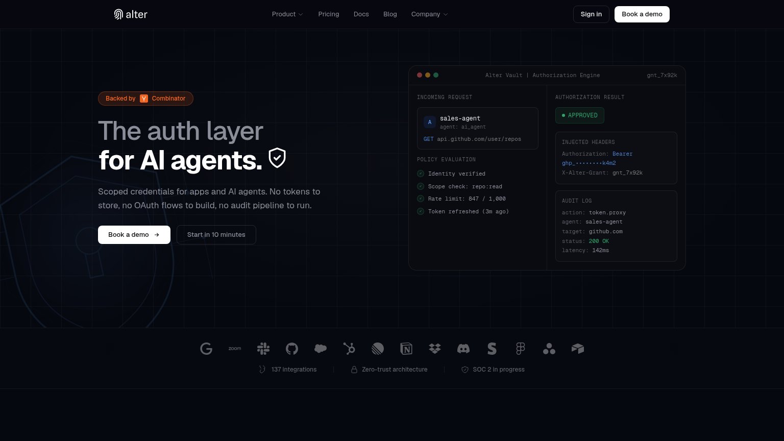
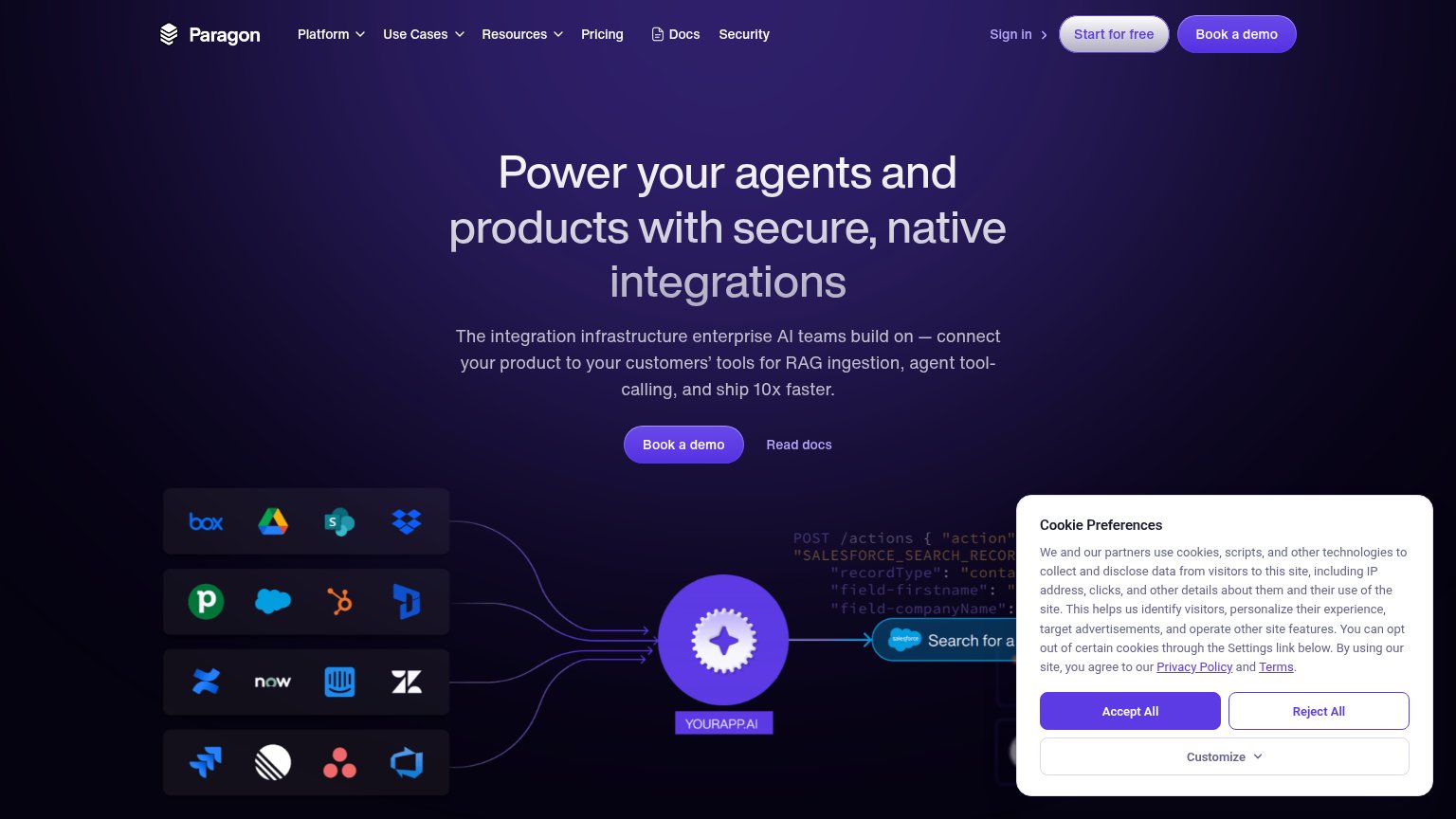
Problems
- no CTA anywhere in either fold
- logo chips look clickable, aren't CTAs
- credibility built with no next step
Mobile web
54FairThe phone experience as a first-class citizen.
 123
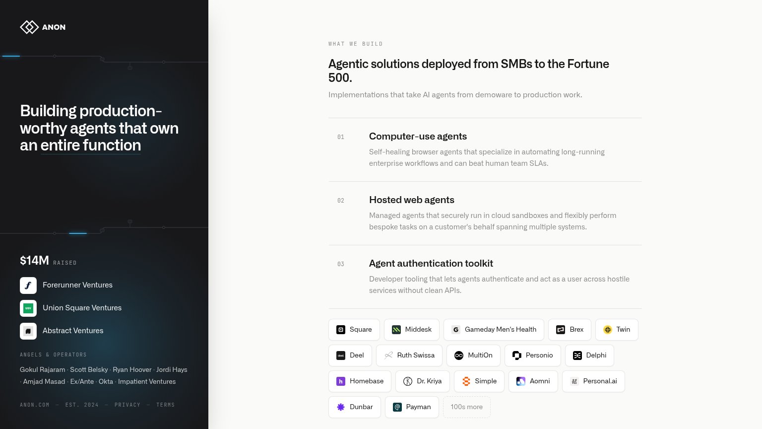
- Investor proof block — The "$14M RAISED" logos and angels list fill the fold where a tappable CTA should be — no action exists anywhere in the first viewport.
- Footer metadata row — "ANON.COM — EST. 2024 — PRIVACY — TERMS" appears mid-page on mobile, signaling the page has ended before any conversion action.
- Header without menu — The logo-only header offers no hamburger, nav, or contact link, leaving mobile visitors with no way to act or navigate.
Information hierarchy
58FairDoes the design help or inhibit what the page is trying to say?
What works
What to improve
Value props
72FairTitle, subtitle, hero — do they sell the product's true value?
Anon’s headline
Building production-worthy agents that own an entire function
Working
Could improve
Trust
74FairProof that the product is real, competent, and safe to try.
How Anon compares
Trust read