
Your landing page’s weakest score is Information hierarchy.
How Alice.tech ranks
80Growth scoreupdated
category scores
category scoresShowHide
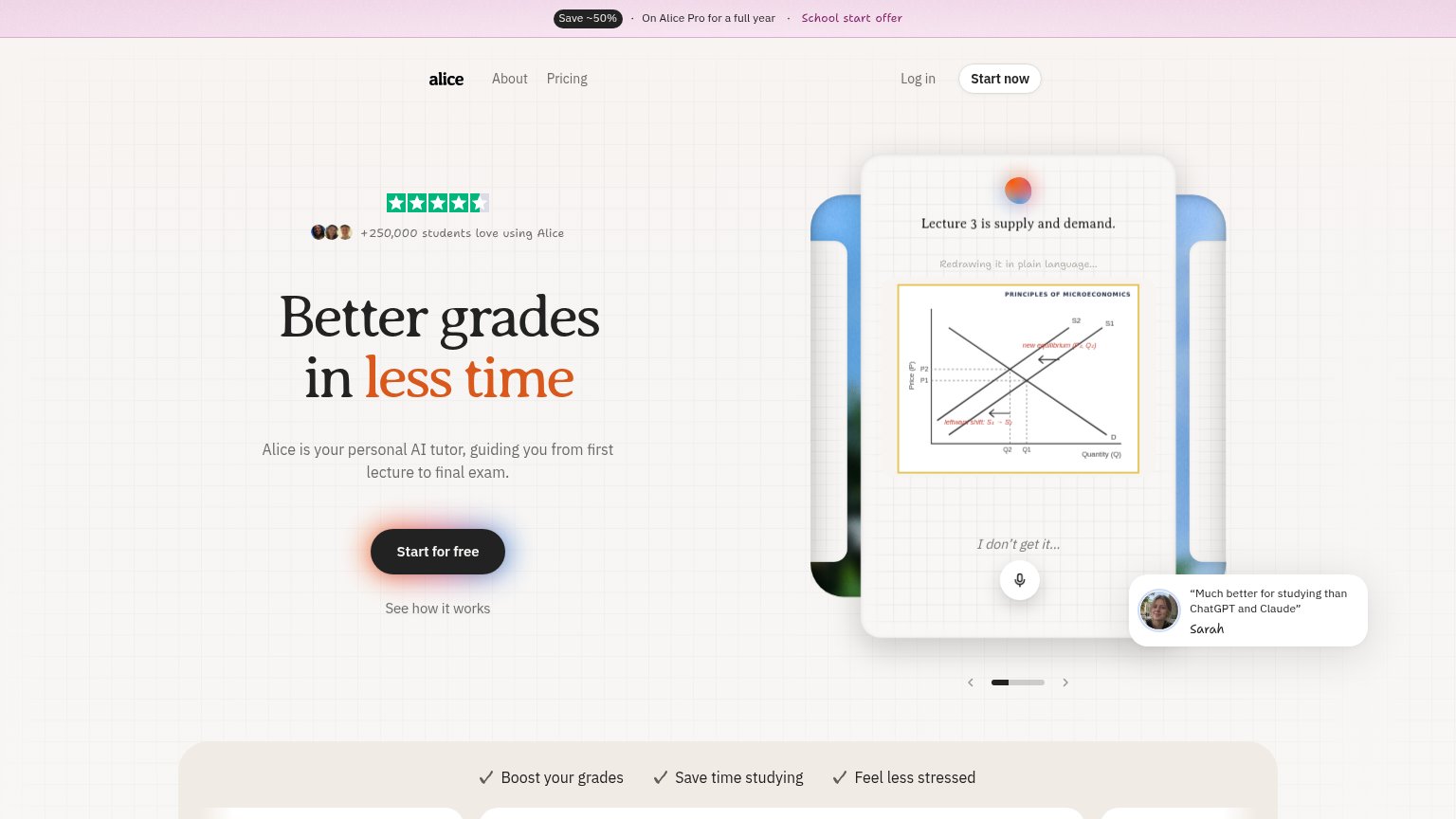
Information hierarchy
76FairDoes the design help or inhibit what the page is trying to say?
 1234
- Testimonial popup overlay — The floating Sarah quote card overlaps the hero visual and competes with the CTA path at equal visual weight.
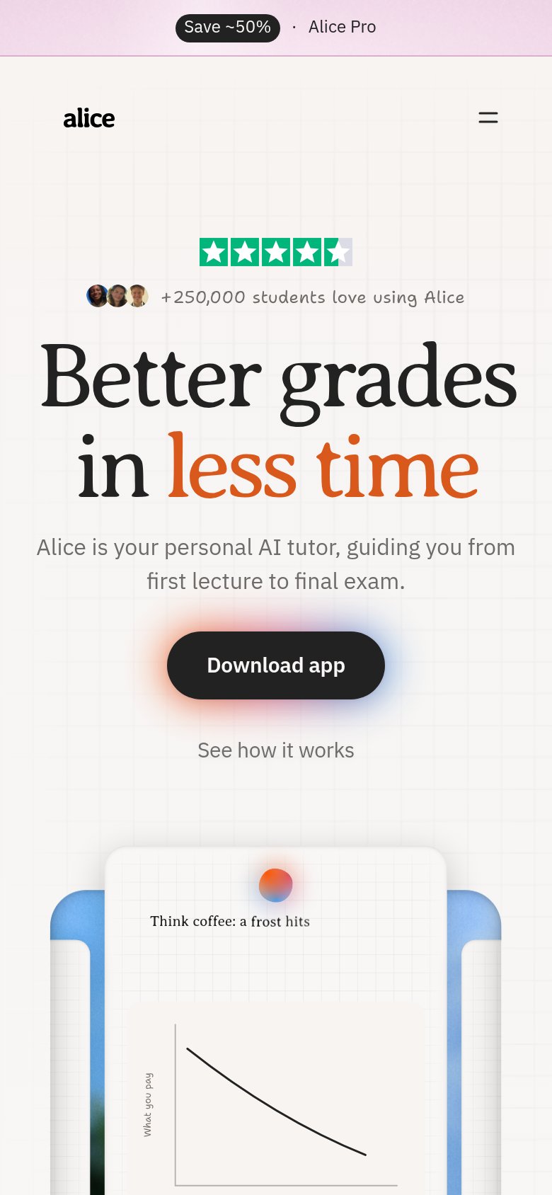
- Save ~50% banner — The 'School start offer' link at the very top pulls first attention to a discount exit before the value prop lands.
- Carousel pagination dots — Carousel controls under the hero visual invite interaction that delays the single decision the fold wants.
- See how it works — Secondary link sits directly under 'Start for free', splitting the action moment into two choices.
CTA
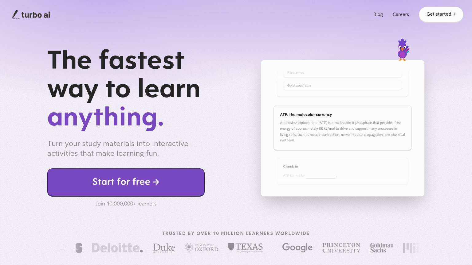
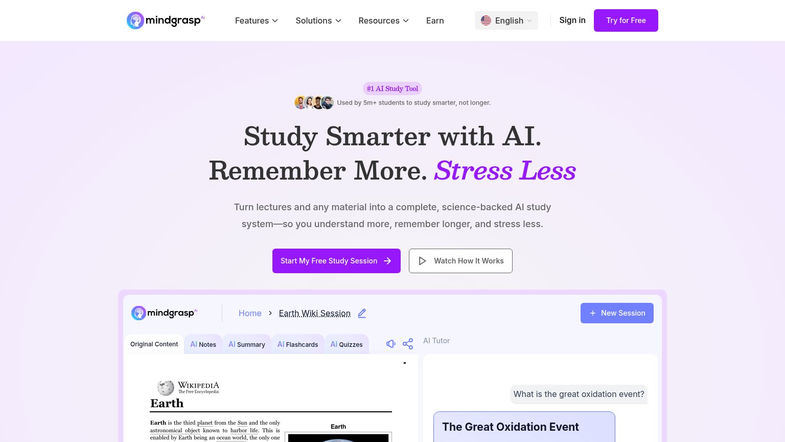
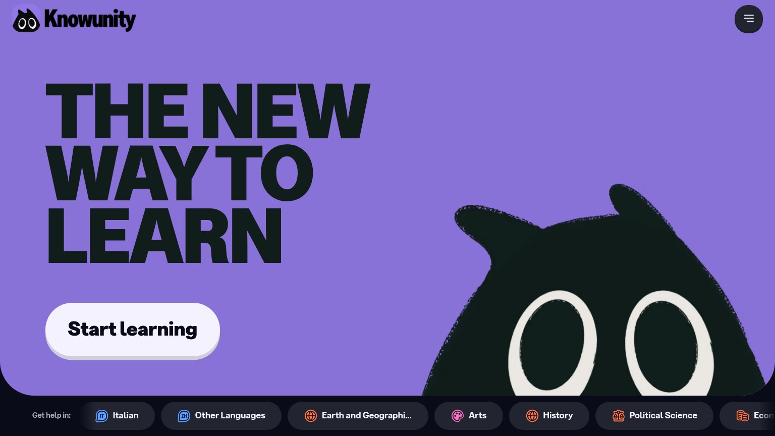
78FairCopy, size, verb, cost-feel — does the primary CTA earn the click?
Problems
- mobile swaps to 'Download app'
- nav uses 'Start now' — 3 labels
- mobile CTA drops 'free'
Trust
78FairProof that the product is real, competent, and safe to try.
How Alice.tech compares
Trust read
Value props
82StrongTitle, subtitle, hero — do they sell the product's true value?
Alice.tech’s headline
Better grades in less time
Alice is your personal AI tutor, guiding you from first lecture to final exam.
Working
Could improve
Mobile web
86StrongThe phone experience as a first-class citizen.
What works
What to improve