
Your landing page’s weakest score is Information hierarchy.
How Actuate ranks
46Growth scoreupdated
category scores
category scoresShowHide
Information hierarchy
38PoorDoes the design help or inhibit what the page is trying to say?
 12
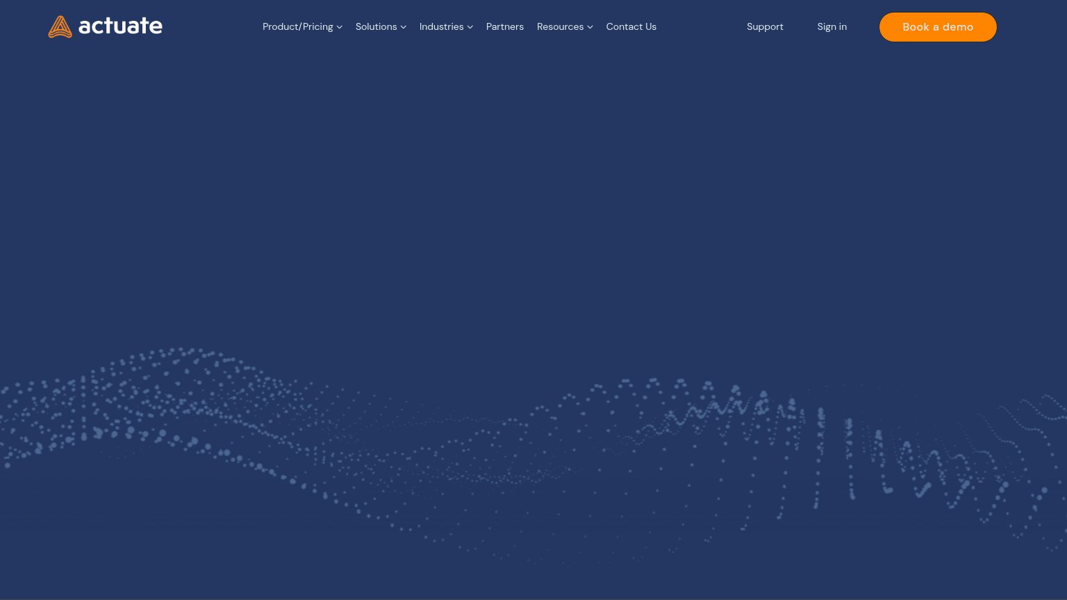
- Seven-item nav row — Product/Pricing through Contact Us plus Support and Sign in give nine exits before any message justifies staying.
- Book a demo context — The lone CTA asks for a demo commitment with no visible copy explaining what Actuate is or does.
Value props
38PoorTitle, subtitle, hero — do they sell the product's true value?
Actuate’s headline undersells
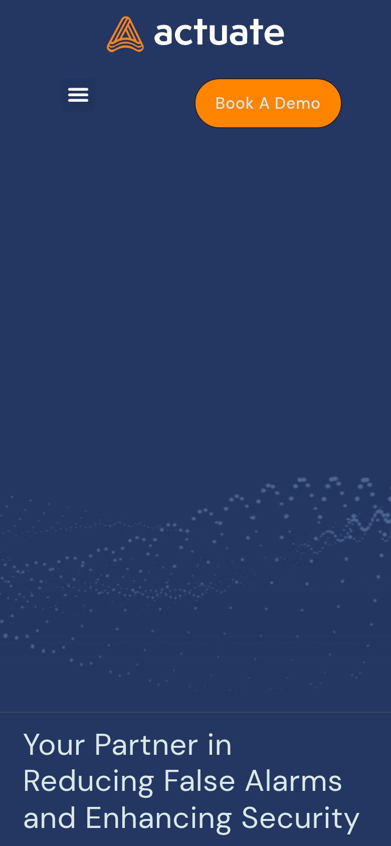
Your Partner in Reducing False Alarms and Enhancing Security
Working
- Names the real pain: false alarms
- Speaks to security buyers directly
- Outcome-oriented, not feature list
Could improve
- Desktop fold shows no headline at all
- No numbers or proof points
- No subhead or product demo image
Trust
38PoorProof that the product is real, competent, and safe to try.
How Actuate compares
Trust read
Mobile web
48PoorThe phone experience as a first-class citizen.
What works
What to improve
CTA
68FairCopy, size, verb, cost-feel — does the primary CTA earn the click?
How Actuate compares
Recommended rewrites