ZeroSettleYC W26 landing page report.
← Back to YC W26

Your landing page’s weakest score is Trust.

How ZeroSettle ranks

  1. 1.ZeroSettle78
  2. 2.Loop Message66
  3. 3.Sendblue64
Fix Trust

Score over time

9080706050Sendblue 62 on Apr 19 (Wayback)Sendblue 66 on May 15 (Wayback)Sendblue 55 on Jun 15 (Wayback)Sendblue 64 on Sep 21 (Live)Loop Message 66 on Sep 20 (Live)ZeroSettle 66 on Apr 12 (Wayback)ZeroSettle 67 on May 21 (Wayback)ZeroSettle 74 on Jun 5 (Wayback)ZeroSettle 75 on Jun 14 (Wayback)ZeroSettle 78 on Sep 21 (Live)Apr 12May 21Jun 5Jun 14Sep 21
Past reportsShow past reportsHide past reports
  1. Sep 21, 202678LiveOverall +3 · Mobile web +14 · Information hierarchy +8Viewing
  2. Jun 14, 202675Overall +1 · Information hierarchy +2 · CTA +2View →
  3. Jun 5, 202674Overall +7 · Information hierarchy +18 · CTA +18View →
  4. May 21, 202667Overall +1 · Information hierarchy +4View →
  5. Apr 12, 202666First tracked report — strongest Value props 88, weakest Trust 48View →

Trust

48Poor

Proof that the product is real, competent, and safe to try.

ZeroSettle
Sendblue
Trust read
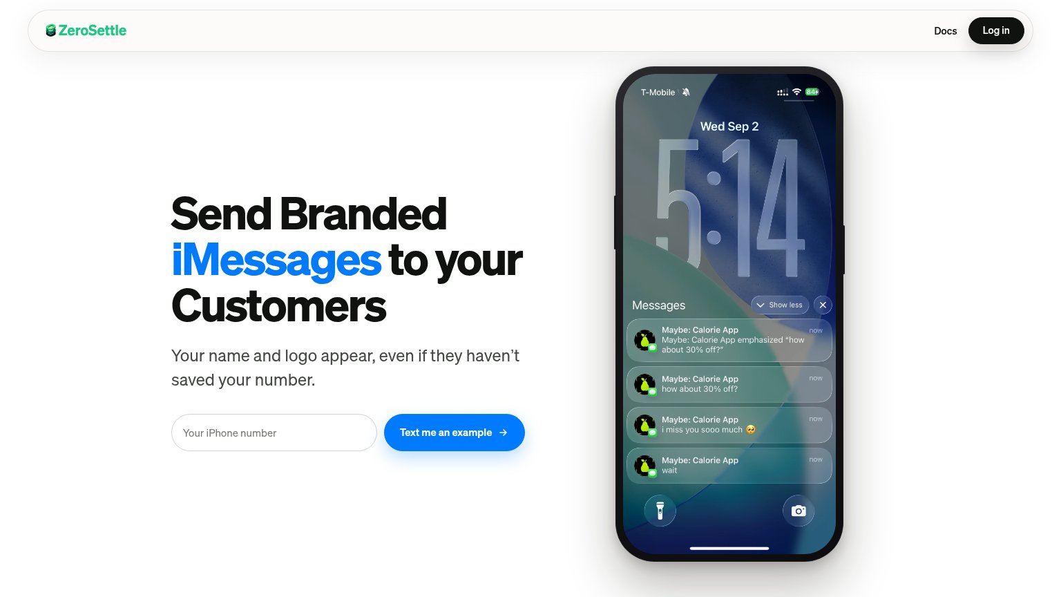
ZeroSettleiPhone lock-screen mockup showing branded "Maybe: Calorie App" iMessage notifications
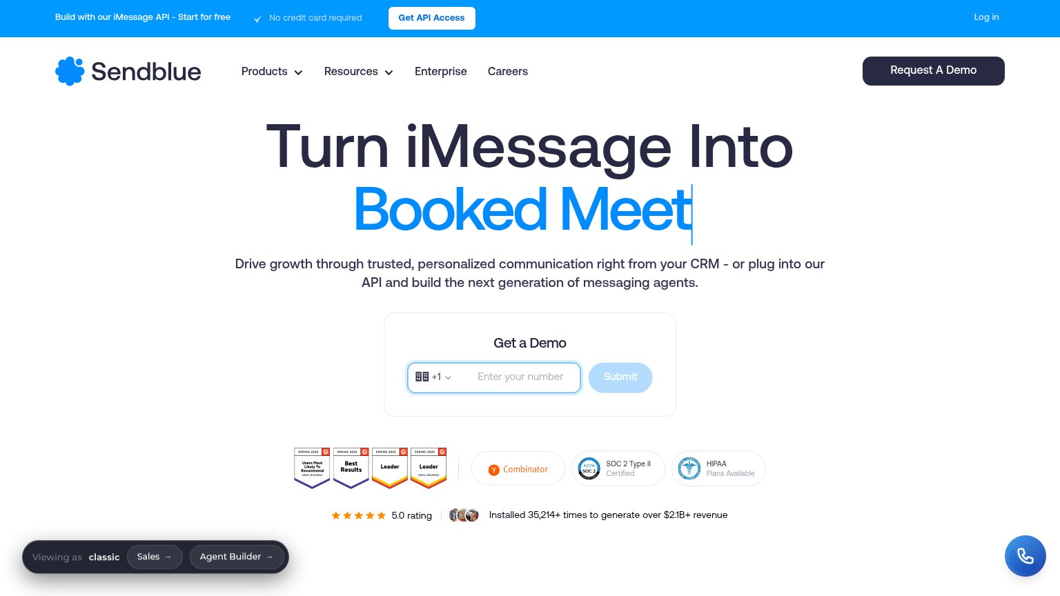
Sendblue"Installed 35,214+ times to generate over $2.1B+ revenue" with 5.0 rating and G2 badges
Loop MessageNo visible trust signal identified.

Value props

82Strong

Title, subtitle, hero — do they sell the product's true value?

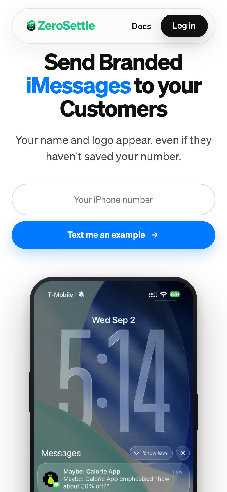
ZeroSettle’s headline sellsSend Branded iMessages to your CustomersYour name and logo appear, even if they haven't saved your number.

Working

  • Concrete, seven-word claim of true value
  • Subhead kills the unknown-number objection
  • Hero phone demos branded messages live

Could improve

  • No numbers or proof points anywhere
  • No emotional hook on the cost of SMS spam look
  • Zero social proof in the fold

Information hierarchy

86Strong

Does the design help or inhibit what the page is trying to say?

Information hierarchy annotations on the desktop capture12
  1. Demo notification stack — Playful 'Maybe: Calorie App' texts read as a personal screenshot, delaying recognition that this demonstrates branded business messaging.
  2. Phone number input — Light gray hairline border gives the capture field far less visual weight than the button it feeds, weakening the input-to-CTA pairing.

CTA

86Strong

Copy, size, verb, cost-feel — does the primary CTA earn the click?

ZeroSettlein-product action

Problems

  • phone number ask feels spammy
  • no zero-commitment reassurance
  • four words, over 3-word ideal

Mobile web

86Strong

The phone experience as a first-class citizen.

Mobile web annotations on the mobile capture1
  1. Uncollapsed nav links — Desktop link row kept on mobile; 'Docs' and the large 'Log in' pill crowd the header instead of collapsing to a menu.