
Your landing page’s weakest score is Mobile web.
How Sendblue ranks
- 1.
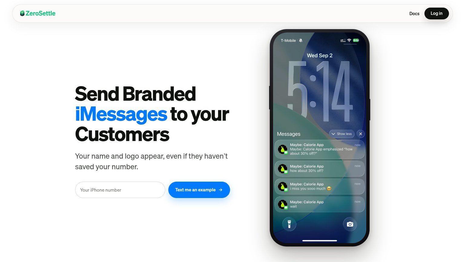
ZeroSettle78
- 2.
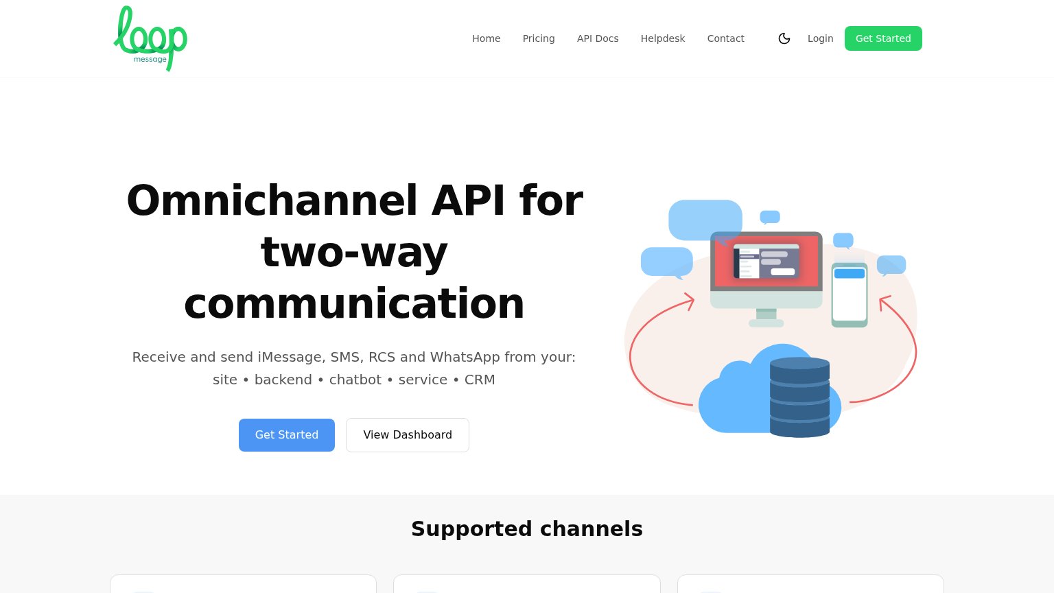
Loop Message66
- 3.
Sendblue64
Mobile web
48PoorThe phone experience as a first-class citizen.
 1234
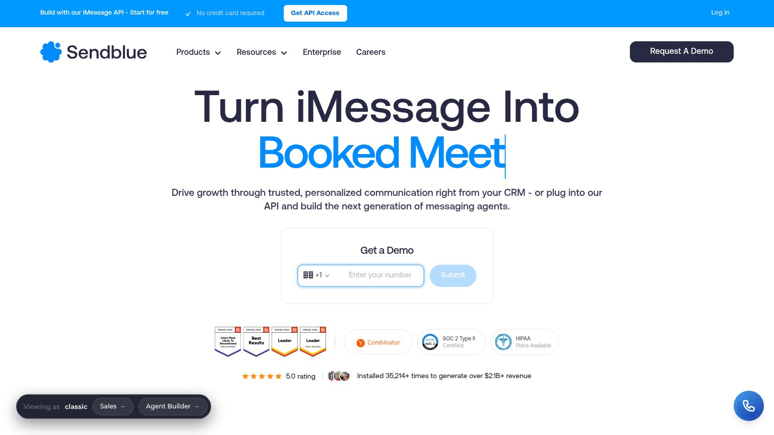
- iClosed demo overlay — Booking widget covers roughly 60% of the first viewport and fully hides the phone-number form, the page's primary CTA.
- Truncated animated headline — The typewriter line "Higher R|" reads as a broken cut-off word, muddying the value statement on first load.
- Viewing-as toolbar — A second sticky bar with "Sales" and "Agent Builder" pills stacks over content at the bottom, crowding the scroll-down chevron.
- Clipped subheadline text — Body copy is cut mid-sentence behind the overlay, so the value proposition never finishes on the first screen.
CTA
58FairCopy, size, verb, cost-feel — does the primary CTA earn the click?
Problems
- Submit button looks disabled/grey
- "Submit" promises nothing
- phone number is a costly first ask
- no 'free' despite free banner offer
Information hierarchy
62FairDoes the design help or inhibit what the page is trying to say?
What works
What to improve
Trust
76FairProof that the product is real, competent, and safe to try.
How Sendblue compares
Trust read
Value props
78FairTitle, subtitle, hero — do they sell the product's true value?
Sendblue’s headline
Turn iMessage Into Booked Meetings
Drive growth through trusted, personalized communication right from your CRM - or plug into our API and build the next generation of messaging agents.
Working
Could improve