
Your landing page’s weakest score is Trust.
How Wideframe ranks
65Growth scoreupdated
category scores
category scoresShowHide
Score over time
Trust
42PoorProof that the product is real, competent, and safe to try.
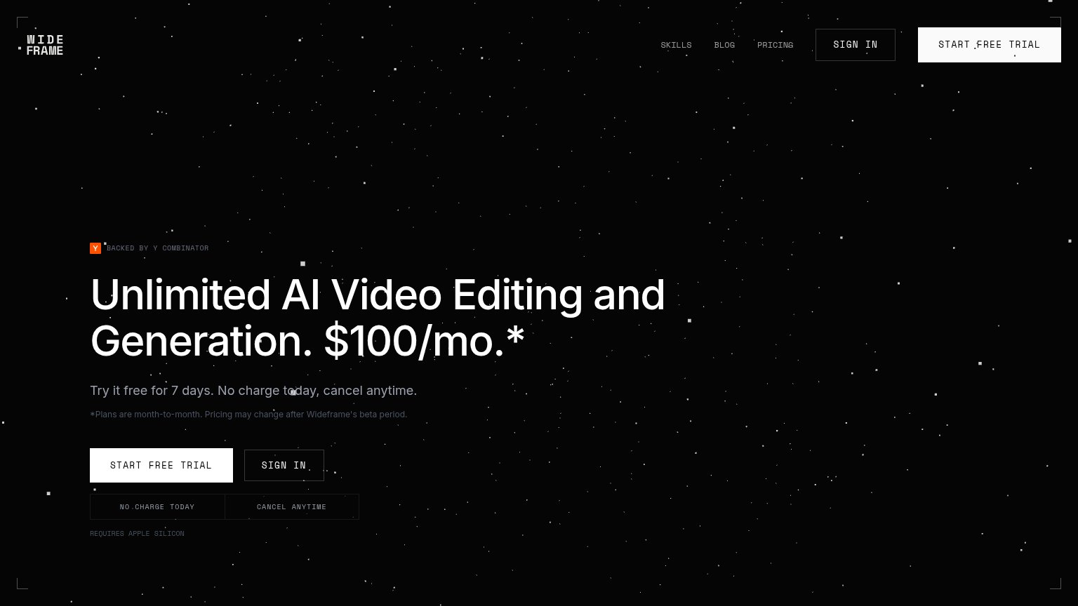
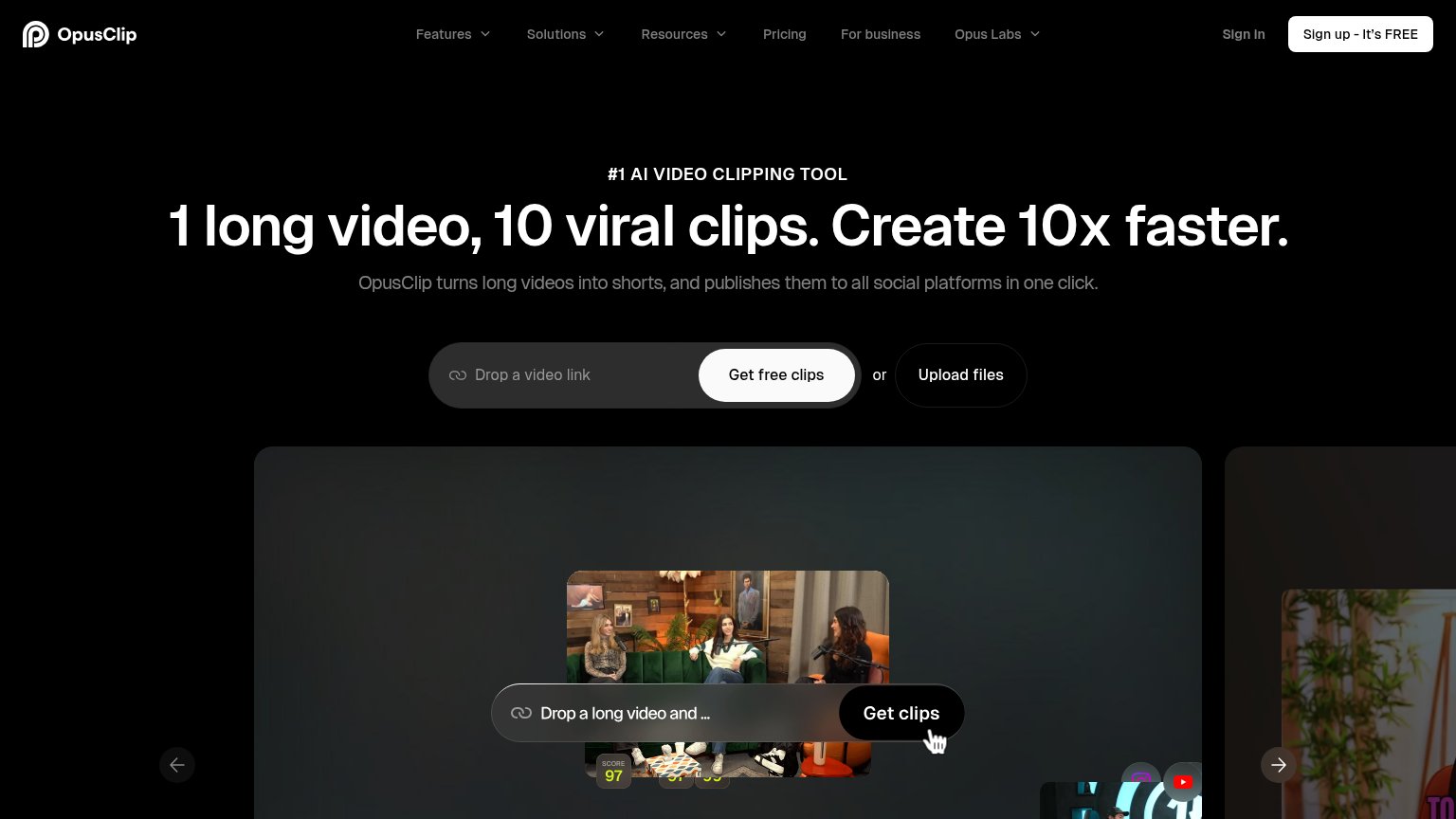
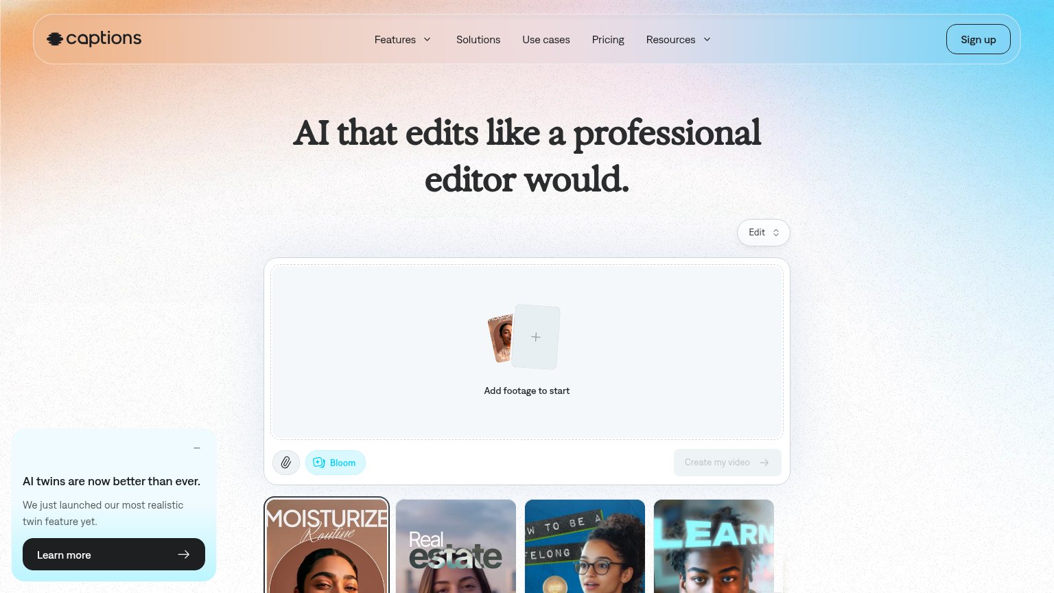


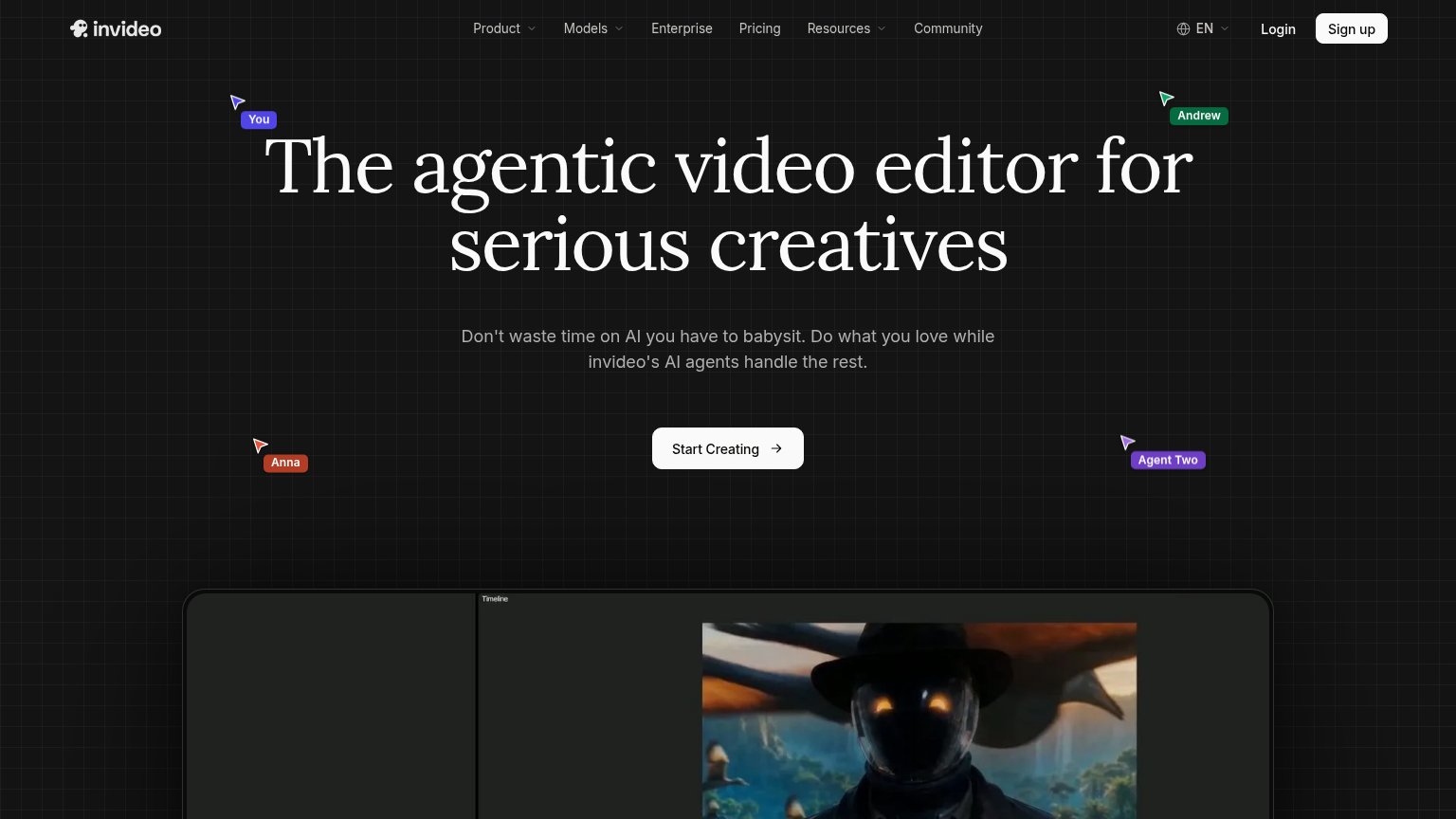
| Trust read | |
|---|---|
| Wideframe | "BACKED BY Y COMBINATOR" badge above the headline |
| Embedded editor widget: "Add footage to start" with "Create my video" button and example output thumbnails | |
| Underlord AI chat panel showing a real editing workflow: "I see there are some repeated takes and long pauses. I'll remo | |
| "We partner with the world's leading organizations to advance their industries:" logo strip (Amazon logo visible) | |
| Product demo showing a long video converted into scored short clips ("SCORE 97") with social platform icons | |
| Product editor screenshot with timeline UI and rendered video output below the hero |
Mobile web
58FairThe phone experience as a first-class citizen.
 1234
- Primary CTA below fold — The full-width "START FREE TRIAL" button sits at ~1200px, well below the first mobile viewport, so most visitors never see it without scrolling.
- Header duplicate CTAs — The header crams both "SIGN IN" and "START FREE TRIAL" as boxed buttons that wrap to two lines and eat ~200px of the first viewport instead of collapsing to a menu.
- Six-line headline stack — "Unlimited AI Video Editing and Generation. $100/mo.*" wraps into five cramped lines because the desktop headline barely scaled down for the phone column.
- Fine-print pricing caveat — The low-contrast asterisk disclaimer about beta pricing adds a fourth competing text block before the visitor reaches any button.
Value props
62FairTitle, subtitle, hero — do they sell the product's true value?
Wideframe’s headline undersells
Unlimited AI Video Editing and Generation. $100/mo.*
Try it free for 7 days. No charge today, cancel anytime.
Working
- Radical price transparency builds trust
- "Unlimited" is a concrete, bold hook
- Subhead removes trial risk cleanly
Could improve
- No outcome or demo of what it produces
- Hero starfield decorates, shows nothing
- Subhead repeats trial terms, adds no value
Information hierarchy
78FairDoes the design help or inhibit what the page is trying to say?
123- Hero SIGN IN button — Styled at near-equal weight and adjacent to the primary CTA, splitting the click; also duplicates the nav SIGN IN.
- Nav SIGN IN box — Boxed styling elevates a secondary exit to button prominence, competing with the trial CTA one inch away.
- Reassurance chip row — "NO CHARGE TODAY / CANCEL ANYTIME" repeats the subhead verbatim, adding a redundant same-styled block below the buttons.
CTA
86StrongCopy, size, verb, cost-feel — does the primary CTA earn the click?
Problems
- 'trial' implies a billing clock
- sits beside a $100/mo. headline
- 'REQUIRES APPLE SILICON' gates click