
Your landing page’s weakest score is Trust.
How Visibl Semiconductors ranks
- 1.
ICsense68
- 2.
Visibl Semiconductors58
- 3.
Zero ASIC57
- 4.
Presto Engineering57
- 5.
Sofics43
- 6.
Efabless39
58Growth scoreupdated
category scores
category scoresShowHide
Score over time
Trust
42PoorProof that the product is real, competent, and safe to try.
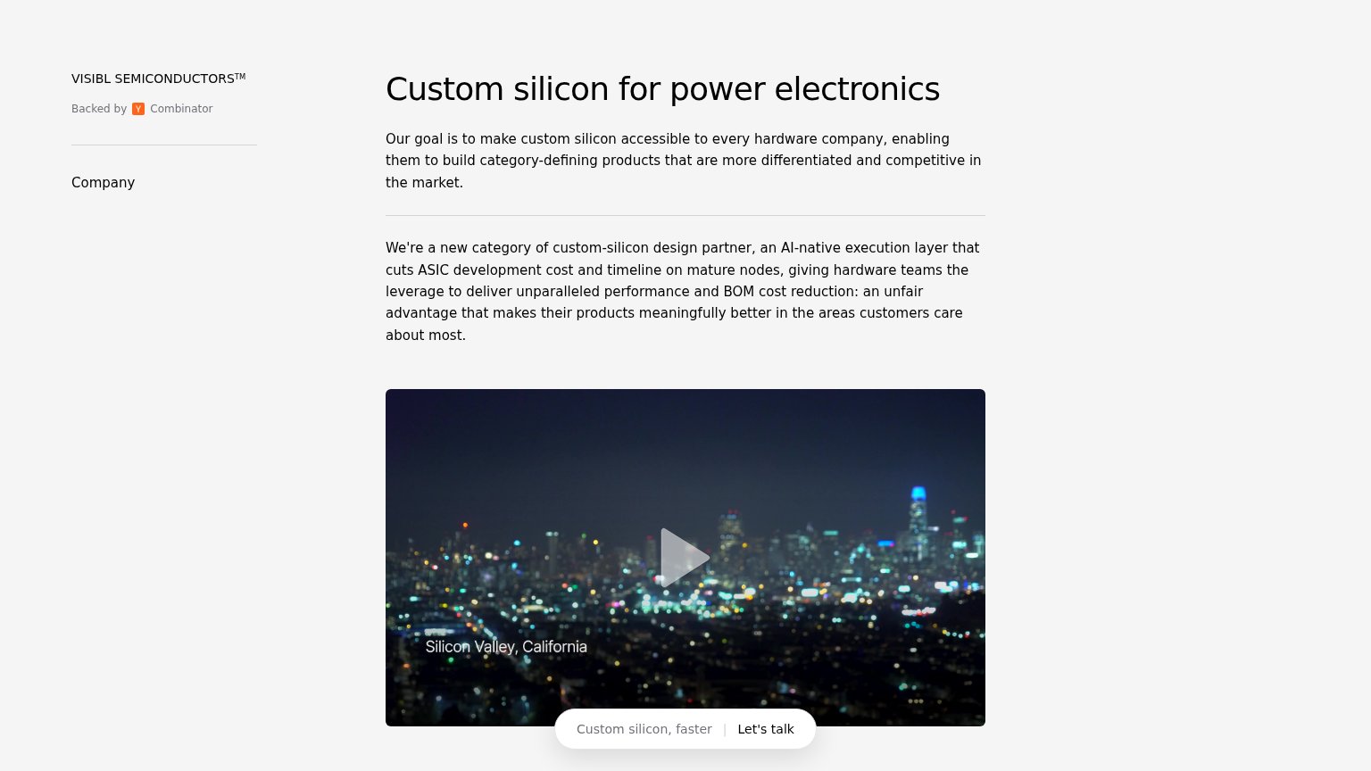
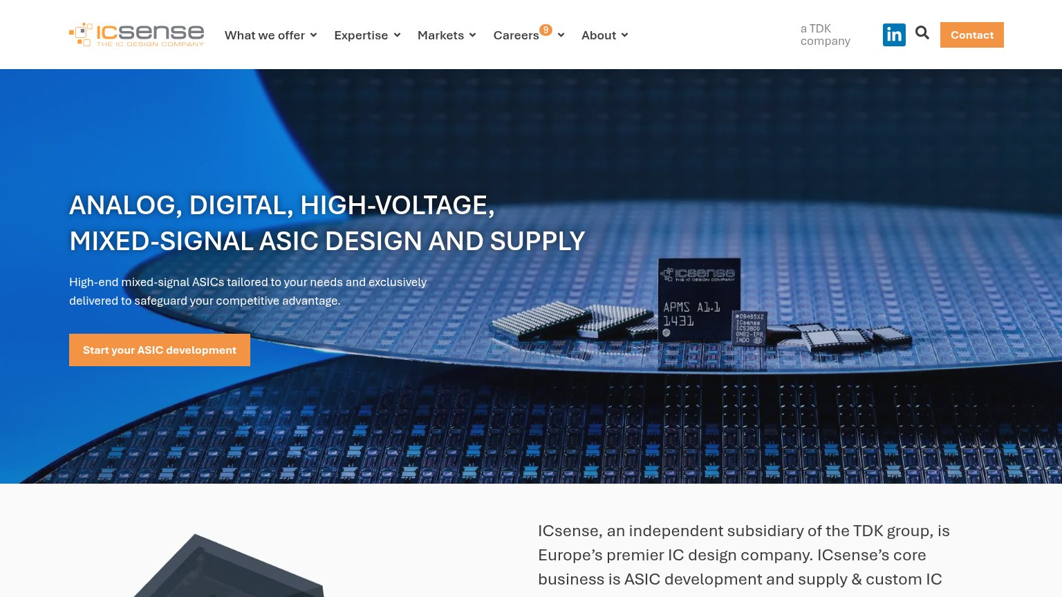
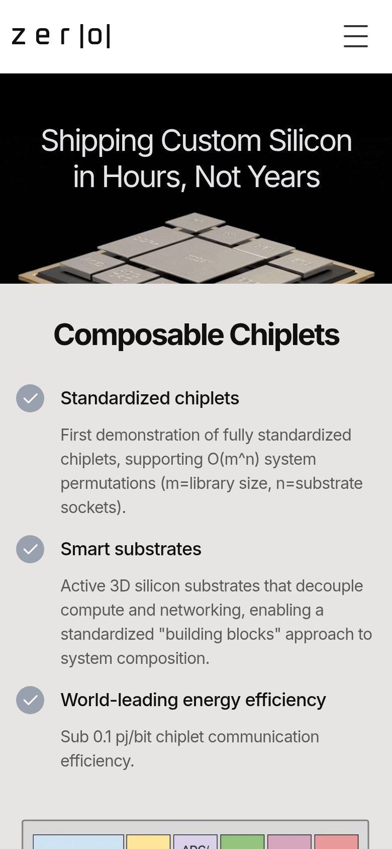
| Trust read | |
|---|---|
| Visibl Semiconductors | "Backed by Y Combinator" badge under the logo |
| Acquisition statement naming both entities: "Umbralogic Technologies LLC, doing business as ChipFoundry, has acquired th | |
| "Sub 0.1 pj/bit chiplet communication efficiency." spec alongside the chiplet-array hardware photo | |
| "Silicon proven, standard process compatible" | |
| "a TDK company" header badge, reinforced by "ICsense, an independent subsidiary of the TDK group" | |
| No visible trust signal identified. |
CTA
58FairCopy, size, verb, cost-feel — does the primary CTA earn the click?
Problems
- sales-call click feels costly
- no imperative action verb
- small pill blends into video
- no low-commitment alternative
Mobile web
58FairThe phone experience as a first-class citizen.
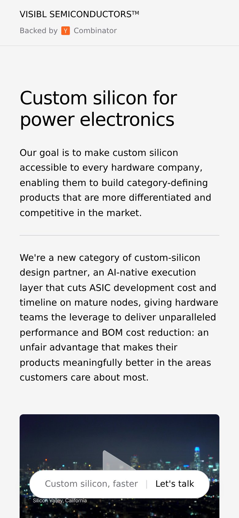 123
- Let's talk pill CTA — Primary CTA sits multiple screens below the fold as a small pill, not a full-width tappable button.
- Second body paragraph — A ten-line block of dense prose fills the fold and pushes every action off-screen.
- CTA overlaps caption — The floating pill covers the "Silicon Valley, California" caption, muddying both elements.
Value props
62FairTitle, subtitle, hero — do they sell the product's true value?
Visibl Semiconductors’s headline undersells
Custom silicon for power electronics
Our goal is to make custom silicon accessible to every hardware company, enabling them to build category-defining products that are more differentiated and competitive in the market.
Working
- Headline names a real category and market
- ASIC cost/timeline cuts are the true value
- YC badge adds credibility signal
Could improve
- No numbers: nodes, timeline, cost delta
- Subhead is a mission, not buyer outcome
- Hero image is skyline, not the product
Information hierarchy
68FairDoes the design help or inhibit what the page is trying to say?
123- Let's talk pill CTA — The only conversion action sits at the bottom edge of the fold, small and overlaid on a dark video where it competes with the play affordance.
- Second paragraph block — One 100-word run-on sentence at the same visual weight as the intro paragraph — two same-weight text walls dilute the headline's message.
- Video play button — The large play triangle is the most prominent interactive element, outranking the 'Let's talk' CTA in the scan path.