
Your landing page’s weakest score is Trust.
How Reframe ranks
69Growth scoreupdated
category scores
category scoresShowHide
Score over time
Trust
58FairProof that the product is real, competent, and safe to try.
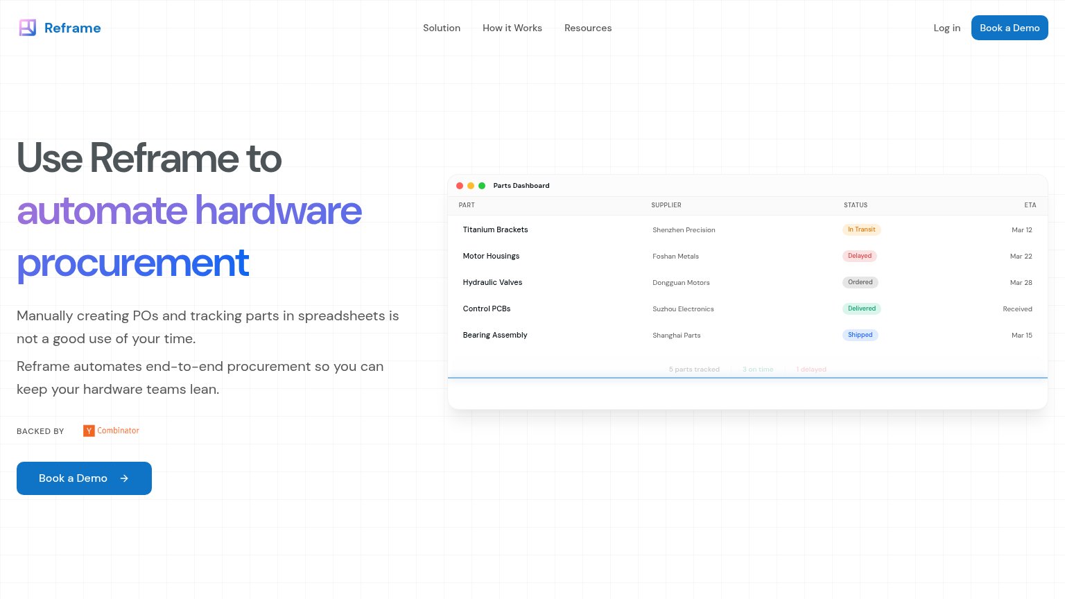
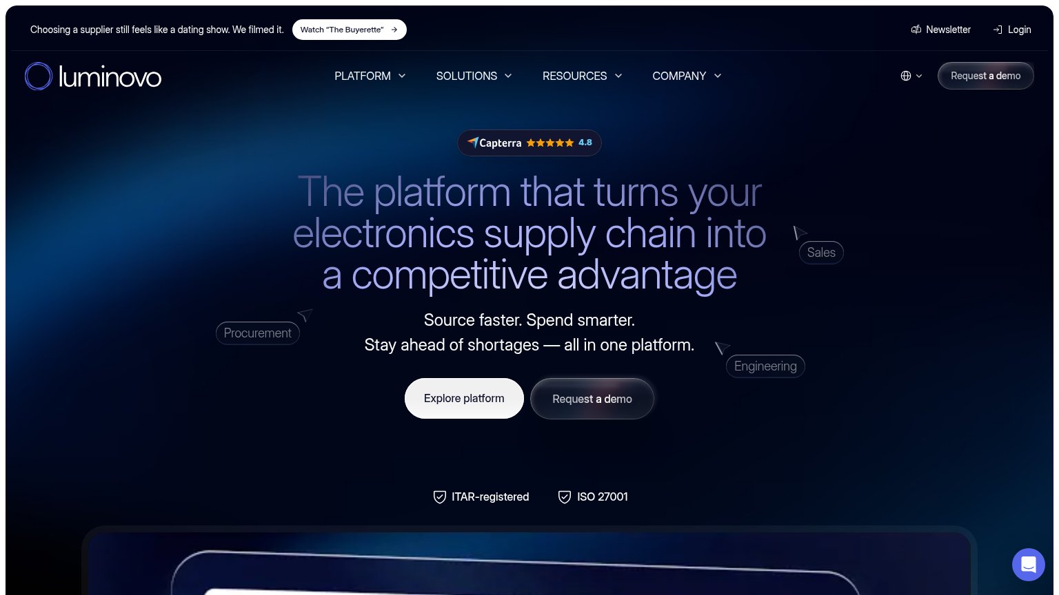
| Trust read | |
|---|---|
| Reframe | "BACKED BY Y Combinator" badge above the Book a Demo CTA |
| "ITAR-registered warehousing and kitting" | |
| No visible trust signal identified. | |
| Capterra ★★★★★ 4.8 rating badge above the hero headline | |
| Detailed "Builds Manager" product UI screenshot with real part numbers, PO data, and inventory forecast chart |
CTA
68FairCopy, size, verb, cost-feel — does the primary CTA earn the click?
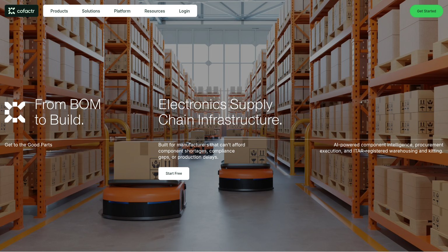
Problems
- high-cost sales-call ask
- no self-serve or trial path
- no value promised in label
- label echoes nothing in headline
Value props
72FairTitle, subtitle, hero — do they sell the product's true value?
Reframe’s headline sells
Use Reframe to automate hardware procurement
Manually creating POs and tracking parts in spreadsheets is not a good use of your time. Reframe automates end-to-end procurement so you can keep your hardware teams lean.
Working
- Names the exact job: automate procurement
- Subhead hits spreadsheet pain directly
- Dashboard hero shows the product working
Could improve
- No numbers quantify time or cost saved
- "Keep teams lean" is vague as an outcome
- Only proof point is the YC badge
Mobile web
72FairThe phone experience as a first-class citizen.
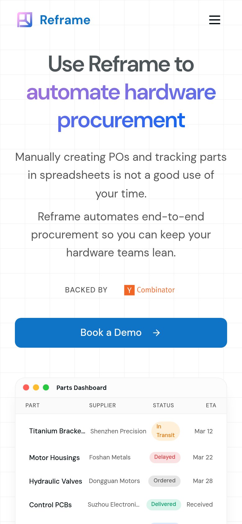 123
- Book a Demo button — Primary CTA sits a full scroll below the fold, so first-viewport visitors see no action to take.
- Stacked hero paragraphs — Two long body paragraphs consume most of the fold and push the CTA off-screen.
- Parts Dashboard table — Desktop four-column table crams into the phone width, truncating 'Titanium Bracke…' and 'Suzhou Electroni…'.
Information hierarchy
76FairDoes the design help or inhibit what the page is trying to say?
123- Duplicate Book a Demo — Nav 'Book a Demo' is styled at the same weight as the hero CTA, splitting attention across two identical actions.
- Hero Book a Demo — Teal button sits below the fold's natural scan line with a small footprint relative to the oversized headline above it.
- Parts Dashboard mockup — Status badges and footer stats ('5 parts tracked') render at low contrast, so the product proof reads as a faded placeholder.