
Your landing page’s weakest score is Information hierarchy.
How Luminovo ranks
- 1.
Luminovo74
- 2.
Reframe69
- 3.
Cofactr66
- 4.
Aligni64
- 5.
ControlHub46
74Growth scoreupdated
category scores
category scoresShowHide
Information hierarchy
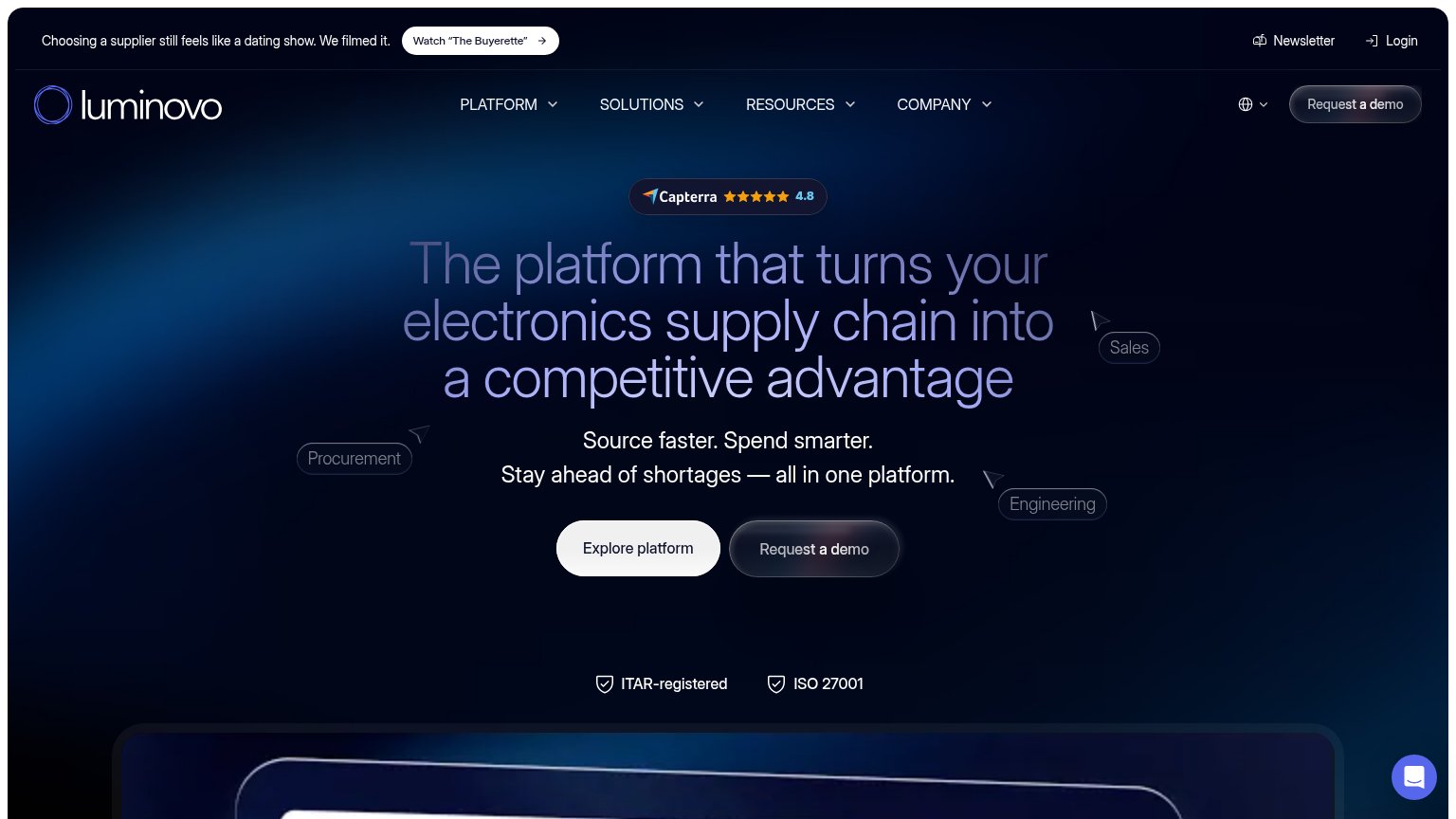
72FairDoes the design help or inhibit what the page is trying to say?
 1234
- Explore platform button — White fill outweighs the darker "Request a demo" beside it, so the secondary action reads as the primary CTA.
- Request a demo CTA — Dark translucent styling nearly dissolves into the navy background; the money action has the weakest contrast in the fold.
- Buyerette announcement banner — A pill-shaped "Watch The Buyerette" button at the very top pulls first-scan attention to a video before the value prop or demo CTA.
- Headline low contrast — Muted lavender-on-navy headline text loses legibility against the gradient, softening the value prop's first-glance punch.
Value props
72FairTitle, subtitle, hero — do they sell the product's true value?
Luminovo’s headline undersells
The platform that turns your electronics supply chain into a competitive advantage
Source faster. Spend smarter. Stay ahead of shortages — all in one platform.
Working
- Names the exact audience: electronics supply chain
- Subhead lists three concrete outcomes
- Shortage anxiety hits the buyer's real pain
Could improve
- 'Competitive advantage' is generic abstraction
- Zero numbers quantify speed or savings
- Trust badges prove credibility, not value
Trust
72FairProof that the product is real, competent, and safe to try.
How Luminovo compares
Trust read
CTA
74FairCopy, size, verb, cost-feel — does the primary CTA earn the click?
How Luminovo compares
Recommended rewrites
Mobile web
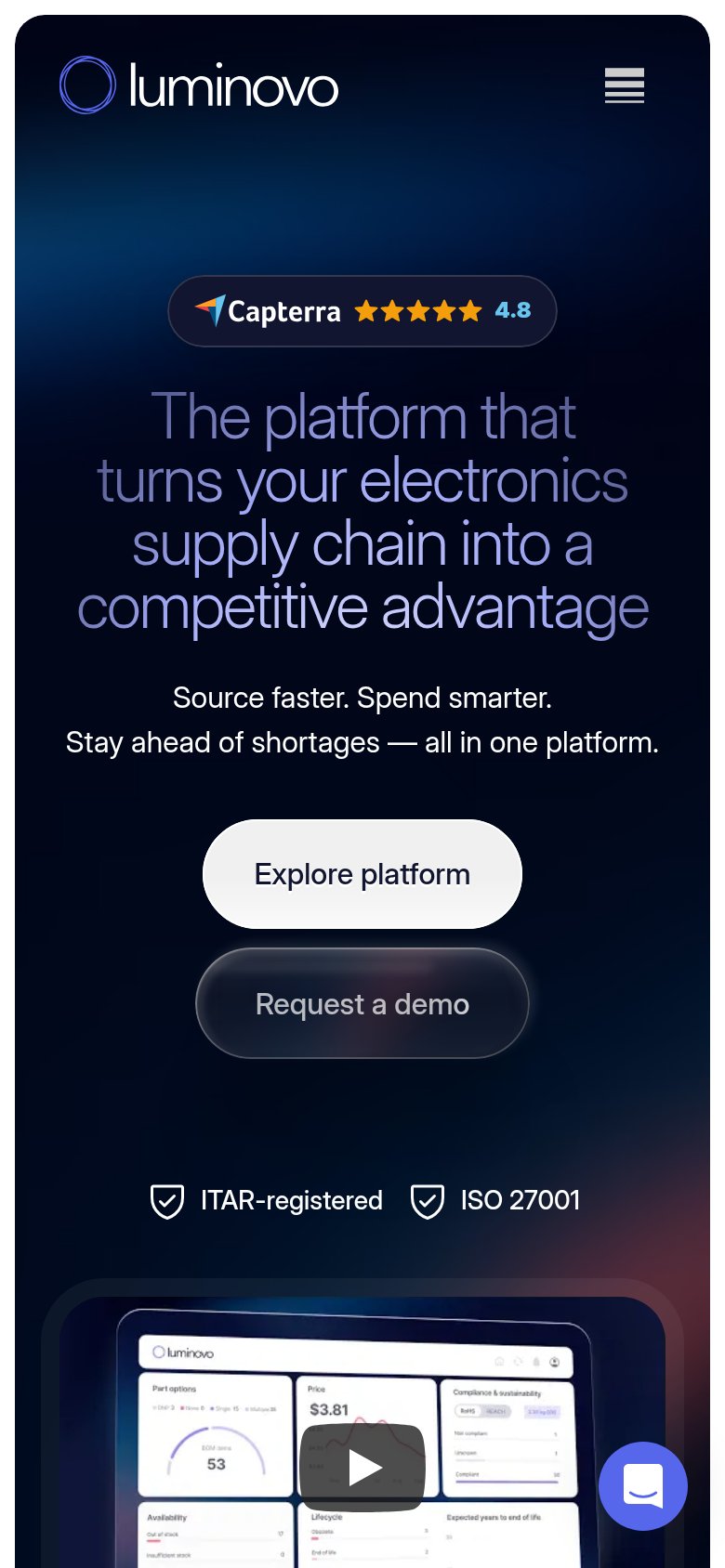
78FairThe phone experience as a first-class citizen.
What works
What to improve