SignalsYC W26 landing page report.
← Back to YC W26

Your landing page’s weakest score is Trust.

Fix Trust

Score over time

8070605040Postscript 73 on Apr 14 (Wayback)Postscript 64 on Apr 25 (Wayback)Postscript 66 on May 7 (Wayback)Postscript 59 on May 18 (Wayback)Postscript 68 on Jun 17 (Wayback)Postscript 69 on Jul 2 (Wayback)Postscript 52 on Sep 22 (Live)Attentive 70 on Jun 1 (Wayback)Attentive 67 on Jun 29 (Wayback)Attentive 65 on Jul 15 (Wayback)Attentive 70 on Jul 25 (Wayback)Attentive 69 on Aug 10 (Wayback)Attentive 69 on Sep 16 (Wayback)Attentive 70 on Sep 22 (Live)Emotive 69 on May 10 (Wayback)Emotive 70 on Sep 12 (Wayback)Emotive 69 on Sep 22 (Live)LiveRecover 72 on Sep 22 (Live)Signals 71 on Apr 14 (Wayback)Signals 68 on Apr 25 (Wayback)Signals 70 on Sep 21 (Wayback)Signals 72 on Sep 22 (Live)Apr 14Apr 25Sep 21Sep 22
Past reportsShow past reportsHide past reports
  1. Sep 22, 202672LiveOverall +2 · Mobile web +8 · Information hierarchy +4Viewing
  2. Sep 21, 202670Overall +2 · Information hierarchy +4 · Trust +4View →
  3. Apr 25, 202668Overall −3 · Mobile web −10 · Information hierarchy −3View →
  4. Apr 14, 202671First tracked report — strongest Value props 84, weakest Trust 58View →

Trust

62Fair

Proof that the product is real, competent, and safe to try.

Trust read
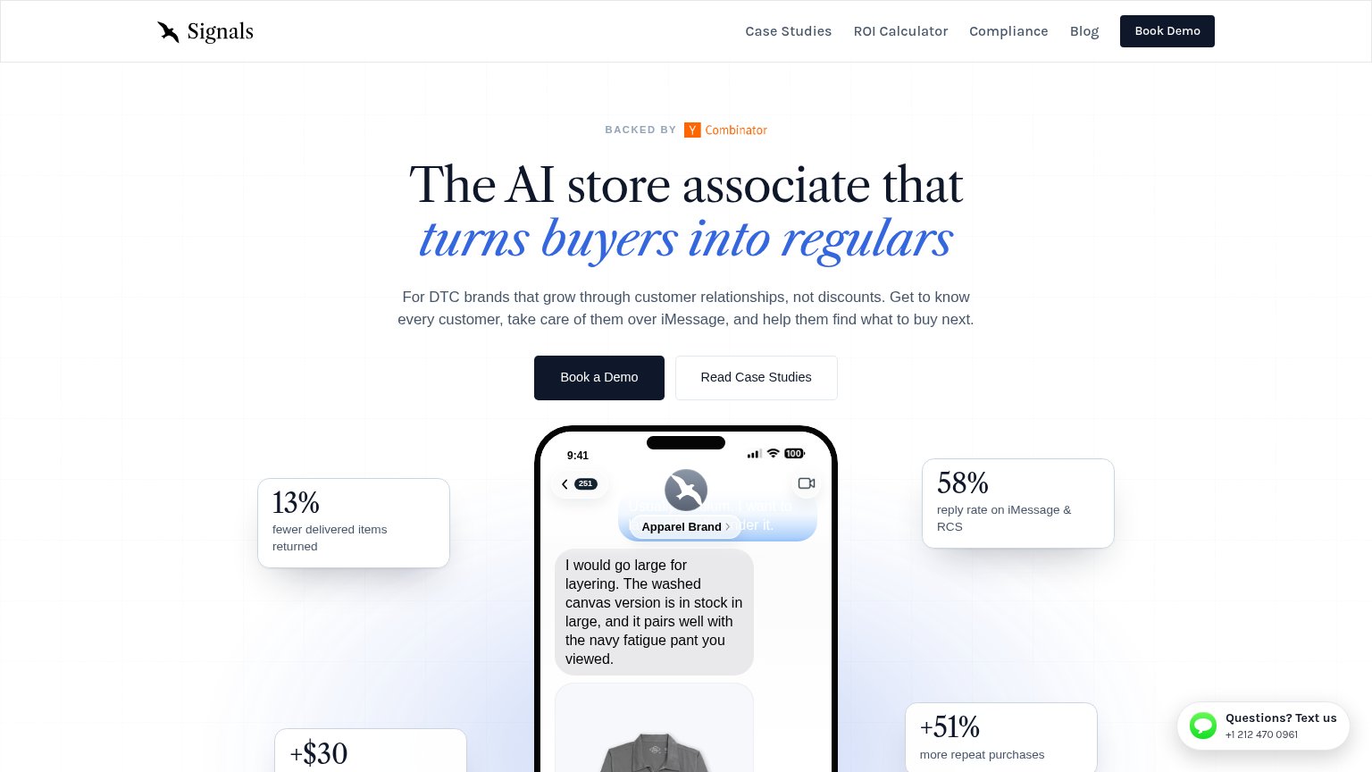
Signals"BACKED BY Y Combinator" badge above the headline
PostscriptNamed co-founder headshots — "Alex Beller, Adam Turner, Colin Turner"
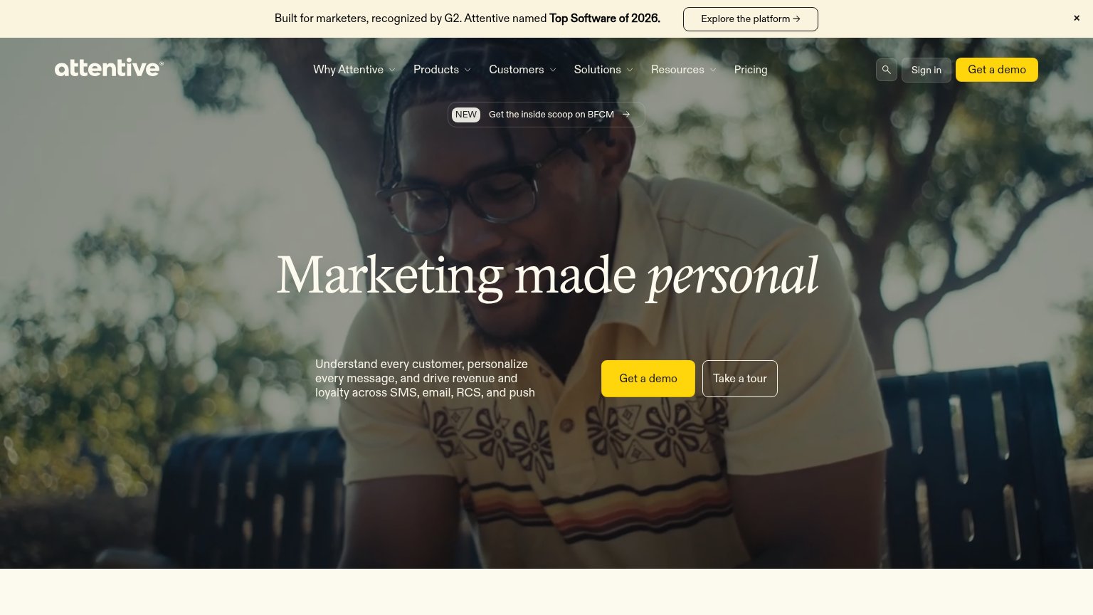
Attentive"Built for marketers, recognized by G2. Attentive named Top Software of 2026." banner
Emotive"5x SMS ROI guarantee" bullet beneath the Book a demo form
LiveRecover"$227M+ recovered" stat in the hero panel

CTA

68Fair

Copy, size, verb, cost-feel — does the primary CTA earn the click?

Signals
Attentive

Problems

  • demo booking feels costly
  • nav says 'Book Demo', hero adds 'a'
  • no low-commitment alternative path

Mobile web

72Fair

The phone experience as a first-class citizen.

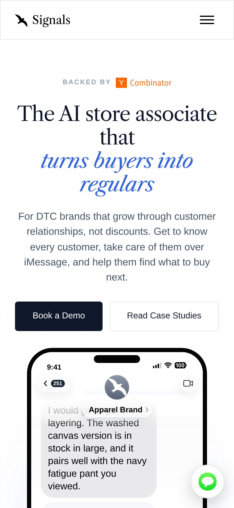
Mobile web annotations on the mobile capture1234
  1. Five-line hero headline — Desktop serif display wraps into five cramped lines, shoving the CTA to the fold's bottom edge.
  2. Apparel Brand pill — Pill renders on top of the chat bubble copy, garbling the first line of the demo message.
  3. Book a Demo button — Half-width desktop proportions split with Read Case Studies instead of a full-bleed thumb target.
  4. Chat widget bubble — Floating chat launcher overlaps the phone mockup content, adding a dead blocker over the demo.

Information hierarchy

76Fair

Does the design help or inhibit what the page is trying to say?

Information hierarchy annotations on the desktop capture1234
  1. Overlapping chat bubbles — The 'Apparel Brand' pill and blurred message collide inside the phone mockup, making the demo read as a rendering bug.
  2. Read Case Studies button — Secondary CTA sits at nearly equal size beside 'Book a Demo', splitting the click decision at the moment of action.
  3. Nav exit links — Four nav links plus a duplicate 'Book Demo' give five attention paths before the hero CTA is reached.
  4. Live chat widget — The 'Questions? Text us' bubble adds a third competing action in the lower-right corner of the fold.

Value props

84Strong

Title, subtitle, hero — do they sell the product's true value?

Signals’s headline sellsThe AI store associate that turns buyers into regularsFor DTC brands that grow through customer relationships, not discounts. Get to know every customer, take care of them over iMessage, and help them find what to buy next.

Working

  • Concrete metaphor: AI store associate
  • Names real outcome: repeat buyers
  • Hero demo shows product in action

Could improve

  • No number in headline or subhead
  • Stats fall below fold on mobile
  • Subhead runs two sentences long