
Your landing page’s weakest score is CTA.
How Polymorph ranks
- 1.
Corgea78
- 2.
DryRun Security73
- 3.
Semgrep72
- 4.
Snyk54
- 5.
Polymorph50
50Growth scoreupdated
category scores
category scoresShowHide
Score over time
CTA
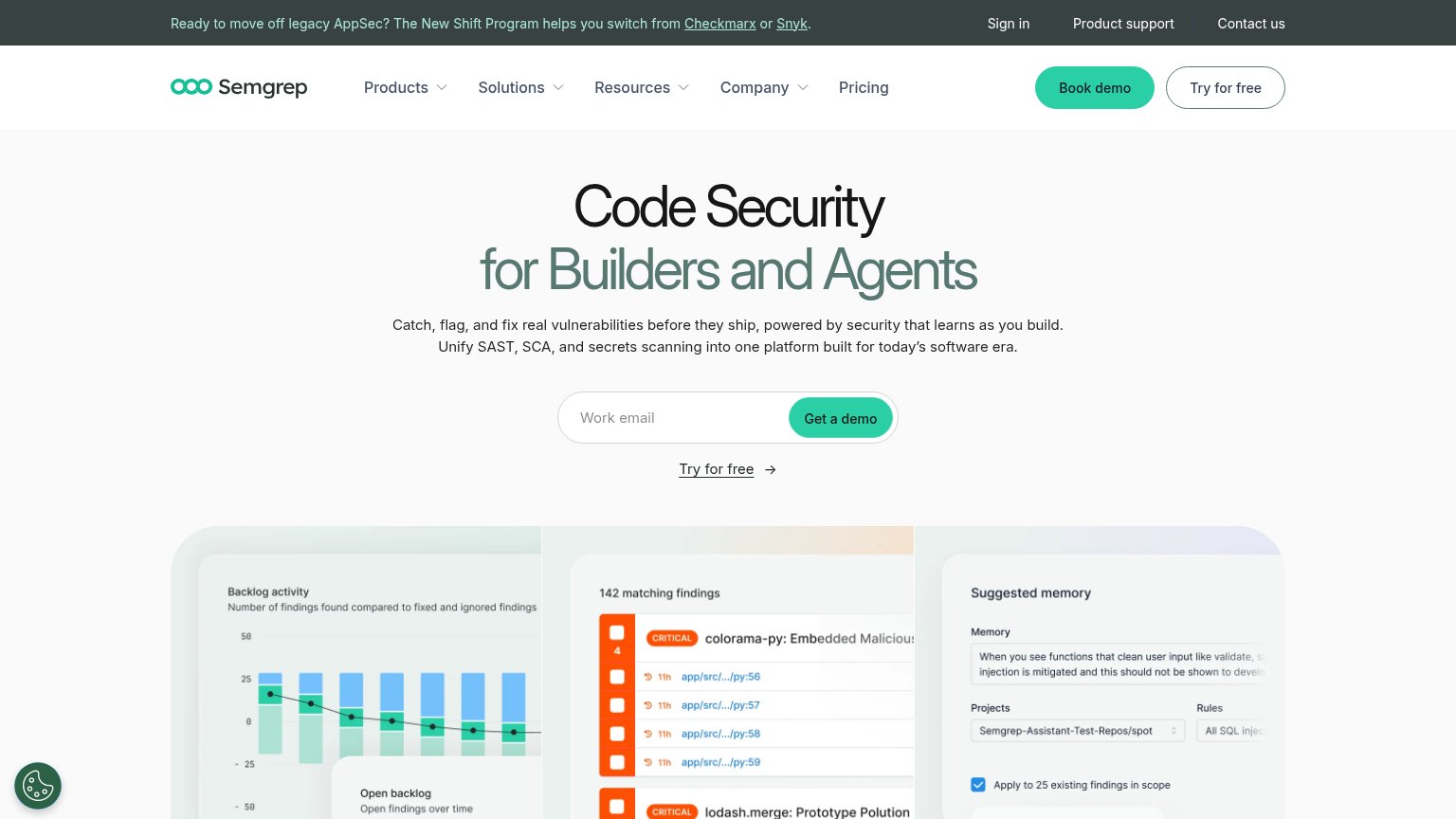
30PoorCopy, size, verb, cost-feel — does the primary CTA earn the click?


Problems
- no button or in-product action
- only CTA is inline mailto text
- email ask feels high-cost
- YC badge outstyles the action
Value props
42PoorTitle, subtitle, hero — do they sell the product's true value?
Polymorph’s headline vague
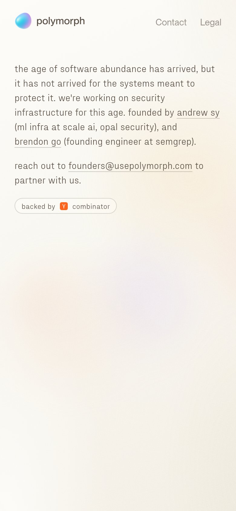
the age of software abundance has arrived, but it has not arrived for the systems meant to protect it. we're working on security infrastructure for this age. fo
reach out to founders@usepolymorph.com to partner with us.
Working
- Strong founder credentials cited
- YC badge adds credibility
- Timely framing of AI-era security
Could improve
- No statement of what the product does
- No outcome or specificity anywhere
- Hero gradient demonstrates nothing
Trust
55FairProof that the product is real, competent, and safe to try.


| Trust read | |
|---|---|
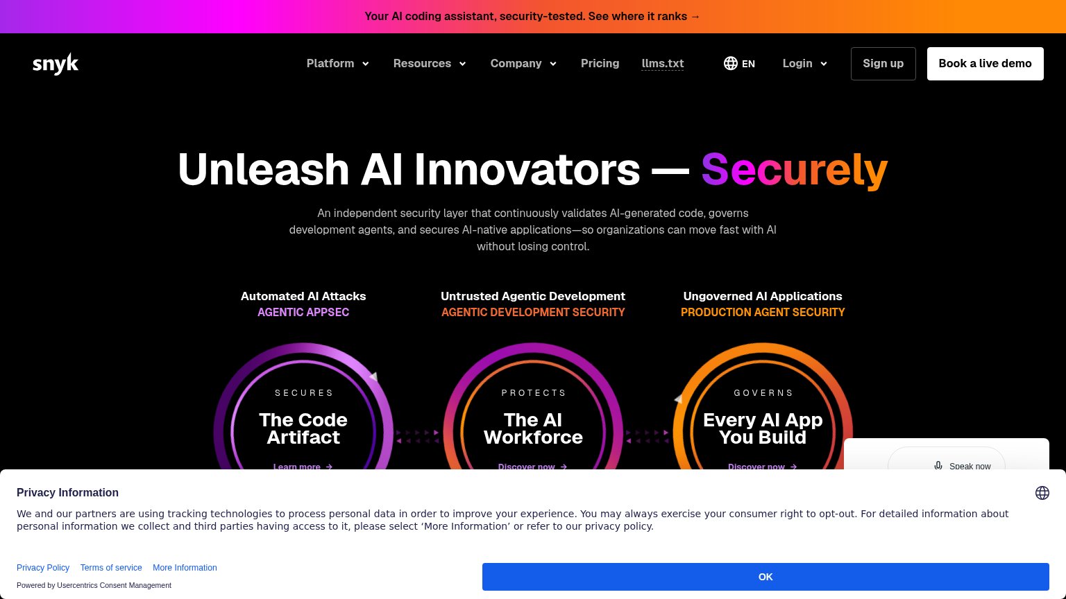
| Polymorph | "backed by Y combinator" badge beneath the contact line |
| G2 rating badge "4.6 (55 reviews)" on the mobile fold | |
| Banner: "Your AI coding assistant, security-tested. See where it ranks →" | |
| No visible trust signal identified. | |
| Customer logo strip (Zepto, Tines, Gusto, Cloudera, Flex, Dematic) under "AI-Native code security trusted by leading eng |
Information hierarchy
58FairDoes the design help or inhibit what the page is trying to say?
1234- Email link CTA — The only conversion action is an underlined mailto inside a sentence, styled identically to the founder bio links beside it.
- Mission paragraph block — The entire value prop is body-weight text with no headline, pushed to the right edge outside the natural left-to-right scan path.
- Founder bio links — "andrew sy" and "brendon go" carry the same underline weight as the CTA, adding two exits that compete with the one action.
- Contact / Legal nav — "Contact" duplicates the email CTA at equal visual weight in the top-right, splitting attention between two routes to the same action.
Mobile web
64FairThe phone experience as a first-class citizen.
 123
- Email text link — The only conversion action is a small inline mailto link, not a thumb-friendly button.
- Y Combinator pill — Styled like a button but non-actionable, drawing the eye away from the real contact link.
- Uncollapsed nav links — Desktop link row ('Contact', 'Legal') kept as-is instead of collapsing to a menu or single CTA.