
Your landing page’s weakest score is Trust.
How Perfectly ranks
73Growth scoreupdated
category scores
category scoresShowHide
Score over time
Trust
62FairProof that the product is real, competent, and safe to try.

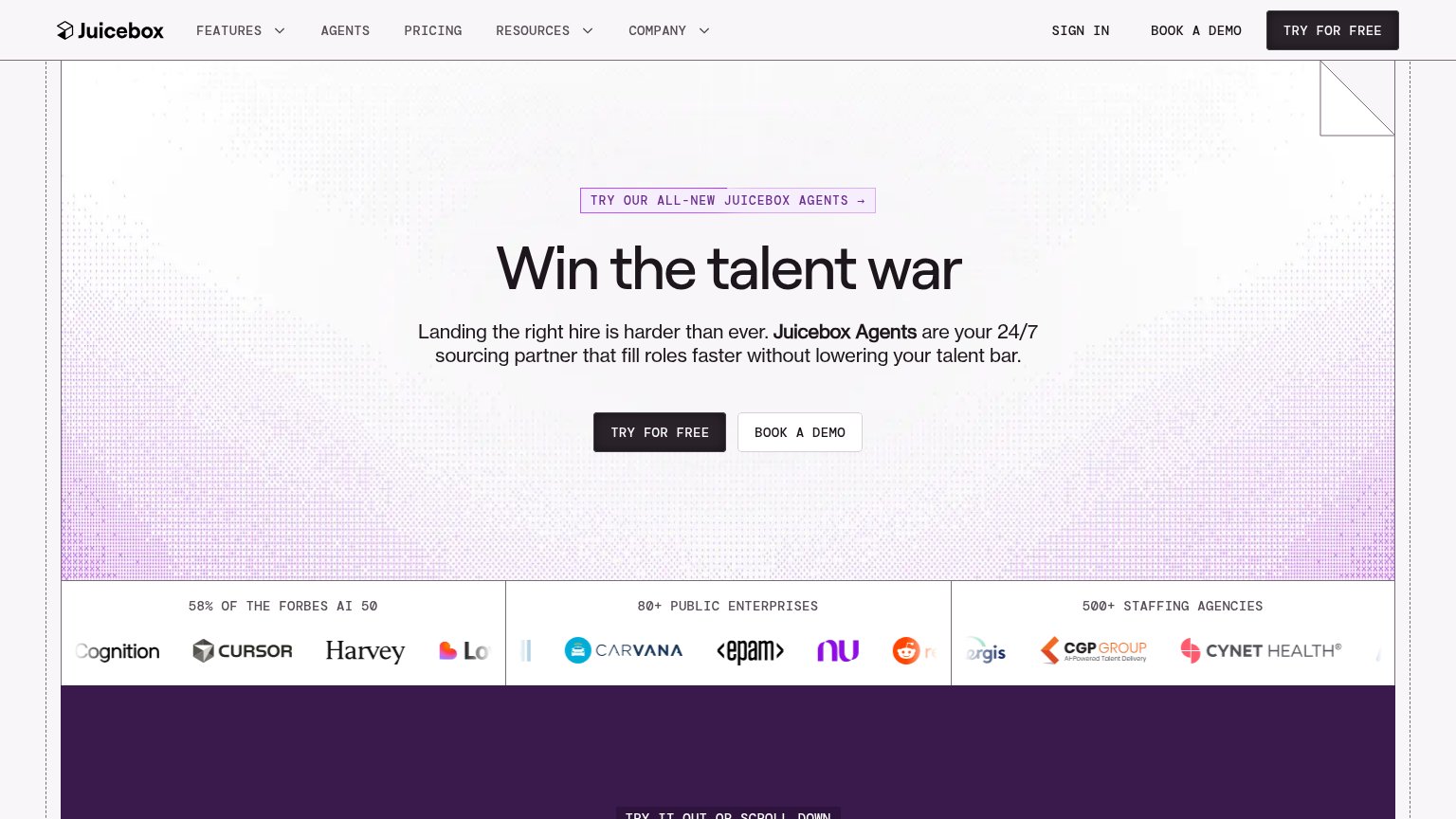
| Trust read | |
|---|---|
| Perfectly | "Backed by Y Combinator" badge above the hero headline |
| "58% OF THE FORBES AI 50" logo band with Cursor, Harvey, Notion, Carvana, EPAM logos | |
| implicit context Mercor may benefit from pre-existing familiarity among its target audience. | |
| "We raised $20M to help AI hire more humans." funding banner | |
| Candidate profile cards showing product-style UI ("Rosa · Warehouse Associate · Memphis, TN · Ready to start in 2 days" | |
| ★★★★★ Trusted by 50,000+ job seekers (directly under the CTA) |
CTA
72FairCopy, size, verb, cost-feel — does the primary CTA earn the click?
Problems
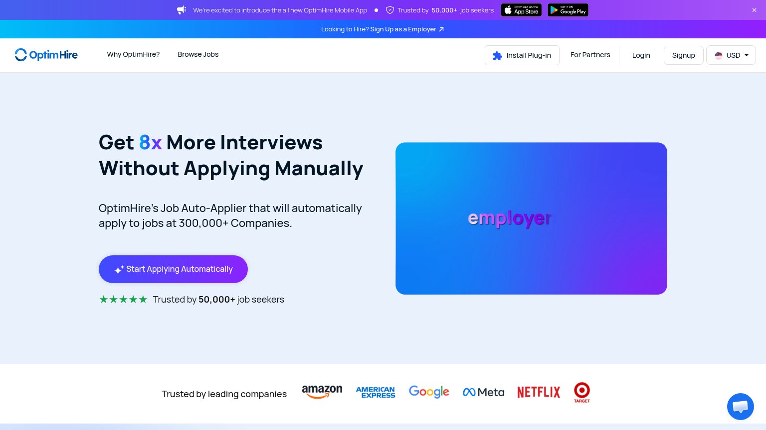
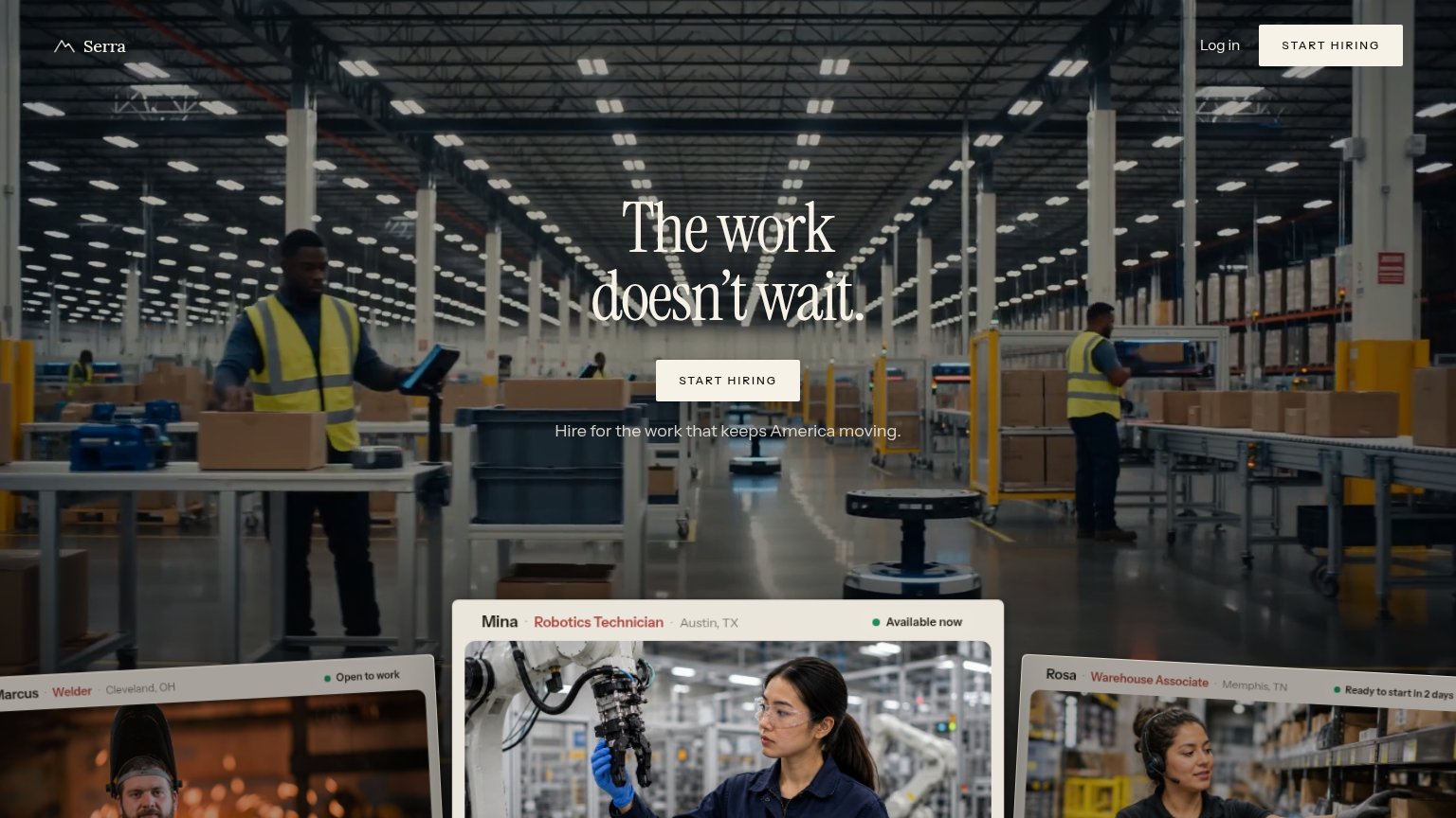
- conflicts with nav 'Schedule Demo'
- 'Now' adds urgency, not payoff
- destination unclear: demo or product?
- no echo of headline promise
Value props
72FairTitle, subtitle, hero — do they sell the product's true value?
Perfectly’s headline sells
Your AI recruiter for understaffed teams
Our agents autonomously handles sourcing, outreach, and coordination to free up time for high-growth startup recruiters
Working
- Names exact audience: understaffed teams
- Subhead lists 3 concrete tasks
- YC badge adds instant credibility
Could improve
- No numbers quantifying time saved
- Hero video shows founder, not product
- Grammar slip: 'agents handles'
Information hierarchy
76FairDoes the design help or inhibit what the page is trying to say?
123- Schedule Demo button — Styled at identical dark-pill weight to "Get Started Now", splitting the primary action between two CTAs.
- Founder video block — Video sits mostly below the fold cut, showing an ambiguous dark frame that communicates nothing at the fold edge.
- Researcher Scout link — Unexplained nav link offers an exit path with no context on what it leads to.
Mobile web
82StrongThe phone experience as a first-class citizen.
 123
- Schedule Demo header CTA — Competes with "Get Started Now" below — two dark CTAs split the first tap between demo and signup.
- Video caption overlap — The "Victor / CEO Perfectly" caption collides with the play button and scrubber, making both hard to read.
- Get Started Now button — Sits at desktop proportions with wide side margins instead of a near-full-bleed thumb target.