Patientdesk.aiYC W26 landing page report.
← Back to YC W26

Your landing page’s weakest score is Information hierarchy.

How Patientdesk.ai ranks

  1. 1.Patientdesk.ai72
  2. 2.Arini68
  3. 3.Peerlogic68
  4. 4.Curve Dental63
  5. 5.Annie by Viva62
  6. 6.Adit54
Fix Information hierarchy

Score over time

8070605040Arini 71 on Jun 5 (Wayback)Arini 68 on Sep 20 (Live)Annie by Viva 62 on Sep 22 (Live)Peerlogic 69 on Jul 24 (Wayback)Peerlogic 70 on Aug 6 (Wayback)Peerlogic 68 on Sep 22 (Live)Adit 51 on May 5 (Wayback)Adit 50 on May 19 (Wayback)Adit 51 on Jun 3 (Wayback)Adit 51 on Jun 17 (Wayback)Adit 51 on Jul 1 (Wayback)Adit 51 on Jul 15 (Wayback)Adit 54 on Sep 22 (Live)Curve Dental 59 on May 28 (Wayback)Curve Dental 61 on Jul 4 (Wayback)Curve Dental 62 on Jul 30 (Wayback)Curve Dental 62 on Aug 10 (Wayback)Curve Dental 63 on Sep 1 (Wayback)Curve Dental 62 on Sep 9 (Wayback)Curve Dental 63 on Sep 22 (Live)Patientdesk.ai 76 on Mar 27 (Wayback)Patientdesk.ai 73 on Apr 20 (Wayback)Patientdesk.ai 74 on May 11 (Wayback)Patientdesk.ai 69 on Jun 14 (Wayback)Patientdesk.ai 72 on Sep 22 (Live)Mar 27Apr 20May 11Jun 14Sep 22
Past reportsShow past reportsHide past reports
  1. Sep 22, 202672LiveOverall +3 · Mobile web +12 · Trust +10Viewing
  2. Jun 14, 202669Overall −5 · Trust −14 · Mobile web −8View →
  3. May 11, 202674Overall +1 · Trust +4 · Information hierarchy +2View →
  4. Apr 20, 202673Overall −3 · Mobile web −6 · Information hierarchy −4View →
  5. Mar 27, 202676First tracked report — strongest Mobile web 82, weakest CTA 68View →

Information hierarchy

68Fair

Does the design help or inhibit what the page is trying to say?

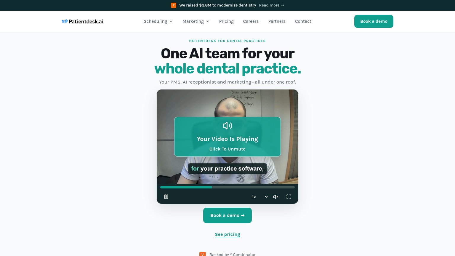
Information hierarchy annotations on the desktop capture1234
  1. Unmute overlay panel — A large teal 'Patientdesk.ai's Video Is Playing / Click To Unmute' panel covers the founder's face, so the fold's biggest visual element reads as a UI error rather than a product story.
  2. Top navigation row — Six equal-weight links (Scheduling, Marketing, Pricing, Careers, Partners, Contact) plus two dropdowns give attention eight exits before the hero CTA.
  3. Fundraise announcement banner — 'Read more →' at the very top of the scan path is the first clickable element and routes visitors away from the demo funnel.
  4. See pricing link — Underlined secondary link sits directly beneath 'Book a demo ➞', splitting the single action into two competing choices at the decision point.

Trust

68Fair

Proof that the product is real, competent, and safe to try.

Trust read
Patientdesk.ai"TRUSTED BY DENTAL PRACTICES" logo strip with Glenferrie Dental and Kings Dental
AriniVoice call transcript card showing the AI receptionist answering: "Hi there. Thank you for calling Arini Dental. This is
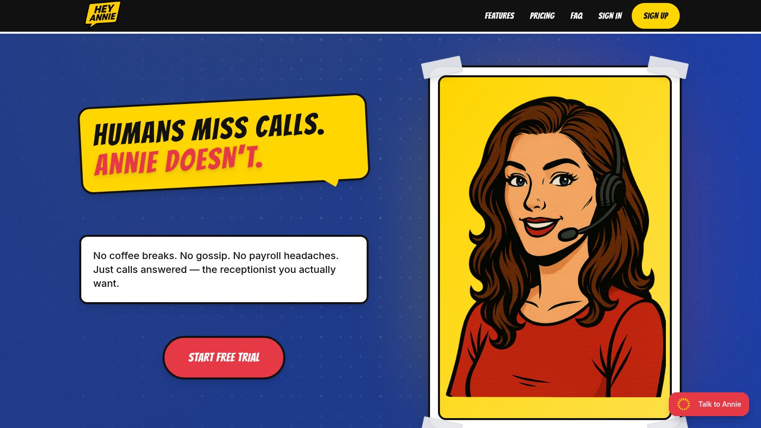
Annie by Viva"Talk to Annie" live demo widget
PeerlogicLive-transcript product demo showing a real AI call for "Mesa Family Dental" with specific pricing dialogue ("Implants a
AditNo visible trust signal identified.
Curve Dental"We're investing $200M to build what's next for dental practices." announcement bar

CTA

72Fair

Copy, size, verb, cost-feel — does the primary CTA earn the click?

Patientdesk.ai
Annie by Viva

Problems

  • demo click feels costly/committal
  • no value promised for the click
  • no low-friction alternative path

Value props

72Fair

Title, subtitle, hero — do they sell the product's true value?

Patientdesk.ai’s headline sellsOne AI team for your whole dental practice.Your PMS, AI receptionist and marketing—all under one roof.

Working

  • Names the exact audience: dental practices
  • Subhead lists three concrete product nouns
  • YC badge and dental logos add credibility

Could improve

  • No numbers or measurable outcome in hero
  • Copy is flat — no pain or relief evoked
  • Video shows a face, not the product working

Mobile web

80Strong

The phone experience as a first-class citizen.

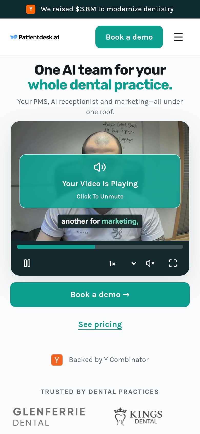
Mobile web annotations on the mobile capture123
  1. Autoplaying muted video — Eats most of the fold and pushes the full-width Book a demo CTA to the viewport edge.
  2. Click To Unmute overlay — A large interstitial card covering the video demands an extra tap before any content is heard.
  3. Fundraise announcement banner — The $3.8M promo bar adds a second header row and steals hero height with no visitor action.

Competitors

inferred from product, audience, and value prop