
Your landing page’s weakest score is Trust.
How Parameter ranks
73Growth scoreupdated
category scores
category scoresShowHide
Score over time
Trust
48PoorProof that the product is real, competent, and safe to try.


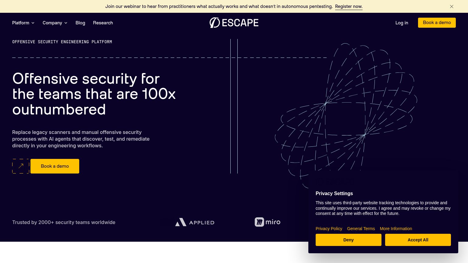


| Trust read | |
|---|---|
| Parameter | "Backed by Y Combinator" badge above the hero headline |
| "150+ security teams trust XBOW to find and prove the flaws attackers would actually exploit" | |
| Video player branded "HORIZON3 — AI-NATIVE PROACTIVE SECURITY" below the hero (visible in the mobile capture) | |
| Gartner Peer Insights Customers' Choice 2026 badge (mobile capture) | |
| Product dashboard UI showing "Signals Received 148" and "5 Critical Findings" | |
| "Trusted by 2000+ security teams worldwide" with Applied and Miro logos |
CTA
68FairCopy, size, verb, cost-feel — does the primary CTA earn the click?
Problems
- 'call' feels costly and committal
- sells the meeting, not the payoff
- microcopy payoff not in the label
Value props
82StrongTitle, subtitle, hero — do they sell the product's true value?
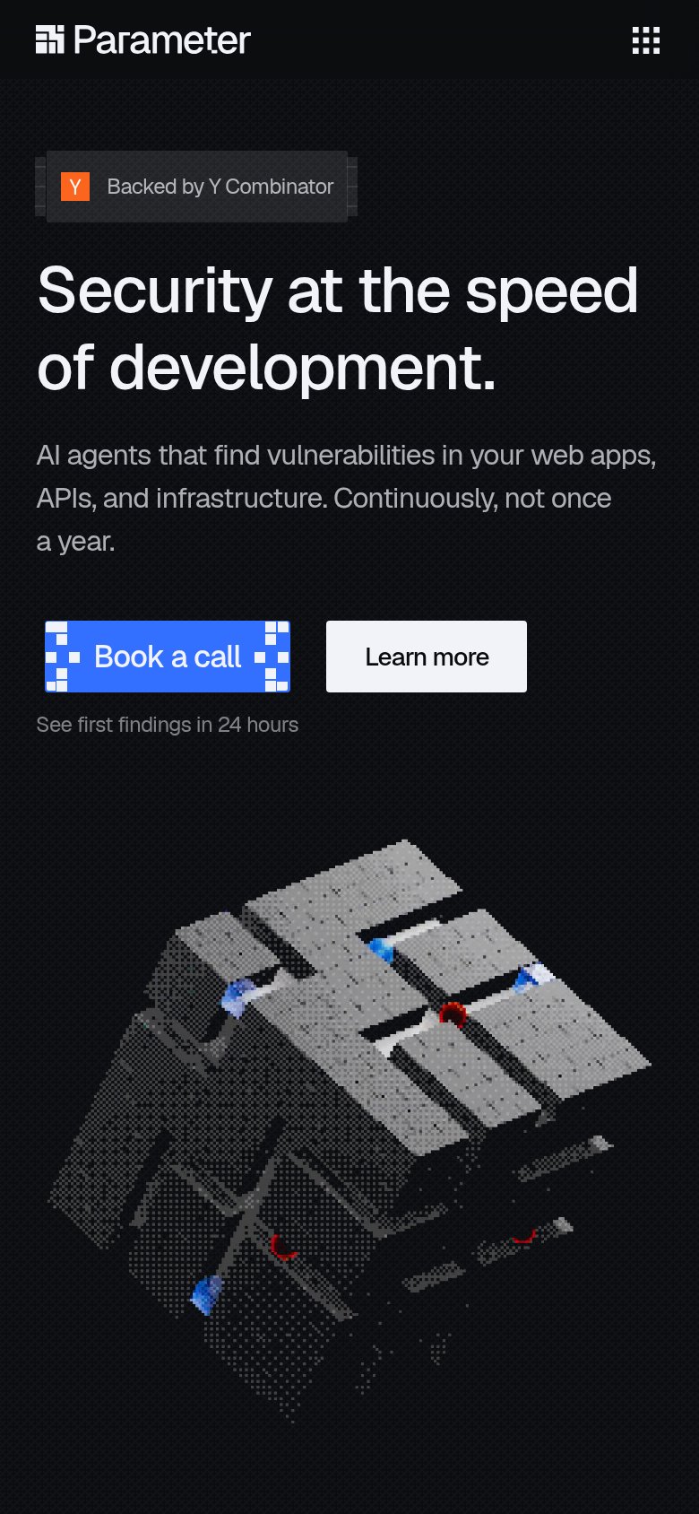
Parameter’s headline sells
Security at the speed of development.
AI agents that find vulnerabilities in your web apps, APIs, and infrastructure. Continuously, not once a year.
Working
- Names the speed-vs-security tension
- 'Not once a year' hits pentest pain
- Numbers strip adds hard proof
Could improve
- Hero art decorates, doesn't demo
- $30B+ claim strains credibility
- '24 hours' proof buried under CTA
Mobile web
82StrongThe phone experience as a first-class citizen.
 12
- Side-by-side CTA pair — "Book a call" and "Learn more" keep desktop proportions instead of stacking near-full-bleed for the thumb.
- Pixel-corner CTA styling — Decorative pixel blocks on "Book a call" clutter the button edges and blur its tap boundary at phone scale.
Information hierarchy
84StrongDoes the design help or inhibit what the page is trying to say?
123- Learn more button — White fill on dark background out-contrasts the blue primary CTA, splitting first-glance attention.
- Book a call CTA — Pixel-corner decorations blur the button's edges and shrink its perceived click target; also duplicated in the nav.
- Proof metrics strip — Low-contrast dark-on-dark panels make $30B+ and 24/7 proof easy to miss on scan.