
Your landing page’s weakest score is Trust.
How Oxus ranks
70Growth scoreupdated
category scores
category scoresShowHide
Score over time
Trust
52FairProof that the product is real, competent, and safe to try.
| Trust read | |
|---|---|
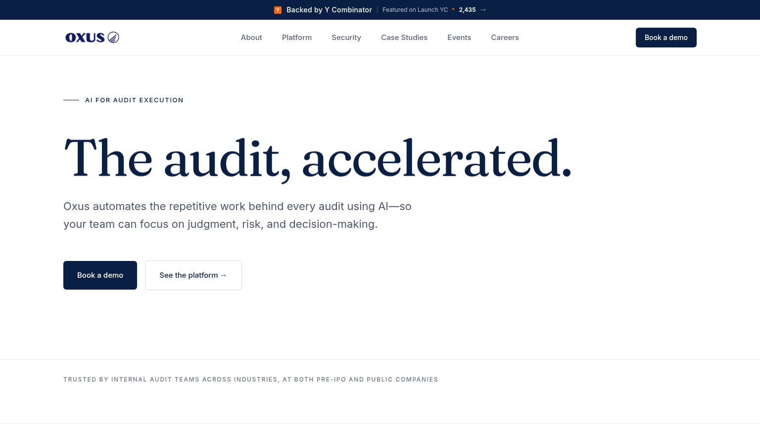
| Oxus | "Backed by Y Combinator" banner with "Featured on Launch YC" and 2,435 upvotes |
| No visible trust signal identified. | |
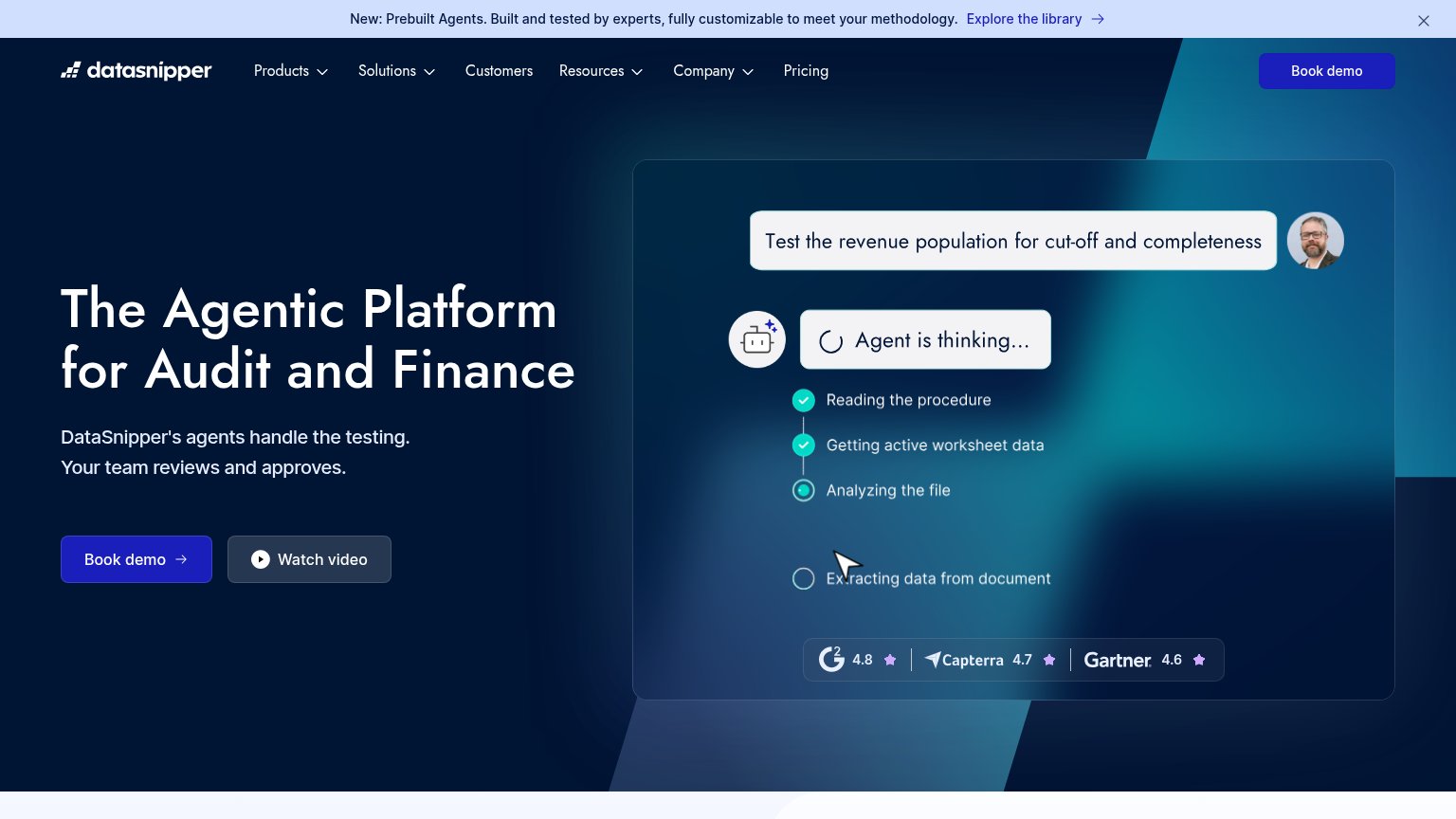
| Review-score strip in the hero demo: G2 4.8, Capterra 4.7, Gartner 4.6 | |
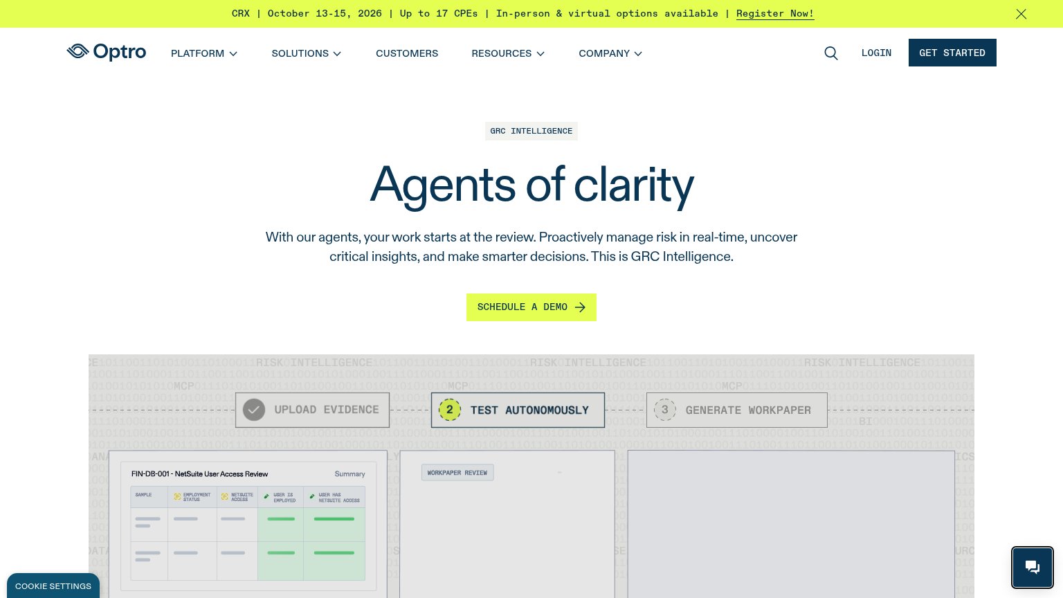
| Product workflow UI showing "Upload Evidence / Test Autonomously / Generate Workpaper" with a NetSuite User Access Revie | |
| "MindBridge analyzes 100% of financial transactions to help finance and audit teams identify risk, understand what matte |
CTA
70FairCopy, size, verb, cost-feel — does the primary CTA earn the click?
Problems
- high-commitment sales-call feel
- mobile header shortens to 'Demo'
- no lower-friction product path first
Value props
72FairTitle, subtitle, hero — do they sell the product's true value?
Oxus’s headline sells
The audit, accelerated.
Oxus automates the repetitive work behind every audit using AI—so your team can focus on judgment, risk, and decision-making.
Working
- Outcome-led headline: speed
- Subhead names the real mechanism
- Judgment-vs-drudgery emotional trade
Could improve
- No numbers or quantified outcome
- Hero is empty — no product shown
- Trust bar names no logos
Information hierarchy
76FairDoes the design help or inhibit what the page is trying to say?
123- Six-link nav row — About, Platform, Security, Case Studies, Events, Careers all sit at equal weight and leak attention before the hero CTA.
- Launch YC banner — Outbound arrow and vote counter at the very top pull visitors off-site before the value prop registers.
- Header Book a demo — Duplicates the hero primary CTA at identical styling, splitting the single-action focus of the fold.
Mobile web
78FairThe phone experience as a first-class citizen.
 123
- YC announcement banner — Wraps to two cramped lines and stacks a second header deck above the nav, eating the top of the fold.
- Header Demo pill — Duplicates the hero's full-width Book a demo button, splitting the primary tap target.
- Vote count 2,435 — Truncated context on mobile — an upvote number with no visible label reads as noise beside the banner.