OpenSpecYC W26 landing page report.
← Back to YC W26

Your landing page’s weakest score is CTA.

How OpenSpec ranks

  1. 1.GitHub Spec Kit69
  2. 2.Kiro69
  3. 3.OpenSpec66
  4. 4.Tessl65
Fix CTA

Score over time

8070605040GitHub Spec Kit 69 on Jul 26 (Live)Kiro 67 on Jul 1 (Wayback)Kiro 49 on Jul 14 (Wayback)Kiro 71 on Jul 27 (Wayback)Kiro 70 on Aug 11 (Wayback)Kiro 67 on Aug 25 (Wayback)Kiro 64 on Sep 9 (Wayback)Kiro 69 on Sep 22 (Live)Tessl 59 on Jun 7 (Wayback)Tessl 67 on Jul 23 (Wayback)Tessl 69 on Sep 3 (Wayback)Tessl 65 on Sep 22 (Live)OpenSpec 60 on May 19 (Wayback)OpenSpec 59 on Jun 6 (Wayback)OpenSpec 60 on Jul 1 (Wayback)OpenSpec 62 on Aug 12 (Wayback)OpenSpec 66 on Aug 31 (Wayback)OpenSpec 65 on Sep 9 (Wayback)OpenSpec 66 on Sep 22 (Live)May 19Jun 6Jul 1Aug 12Aug 31Sep 9Sep 22
Past reportsShow past reportsHide past reports
  1. Sep 22, 202666LiveOverall +1 · Mobile web +4 · Information hierarchy +2Viewing
  2. Sep 9, 202665Overall −1 · CTA −6View →
  3. Aug 31, 202666Overall +4 · Value props +26 · CTA −14View →
  4. Aug 12, 202662Overall +2 · CTA +14 · Mobile web −6View →
  5. Jul 1, 202660Overall +1 · Trust +6 · CTA −3View →
  6. Jun 6, 202659Overall −1 · Trust −10 · Mobile web +6View →
  7. May 19, 202660First tracked report — strongest Trust 72, weakest Value props 52View →

CTA

48Poor

Copy, size, verb, cost-feel — does the primary CTA earn the click?

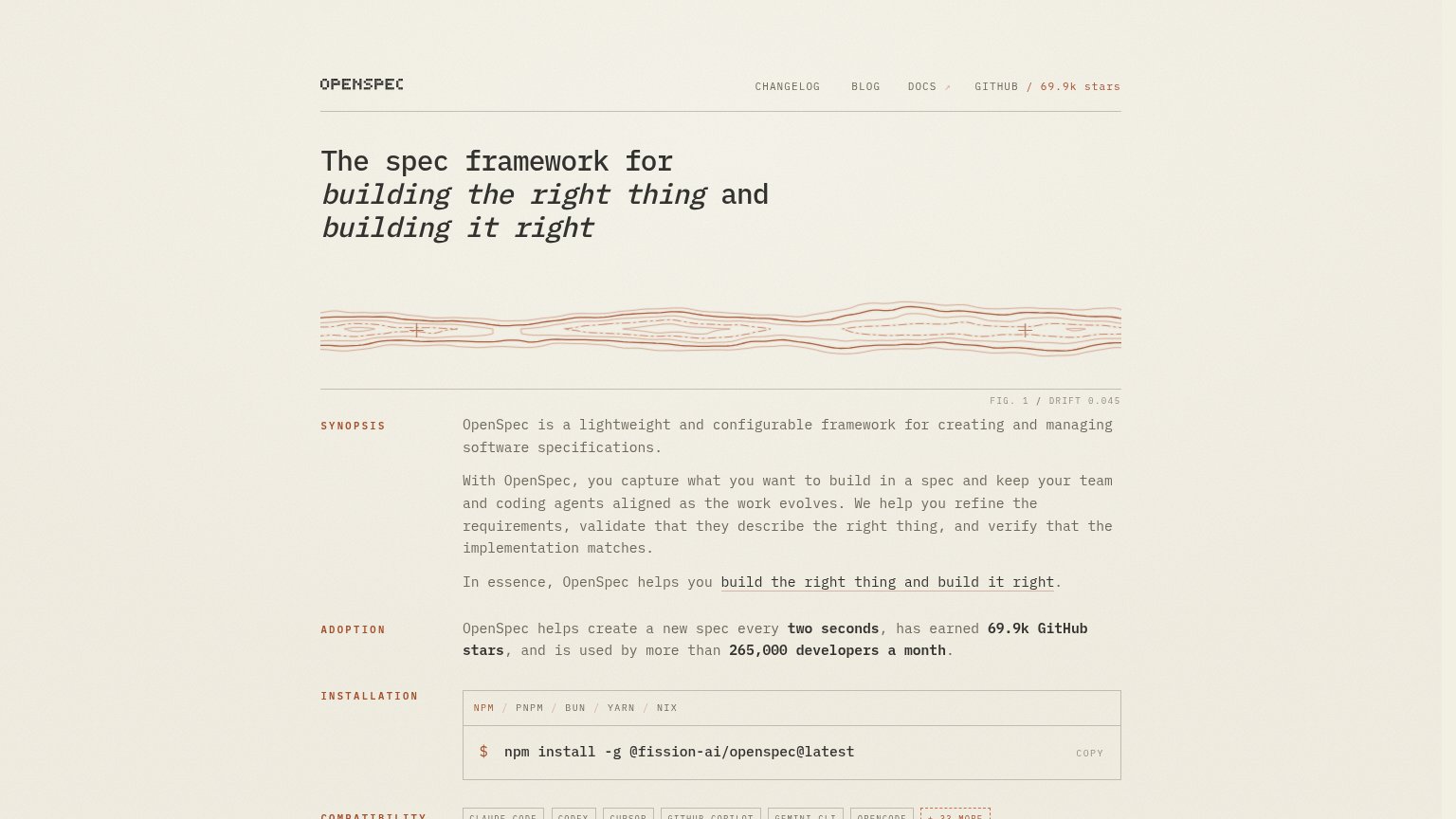
OpenSpecin-product action
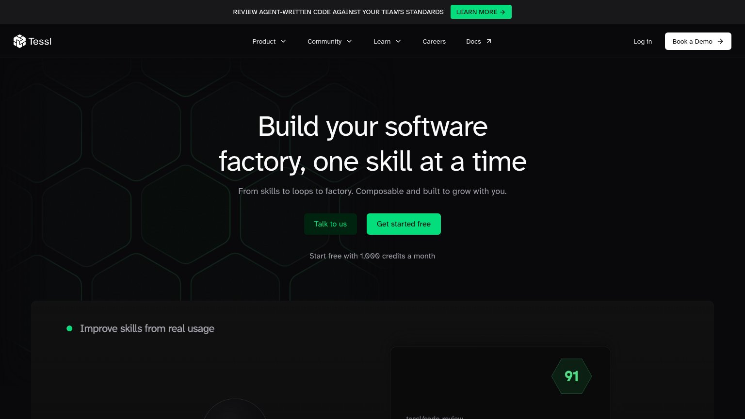
Tessl
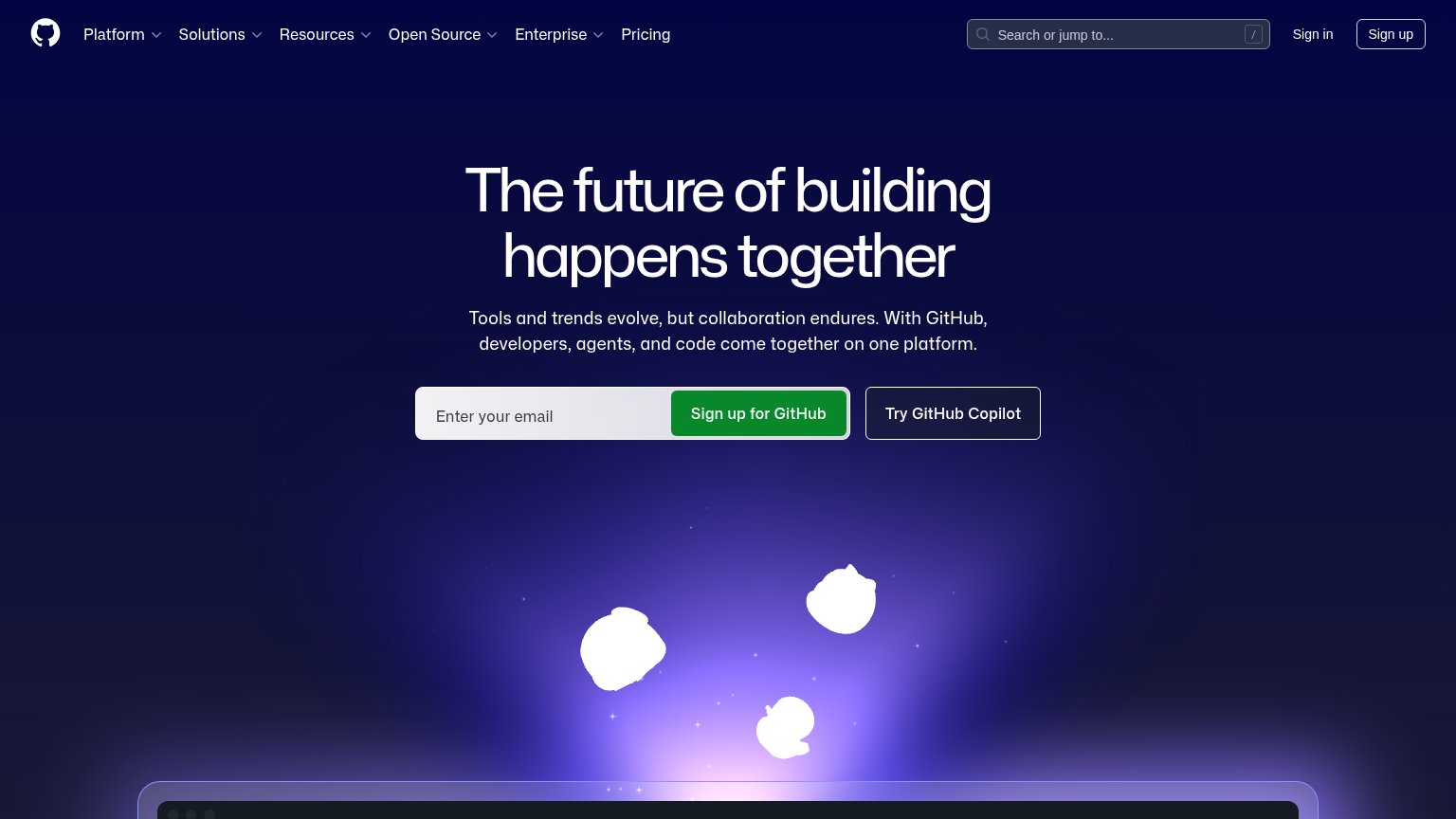
GitHub Spec Kit
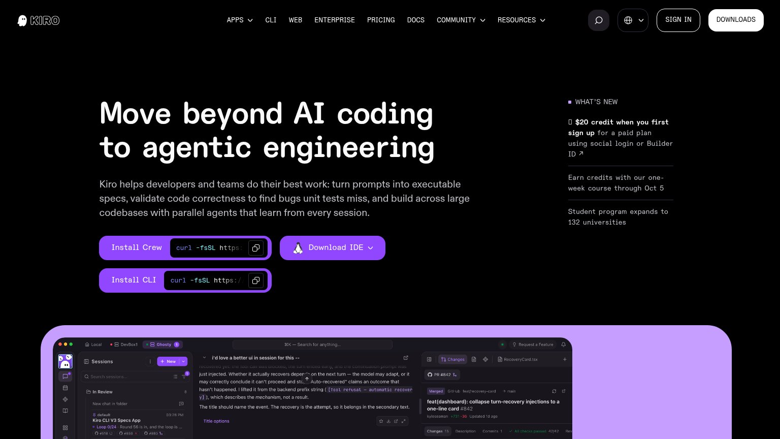
Kiro

Problems

  • at bottom edge of desktop fold
  • absent from mobile fold entirely
  • styled as docs, not an action
  • no action verb or payoff copy

Mobile web

62Fair

The phone experience as a first-class citizen.

Mobile web annotations on the mobile capture12
  1. SYNOPSIS body paragraphs — Monospace body text barely scales down, wrapping into nine dense lines that push the install CTA far below the fold.
  2. Decorative wave graphic — Large ornamental band consumes prime viewport space while the primary install action sits off-screen.

Information hierarchy

68Fair

Does the design help or inhibit what the page is trying to say?

Information hierarchy annotations on the desktop capture1234
  1. Install command block — The only actionable element sits at the fold's bottom edge in the same muted weight as body copy — no visitor finds it in one second.
  2. GitHub stars nav link — The red '/ 69.9k stars' is the highest-contrast element in the header, pulling attention to an exit before any on-page action.
  3. Inline anchor link — The underlined 'build the right thing and build it right' link reads as the page's most prominent action but competes with the install CTA below.
  4. Nav link row — Four equal-weight exits (CHANGELOG, BLOG, DOCS, GITHUB) with no subordinate styling siphon attention before the value prop lands.

Trust

72Fair

Proof that the product is real, competent, and safe to try.

Trust read
OpenSpec"69.9k GitHub stars" and "265,000 developers a month" in the ADOPTION section
GitHub Spec KitCode editor screenshot with tabs "game.ts", "characters.module.css", "bonus-level.ts"
KiroReal IDE screenshot with sessions list, PR pane "feat(dashboard): collapse turn-recovery injections" #842 and passing ch
TesslProduct UI panel "Improve skills from real usage" showing a code-review scorecard (Quality 89%, Impact 99%, Security Pas

Value props

82Strong

Title, subtitle, hero — do they sell the product's true value?

OpenSpec’s headline sellsThe spec framework for building the right thing and building it rightOpenSpec is a lightweight and configurable framework for creating and managing software specifications.

Working

  • Names category and dual outcome in one line
  • Rare proof: 69.9k stars, 265k devs/month
  • Agent-alignment value spelled out in synopsis

Could improve

  • No emotional hook for wrong-thing pain
  • Hero art decorates, never demonstrates
  • Proof numbers buried below the fold line

Competitors

inferred from product, audience, and value prop