
Your landing page’s weakest score is CTA.
How Mango Medical ranks
40Growth scoreupdated
category scores
category scoresShowHide
Score over time
CTA
25PoorCopy, size, verb, cost-feel — does the primary CTA earn the click?
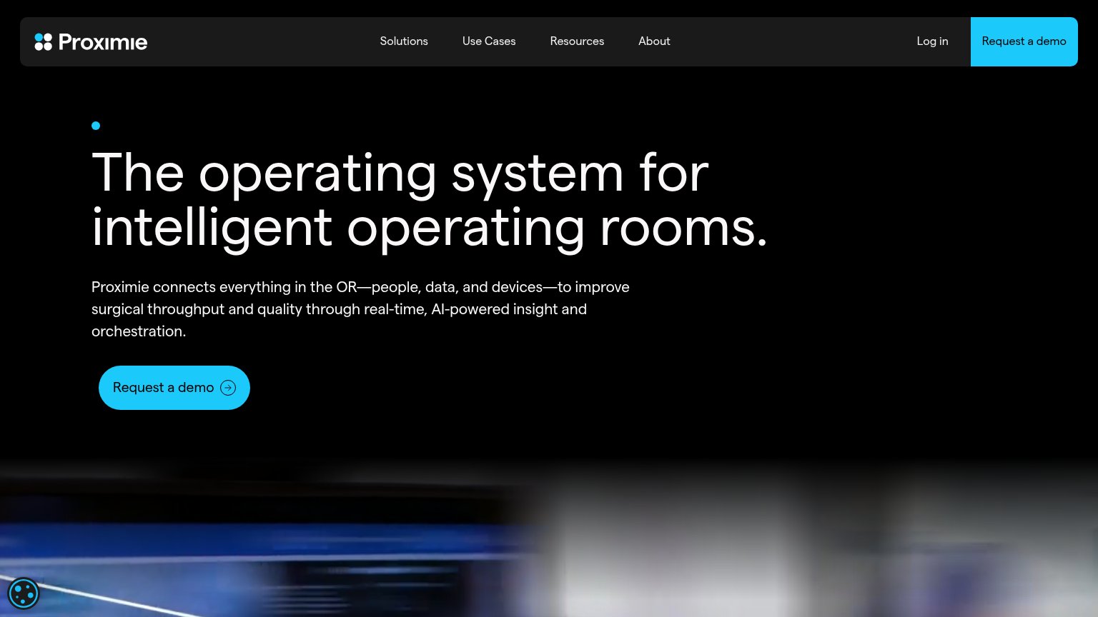
Problems
- no CTA anywhere in the fold
- YC badge is only clickable-looking item
- no nav, no link, no next step
Value props
32PoorTitle, subtitle, hero — do they sell the product's true value?
Mango Medical’s headline vague
Mango Medical
GLOBAL SURGICAL INTELLIGENCE
Working
- YC badge adds instant credibility
- Clean, memorable brand presentation
- Tagline hints at the category
Could improve
- Headline is just the company name
- No outcome, user, or use case named
- Zero specifics or proof points
Trust
44PoorProof that the product is real, competent, and safe to try.

| Trust read | |
|---|---|
| Mango Medical | "Backed by Y Combinator" badge |
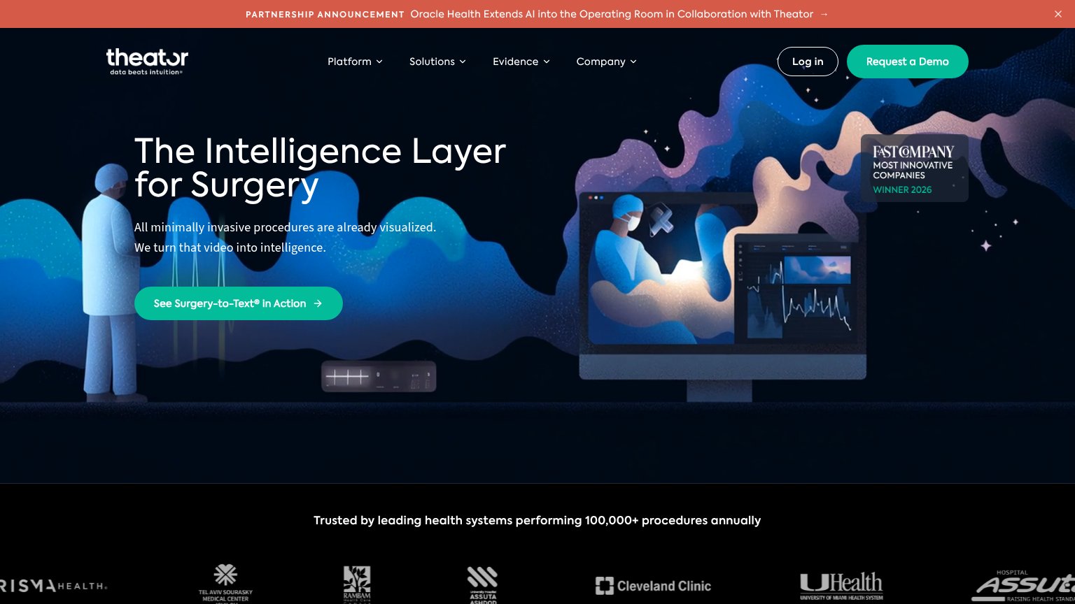
| "Trusted by leading health systems performing 100,000+ procedures annually" logo wall with Cleveland Clinic and UHealth | |
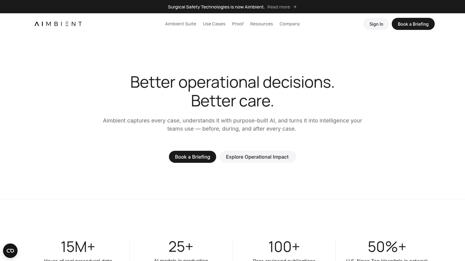
| "100+ Peer-reviewed publications" stats bar alongside "15M+ hours of real procedural data" and "50%+ U.S. News Top Hospi | |
| No visible trust signal identified. |
Mobile web
44PoorThe phone experience as a first-class citizen.
 1
- Y Combinator badge — A credibility pill styled like a button is the most prominent tappable-looking element, drawing the thumb toward a dead end.
Information hierarchy
55FairDoes the design help or inhibit what the page is trying to say?
12- Y Combinator badge — The only button-shaped element in the fold routes attention to YC instead of a product action.
- Subtitle carries no meaning — "GLOBAL SURGICAL INTELLIGENCE" is styled as a faint caption, too low-contrast to land as the value proposition.