
Your landing page’s weakest score is Mobile web.
How Theator ranks
Mobile web
74FairThe phone experience as a first-class citizen.
 123
- Partnership announcement banner — Four-line promo banner eats ~200px of the first mobile viewport before the logo appears.
- Fast Company badge — Award badge crowds the header row and collides with the hamburger menu instead of sitting in the hero.
- Wrapped headline — "The Intelligence Layer for Surgery" wraps awkwardly onto three lines with an orphaned "for Surgery".
CTA
76FairCopy, size, verb, cost-feel — does the primary CTA earn the click?
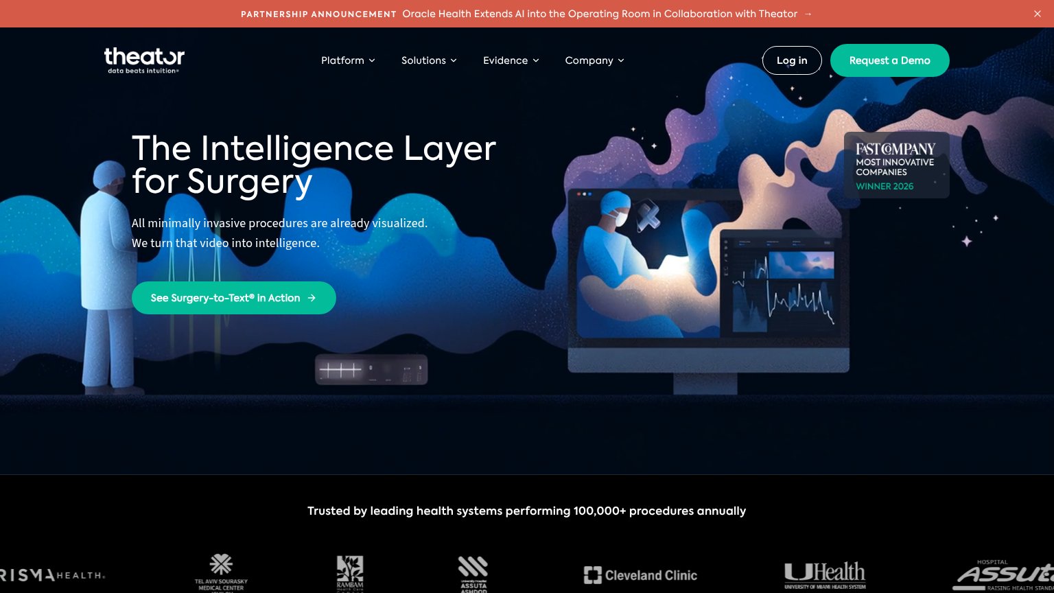
Problems
- 5 words — too long to scan
- competing label: 'Request a Demo'
- ® symbol adds visual noise
Information hierarchy
78FairDoes the design help or inhibit what the page is trying to say?
What works
What to improve
Value props
78FairTitle, subtitle, hero — do they sell the product's true value?
Theator’s headline
The Intelligence Layer for Surgery
All minimally invasive procedures are already visualized. We turn that video into intelligence.
Working
Could improve
Trust
82StrongProof that the product is real, competent, and safe to try.
How Theator compares
Trust read