
Your landing page’s weakest score is Trust.
How Lexius ranks
73Growth scoreupdated
category scores
category scoresShowHide
Score over time
Trust
56FairProof that the product is real, competent, and safe to try.
| Trust read | |
|---|---|
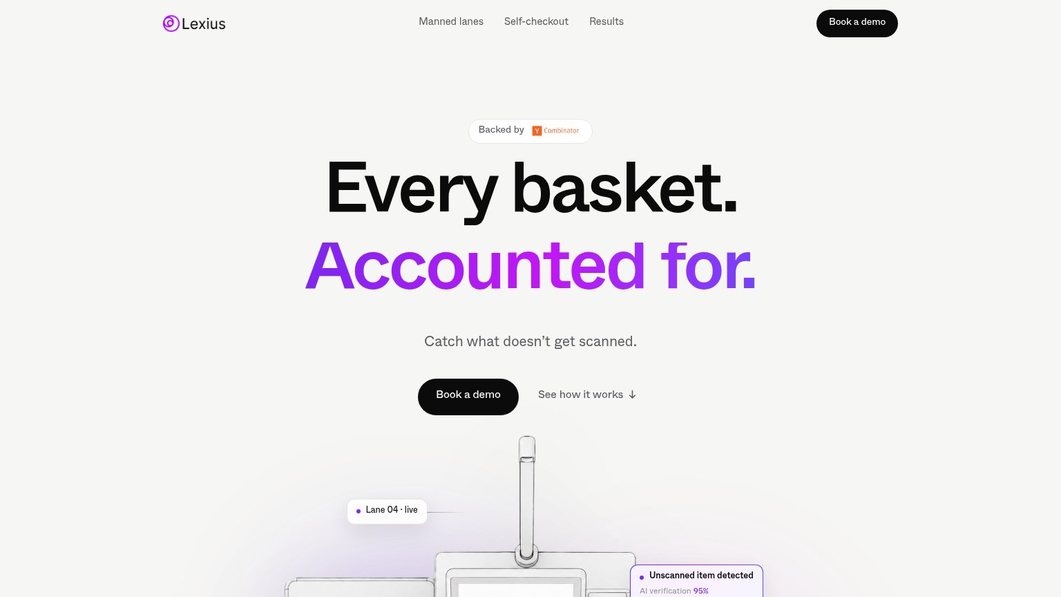
| Lexius | "Backed by Y Combinator" badge above the headline |
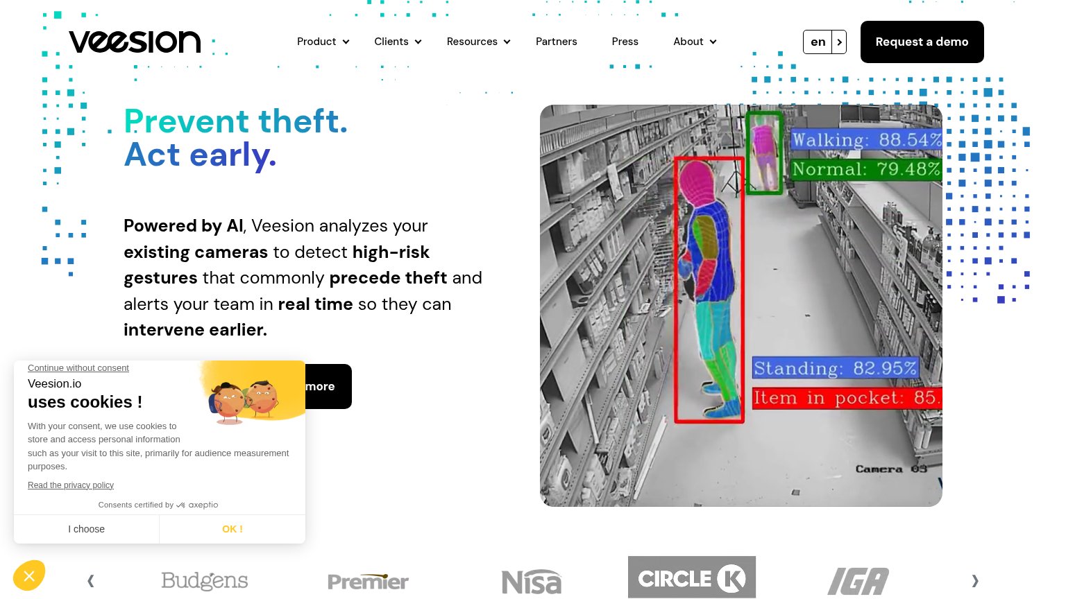
| Real surveillance-camera product shot with AI detection overlays ("Item in pocket: 85…", "Walking: 88.54%") demonstratin | |
| implicit context Diebold Nixdorf Vynamic Smart Vision may benefit from pre-existing familiarity among its target audience. | |
| "Sensormatic by Johnson Controls" logo lockup | |
| Gartner "2025 Hype Cycle for Retail Technologies" recognition in the top ticker |
CTA
72FairCopy, size, verb, cost-feel — does the primary CTA earn the click?
Problems
- 'Book a demo' feels committal
- sells a meeting, not the payoff
- no low-friction product taste
Value props
72FairTitle, subtitle, hero — do they sell the product's true value?
Lexius’s headline sells
Every basket. Accounted for.
Catch what doesn't get scanned.
Working
- Outcome-first, zero jargon
- Hero image demonstrates detection live
- YC badge adds instant credibility
Could improve
- No numbers: shrink %, detection rate
- Subhead is short but unspecific
- Audience (retailers) never named
Information hierarchy
82StrongDoes the design help or inhibit what the page is trying to say?
123- Duplicate Book a demo — Nav 'Book a demo' repeats the hero button at equal black-pill weight, splitting attention between two identical CTAs.
- Backed by badge — The Y Combinator badge sits directly above the headline in the scan path, making the first read a credential instead of the promise.
- See how it works link — Low-contrast gray secondary link sits at the same baseline as the primary CTA and invites a scroll away from conversion.
Mobile web
84StrongThe phone experience as a first-class citizen.
 12
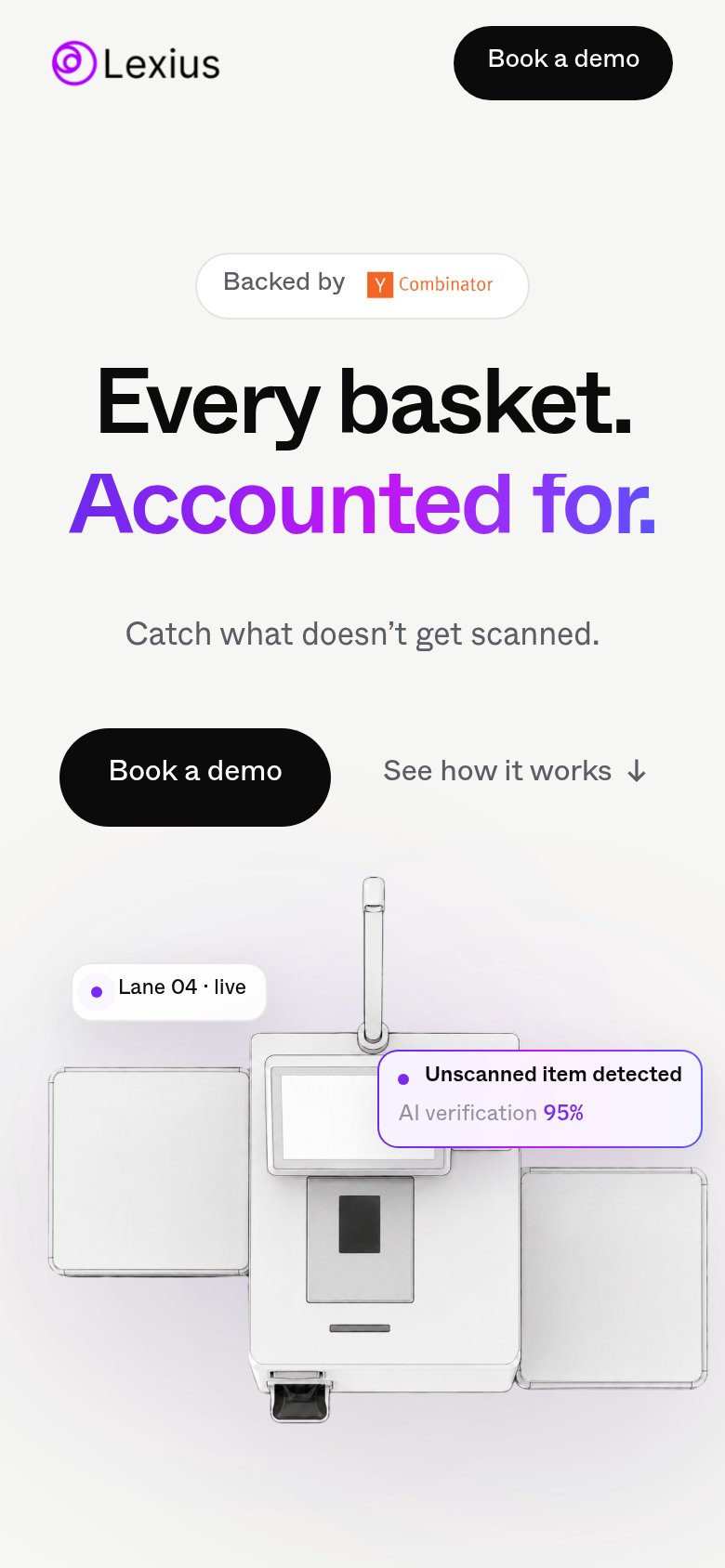
- Hero Book a demo — Desktop-proportioned button at half column width; should be near-full-bleed for thumb reach.
- Unscanned item callout — Overlay card collides with the kiosk screen and clips against the illustration at phone width.