
Your landing page’s weakest score is Trust.
How Khotan (formerly Pollinate) ranks
- 1.
Khotan (formerly Pollinate)74
- 2.
SourceDay69
- 3.
Tropic64
74Growth scoreupdated
category scores
category scoresShowHide
Trust
64FairProof that the product is real, competent, and safe to try.
| Trust read | |
|---|---|
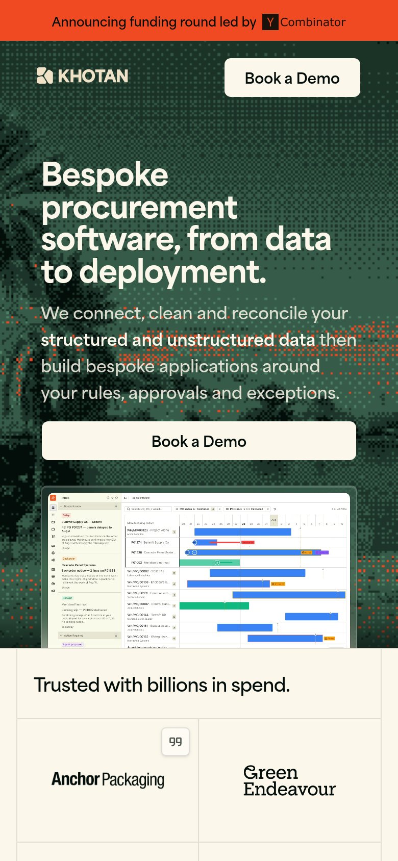
| Khotan (formerly Pollinate) | "Trusted with billions in spend." section with customer names Anchor Packaging and Green Endeavour (mobile capture) |
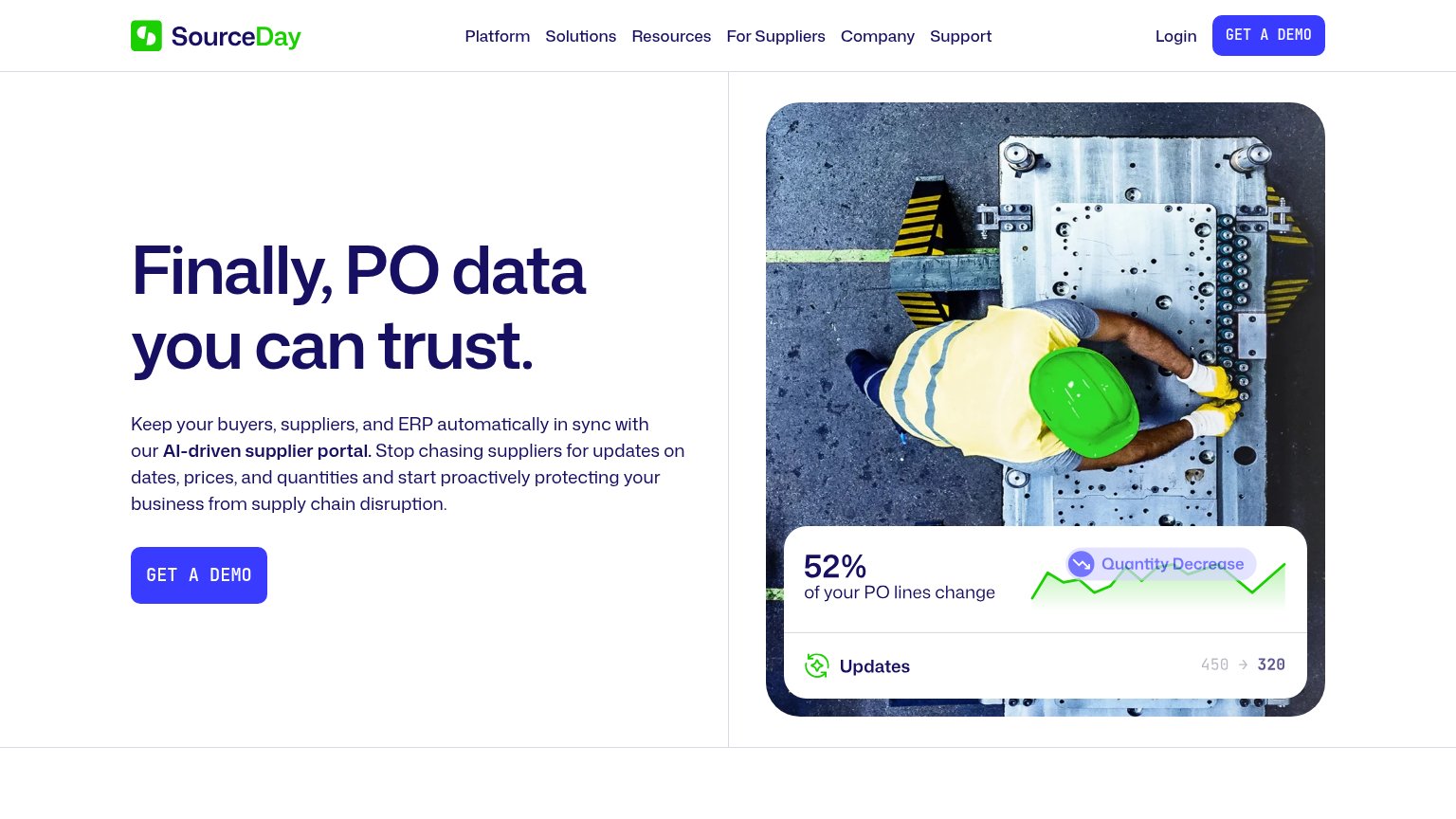
| "52% of your PO lines change" stat card with an Updates 450 → 320 metric overlaid on the hero image | |
| No visible trust signal identified. |
CTA
68FairCopy, size, verb, cost-feel — does the primary CTA earn the click?
Problems
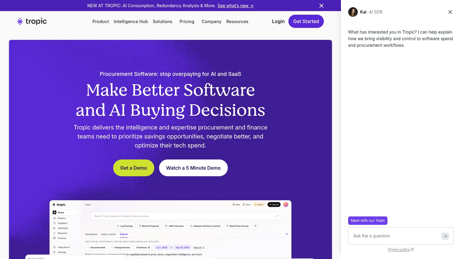
- click feels like a sales meeting
- no value promise in the label
- no lower-commitment alternative CTA
- doesn't echo the headline's promise
Value props
68FairTitle, subtitle, hero — do they sell the product's true value?
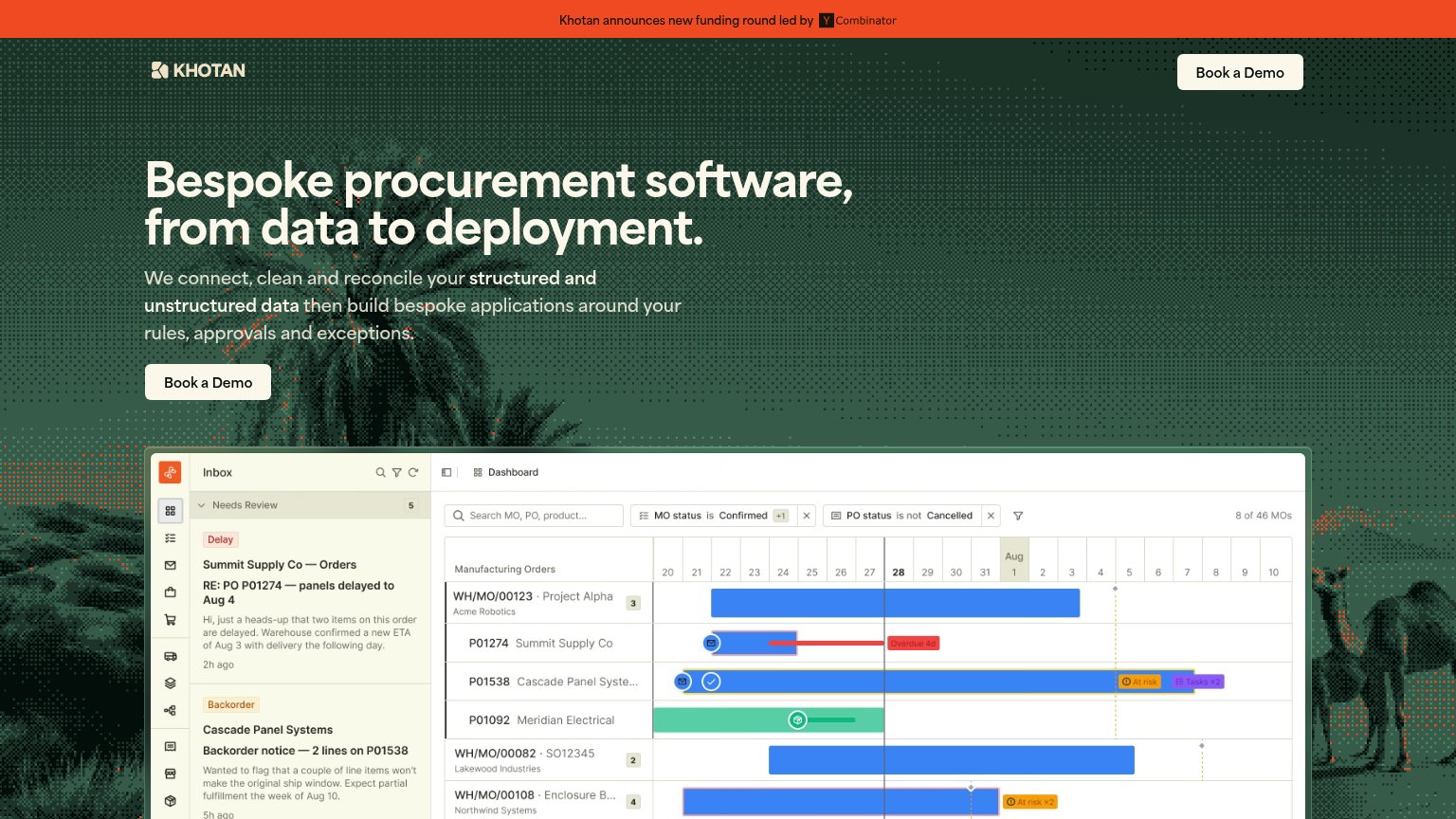
Khotan (formerly Pollinate)’s headline sells
Bespoke procurement software, from data to deployment.
We connect, clean and reconcile your structured and unstructured data then build bespoke applications around your rules, approvals and exceptions.
Working
- Subhead names real work: connect, clean, reconcile
- Hero image shows product handling real exceptions
- 'Bespoke' differentiates from off-the-shelf tools
Could improve
- No numbers or quantified outcomes anywhere
- Zero emotional pull — no pain or relief named
- Social proof buried below the fold
Information hierarchy
86StrongDoes the design help or inhibit what the page is trying to say?
123- Product dashboard screenshot — Packs a Gantt chart, inbox threads, and filter chips into a half-cropped strip — too dense to read as one proof point.
- YC funding banner — High-contrast orange bar is the loudest element on the page and pulls the first glance above the headline.
- Duplicate header CTA — Same-weight 'Book a Demo' repeats inches from the hero button, splitting the click target without adding reach.
Mobile web
86StrongThe phone experience as a first-class citizen.
 123
- Subheadline over texture — Body copy sits on a noisy halftone background, cutting contrast and legibility at arm's length.
- Desktop product screenshot — A full desktop Gantt UI shrunk into the phone column — every label is illegible and it adds noise, not proof.
- Funding announcement banner — The orange promo bar eats the top of the viewport and pushes the hero down without any tappable action.
Competitors
inferred from product, audience, and value prop#1Khotan (formerly Pollinate)74
#2