
Your landing page’s weakest score is Value props.
How DAIVIN! ranks
48Growth scoreupdated
category scores
category scoresShowHide
Value props
44PoorTitle, subtitle, hero — do they sell the product's true value?
DAIVIN!’s headline vague
Supporting life
We bring air to the frontiers of humanity, from the ocean's depths to the reaches of space.
Working
- Evocative, ambitious tone
- Y Combinator badge adds credibility
- "World's first" claim exists on-page
Could improve
- Headline could caption any company
- Tankless diving buried below fold
- Hero image never shows the product
Trust
44PoorProof that the product is real, competent, and safe to try.

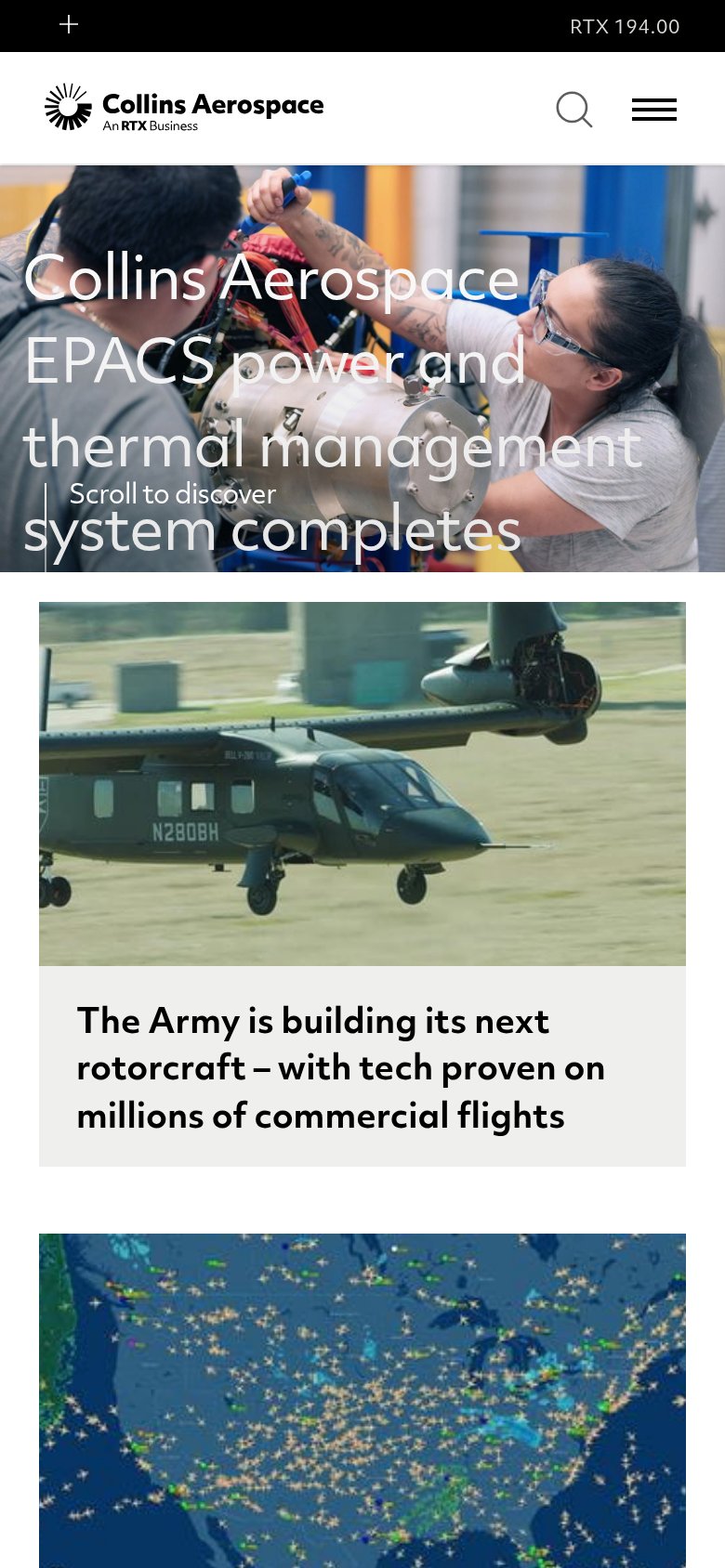

| Trust read | |
|---|---|
| DAIVIN! | "Backed by Y Combinator" badge (mobile capture) |
| "Since 1889, Dräger products protect, support and save lives." | |
| "The Army is building its next rotorcraft – with tech proven on millions of commercial flights" headline naming a custom | |
| implicit context Honeywell Aerospace may benefit from pre-existing familiarity among its target audience. |
CTA
45PoorCopy, size, verb, cost-feel — does the primary CTA earn the click?
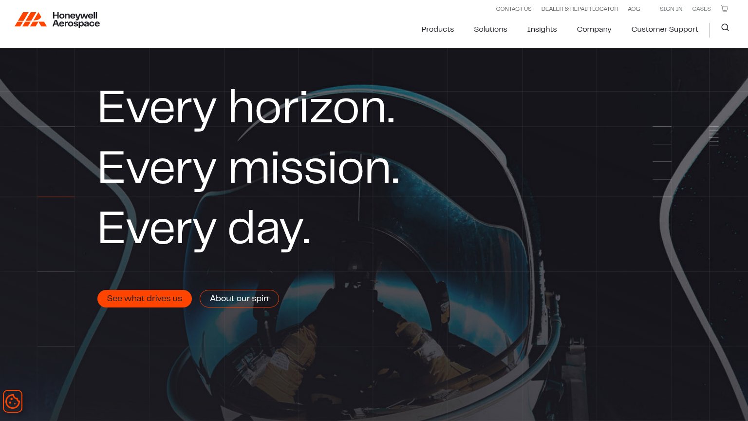
Problems
- absent from desktop fold
- styled as text link, no button
- passive 'see' — browse, not act
- secondary CTA exits to YouTube
Information hierarchy
52FairDoes the design help or inhibit what the page is trying to say?
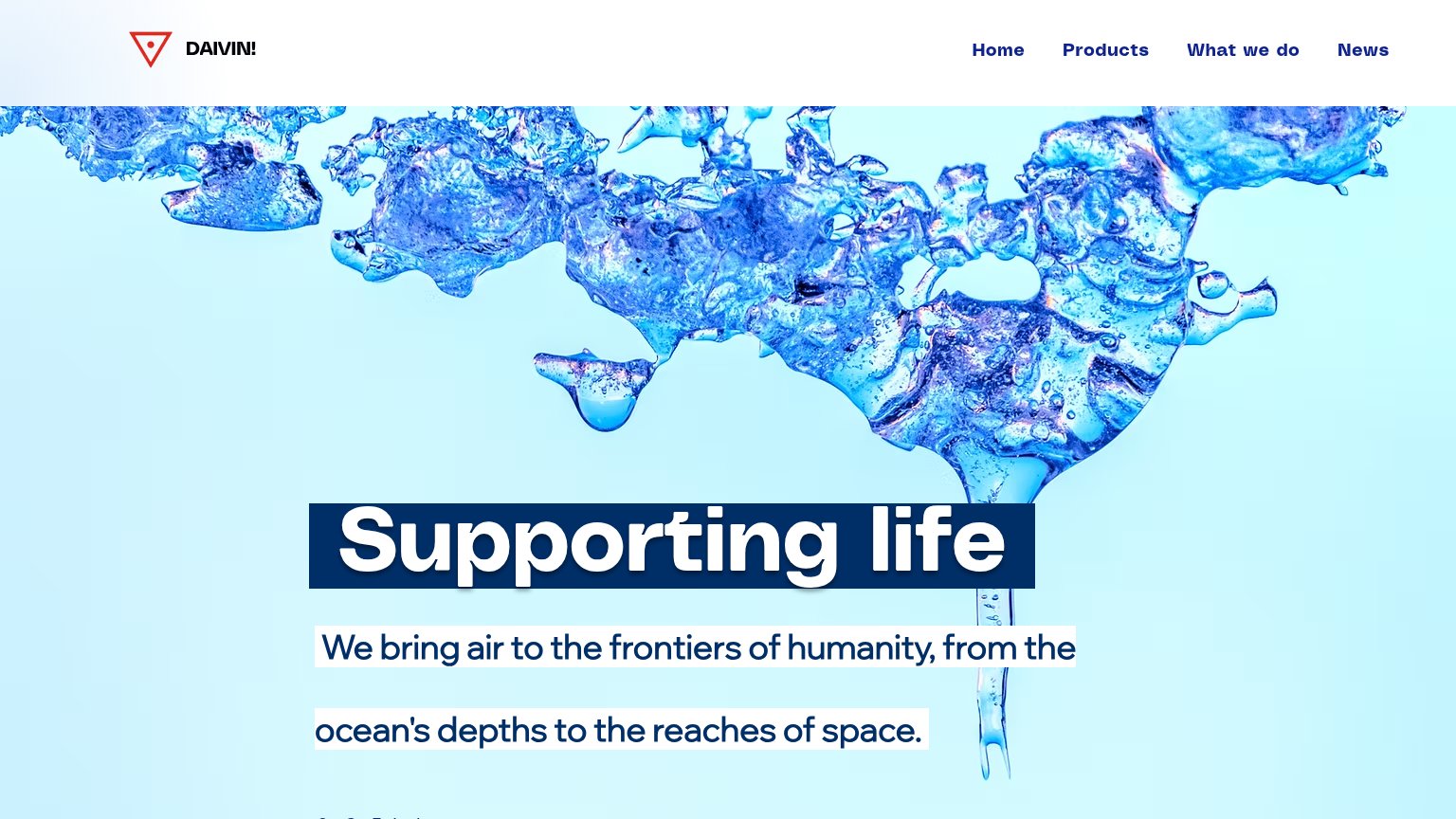 12
- Nav links only actions — Four equal-weight nav links are the sole interactive elements, so all attention leaks away from conversion.
- Fragmented subtitle boxes — The white highlight boxes break the subtitle into ragged strips, weakening its read as one statement.
Mobile web
54FairThe phone experience as a first-class citizen.
123- See Our Technology link — Primary action styled as plain text with no button shape or tap target.
- Stacked logo header — Logo-only header consumes the top of the fold and offers no menu to reach Products or News.
- See on Youtube button — Only real button sits a viewport down and sends traffic off-site instead of into a funnel.