CorveraYC W26 landing page report.
← Back to YC W26

Score over time

807570656055Crisp 63 on May 10 (Wayback)Crisp 63 on May 19 (Wayback)Crisp 64 on May 27 (Wayback)Crisp 66 on Jun 12 (Wayback)Crisp 66 on Jul 11 (Wayback)Crisp 67 on Sep 22 (Live)Turing Labs' rival Vividly (Cresicor) 69 on Apr 22 (Wayback)Turing Labs' rival Vividly (Cresicor) 70 on May 13 (Wayback)Turing Labs' rival Vividly (Cresicor) 72 on Sep 25 (Live)Crstl / Turvo alternatives excluded — replaced by Bedrock Analytics 59 on Sep 22 (Live)Dot (heydot.ai) 67 on Sep 22 (Live)Corvera 72 on May 5 (Wayback)Corvera 73 on Jun 4 (Wayback)Corvera 74 on Sep 22 (Live)May 5Jun 4Sep 22
Past reportsShow past reportsHide past reports
  1. Sep 22, 202674LiveOverall +1 · Value props +10 · Mobile web −8Viewing
  2. Jun 4, 202673Overall +1 · Mobile web +16 · Value props −10View →
  3. May 5, 202672First tracked report — strongest Information hierarchy 74, weakest CTA 68View →

CTA

68Fair

Copy, size, verb, cost-feel — does the primary CTA earn the click?

Corvera
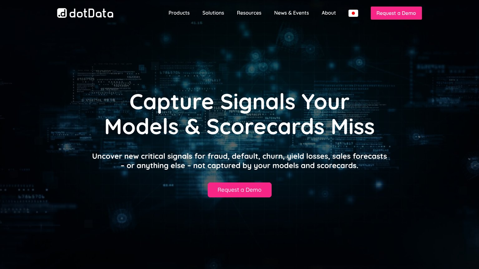
Dot (heydot.ai)

Problems

  • 'demo' signals a sales-call cost
  • email required before any value
  • no payoff named for the click

Trust

68Fair

Proof that the product is real, competent, and safe to try.

Trust read
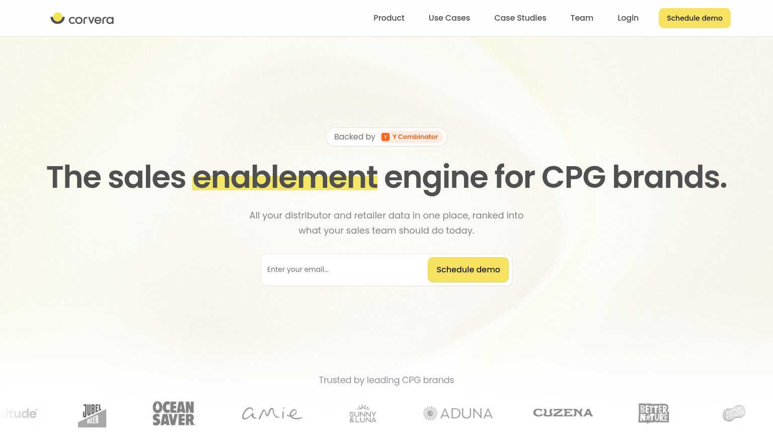
Corvera"Trusted by leading CPG brands" logo wall (Jubel Beer, Ocean Saver, Amie, Aduna, Better Nature)
Crisp"Crisp Ranks No. 11 Fastest-Growing Company in AI and Data on the 2026 Inc. 5000 List" banner
Turing Labs' rival Vividly (Cresicor)"Trusted by 3500+ CPG Professionals" badge above the headline
Crstl / Turvo alternatives excluded — replaced by Bedrock AnalyticsEmbedded 1:07 explainer video in the hero
Dot (heydot.ai)No visible trust signal identified.

Value props

72Fair

Title, subtitle, hero — do they sell the product's true value?

Corvera’s headline sellsThe sales enablement engine for CPG brands.All your distributor and retailer data in one place, ranked into what your sales team should do today.

Working

  • Names exact audience: CPG brands
  • Subhead states mechanism and daily outcome
  • YC badge and brand logos add credibility

Could improve

  • No numbers or proof metrics in fold
  • Hero is a gradient, not a product demo
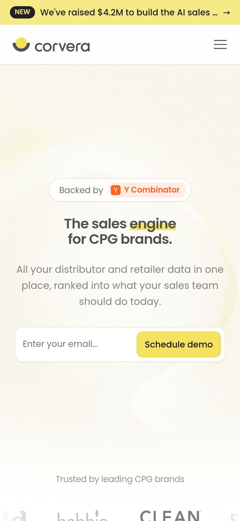
  • Mobile headline differs from desktop

Mobile web

78Fair

The phone experience as a first-class citizen.

Mobile web annotations on the mobile capture12
  1. Promo announcement bar — The "We've raised $4.2M" sticky banner truncates mid-sentence and eats the top of the fold with no conversion-valuable CTA.
  2. Schedule demo button — The CTA sits as an inline segment of the email field instead of a full-width thumb target, shrinking the tappable area.

Information hierarchy

82Strong

Does the design help or inhibit what the page is trying to say?

Information hierarchy annotations on the desktop capture123
  1. Six-item navigation row — Product, Use Cases, Case Studies, Team, and Login give attention five exits before the hero form reaches it.
  2. Duplicate nav demo button — Second yellow 'Schedule demo' at the same visual weight splits the click with the hero email form below.
  3. Faded partner logos — Trust logos are washed out to near-background contrast, weakening the 'Trusted by leading CPG brands' proof at a glance.