CompresrYC W26 landing page report.
← Back to YC W26

Your landing page’s weakest score is Trust.

How Compresr ranks

  1. 1.Compresr74
  2. 2.Not Diamond62
  3. 3.LLMLingua (Microsoft)55
Fix Trust

Score over time

80706050LLMLingua (Microsoft) 56 on May 15 (Wayback)LLMLingua (Microsoft) 54 on Jun 14 (Wayback)LLMLingua (Microsoft) 54 on Jul 8 (Wayback)LLMLingua (Microsoft) 55 on Sep 20 (Live)Not Diamond 58 on Feb 9 (Wayback)Not Diamond 58 on Feb 27 (Wayback)Not Diamond 59 on Mar 13 (Wayback)Not Diamond 58 on Apr 15 (Wayback)Not Diamond 56 on May 27 (Wayback)Not Diamond 56 on Jun 7 (Wayback)Not Diamond 62 on Jul 31 (Live)Compresr 67 on Mar 29 (Wayback)Compresr 75 on May 10 (Wayback)Compresr 75 on Jul 20 (Wayback)Compresr 74 on Sep 22 (Live)Mar 29May 10Jul 20Sep 22
Past reportsShow past reportsHide past reports
  1. Sep 22, 202674LiveOverall −1 · Trust −4 · Mobile web −4Viewing
  2. Jul 20, 202675Mobile web −6 · Information hierarchy +4View →
  3. May 10, 202675Overall +8 · Value props +20 · Mobile web +14View →
  4. Mar 29, 202667First tracked report — strongest Information hierarchy 68, weakest CTA 66View →

Trust

58Fair

Proof that the product is real, competent, and safe to try.

Compresr
LLMLingua (Microsoft)
Trust read
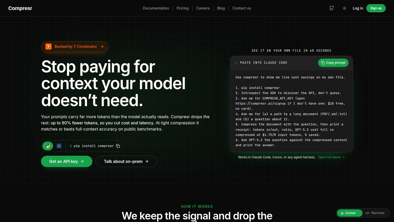
Compresr"Backed by Y Combinator" badge above the headline
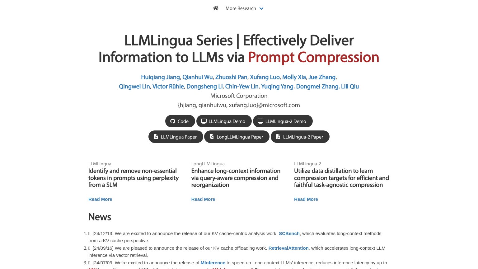
LLMLingua (Microsoft)Author list with "Microsoft Corporation" affiliation and {hjiang, qianhuiwu, xufang.luo}@microsoft.com emails plus linke
Not Diamond5%+ accuracy gains | 30%+ cost savings | 2x faster dev cycles

Mobile web

72Fair

The phone experience as a first-class citizen.

Mobile web annotations on the mobile capture123
  1. Six-line subheadline paragraph — Desktop-length body copy wraps into six lines and pushes the primary CTA below the first viewport.
  2. Wrapping Sign up pill — The header CTA breaks onto two lines, signalling the button was never sized for a phone.
  3. Human/Machine floating toggle — The toggle overlaps the code prompt text, obscuring content and inviting accidental taps.

Information hierarchy

76Fair

Does the design help or inhibit what the page is trying to say?

Information hierarchy annotations on the desktop capture1234
  1. Green Sign up button — Same green weight as the hero CTA, splitting the one action into two competing buttons.
  2. Five-link nav row — Documentation, Pricing, Careers, Blog, Contact us — Careers and Blog leak attention before the conversion.
  3. Terminal prompt body — Six numbered steps of small monospace text is a wall that competes with the headline for first-read attention.
  4. Y Combinator badge arrow — Orange badge with an arrow reads as a clickable exit placed above the headline in the scan path.

CTA

76Fair

Copy, size, verb, cost-feel — does the primary CTA earn the click?

Compresr

Problems

  • no 'free' despite $10 free credit
  • 'API key' feels like setup, not value
  • competes with Sign up in nav

Value props

86Strong

Title, subtitle, hero — do they sell the product's true value?

Compresr’s headline sellsStop paying for context your model doesn't need.Your prompts carry far more tokens than the model actually reads. Compresr drops the rest: up to 90% fewer tokens, so you cut cost and latency. At light compression it matches or beats full-context accuracy on public benchmarks.

Working

  • Names the pain: wasted token spend
  • Concrete number: up to 90% fewer tokens
  • 60-second try-it-Compresr demo prompt

Could improve

  • "Public benchmarks" left unnamed
  • "Up to 90%" is a soft ceiling claim
  • No dollar-savings example in fold

Competitors

inferred from product, audience, and value prop