
Your landing page’s weakest score is Value props.
How CodeWisp ranks
58Growth scoreupdated
category scores
category scoresShowHide
Score over time
Value props
38PoorTitle, subtitle, hero — do they sell the product's true value?
CodeWisp’s headline vague
Recommended
Working
- Game art shows real content instantly
- Play counts and likes act as social proof
- Featured carousel proves an active catalog
Could improve
- No headline explains what CodeWisp is
- Platform value hidden behind a game promo
- Zero copy about creating or AI features
Information hierarchy
58FairDoes the design help or inhibit what the page is trying to say?
 1234
- PLAY button — Primary CTA is a thin outlined bar at the panel's bottom, visually outranked by the hero art and leaderboard above it.
- Nav link row — Five equal-weight links plus search open exits before the visitor reaches the PLAY action.
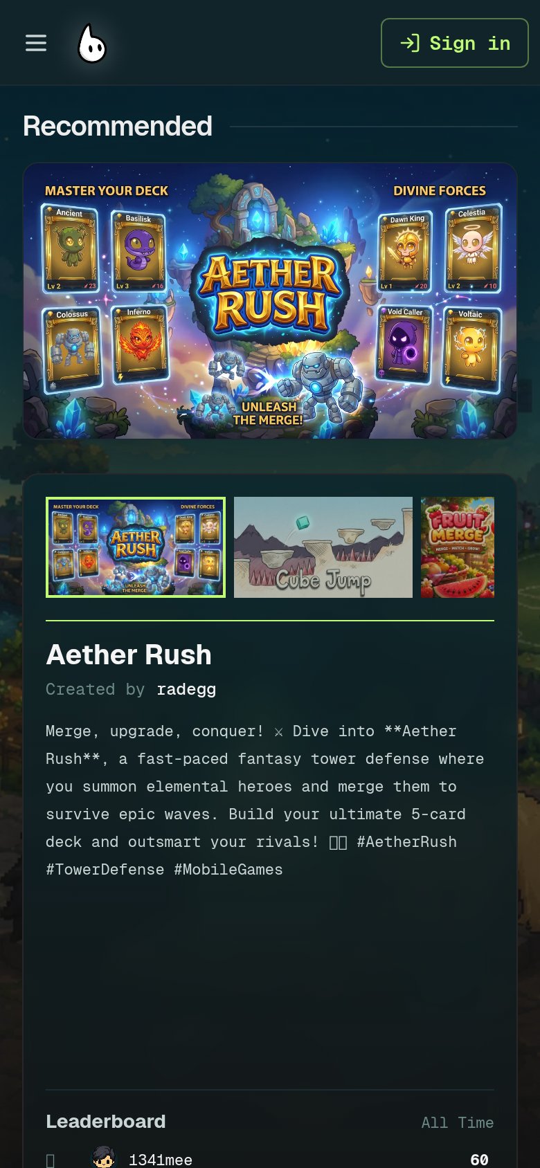
- Game description text — Truncated mid-sentence with raw **markdown** asterisks, so the value message never lands.
- Leaderboard panel — Usernames and scores sit directly above the CTA at equal weight, competing with the action instead of supporting it.
Mobile web
58FairThe phone experience as a first-class citizen.
 12
- Raw markdown description — Shows unrendered **Aether Rush** and broken glyph boxes, plus seven long monospace lines that push the CTA down.
- Duplicate hero banner — The same Aether Rush art appears twice back-to-back (banner then thumbnail), wasting scroll depth before any action.
Trust
66FairProof that the product is real, competent, and safe to try.
| Trust read | |
|---|---|
| CodeWisp | No visible trust signal identified. |
| Live product prompt UI with 'gemini-flash' model selector and '0/1000' character counter | |
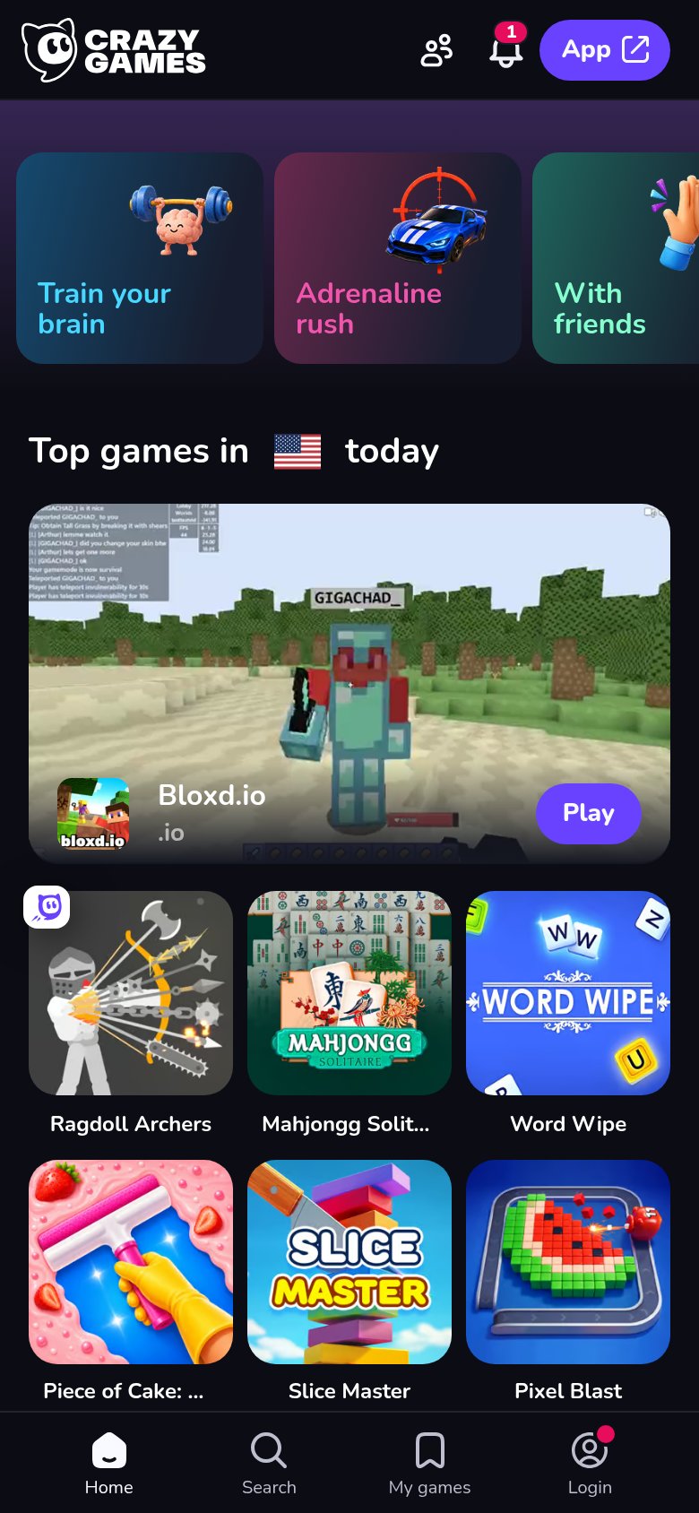
| implicit context Poki (with playful web games hub) may benefit from pre-existing familiarity among its target audience. | |
| Live Bloxd.io gameplay preview with real player chat and nameplates in the "Top games in 🇺🇸 today" rail | |
| '899k' plays and '3.1k' likes counter on the Modern Wars (DEMO) card |
CTA
72FairCopy, size, verb, cost-feel — does the primary CTA earn the click?
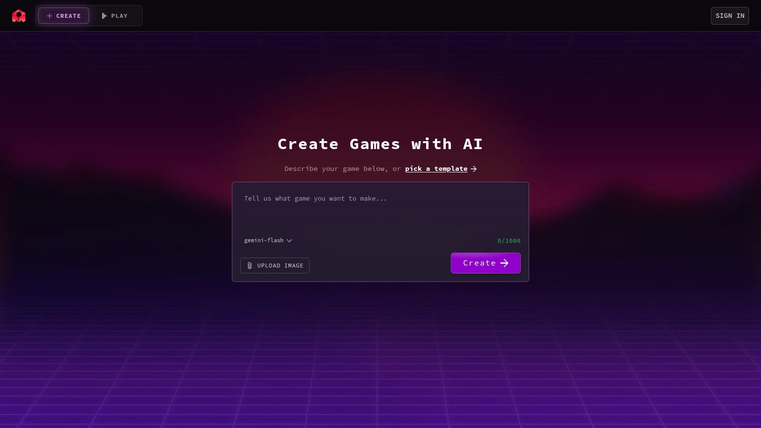
Problems
- outline style, weak footprint
- below the fold on mobile
- Sign in outshines it in header
- no payoff context around button